# Checkbox
> This page is about FlutterFlow Studio (the visual builder), not FlutterFlow (the app builder you use by describing your app).
URL: https://docs.flutterflow.io/resources/forms/checkbox
Learn how to add Checkbox, CheckboxGroup, and CheckboxListTile widget in your FlutterFlow Studio app.
In FlutterFlow Studio, a checkbox is a versatile input widget used to capture binary choices from users, such as true/false or yes/no options. It is ideal for situations where you need to present users with options that can be individually selected or deselected. FlutterFlow Studio provides three primary variations of the checkbox widget: **Checkbox**, [**CheckboxListTile**](#checkboxlisttile), and [**CheckboxGroup**](#checkboxgroup). Each of these widgets offers distinct features and use cases, making it easy to tailor your app's interface to your specific needs.
:::tip[Widget State]
Before diving into form widgets, check out our guide on [**Widget States**](https://docs.flutterflow.io/concepts/state-management/widget-state) to efficiently manage the state and behavior of your form elements.
:::
## Checkbox {#checkbox-1}
The **Checkbox** widget is the simplest form of a checkbox. It consists of a small square that can be either checked or unchecked. This widget is typically used for individual boolean options. You can customize the appearance and behavior of the checkbox, such as its size, color, and whether it starts as checked or unchecked.
### Adding Checkbox
Let's see how to add a checkbox widget and build an example that shows its value on a Text widget. Here's how it looks:
Here is a simple way to do it:
1. First, click on the **+ Add Widget**, drag the **Checkbox** widget from the **Base Elements** tab, or add it directly from the widget tree.
2. Below the Checkbox, add a [**Text**](https://docs.flutterflow.io/resources/ui/widgets/text) widget, move to the properties panel, click on **Set from Variable,** and choose the **Widget State > checkboxValue** (i.e., name of your checkbox).
### Setting Initial Value
You might want to show the checkbox with a default value, either check or uncheck. For example, showing the checked checkbox for travel insurance.
To set the initial value:
1. Select the **Checkbox** widget, move to the properties panel, and see the **Checkbox Initial Value** property.
2. Use the checkbox to set this value manually, or click **Set from Variable** to set it based on the dynamic value. If you choose *Set from Variable*, ensure you pass the boolean value from the source (e.g., API response, Firestore document field).
### Saving Checkbox Value
You may want to immediately save the checkbox’s value when it is checked or unchecked. To do this, [add an action using the trigger](https://docs.flutterflow.io/resources/forms/form-triggers#on-toggled-on--on-toggled-off) that responds to changes in the widget’s selection.
### Customizing
You can customize the appearance and behavior of this widget using the various properties available under the properties panel.
#### Changing color
To change the checkbox colors:
1. Select the **Checkbox** widget, move to the properties panel, and scroll down to the **Checkbox Properties** section.
2. To [change the color](https://docs.flutterflow.io/resources/ui/widgets/widget-commonalities#change-color) of the checkbox when it is selected and unselected, use the **Checked Color** and **Unchecked Color** properties, respectively.
3. To [change the color](https://docs.flutterflow.io/resources/ui/widgets/widget-commonalities#change-color) of the check icon, use the **Check Color** property.
#### Add rounded corners
To change the rounded corner for this widget:
1. Select the **Checkbox** widget, move to the properties panel, and scroll down to the **Checkbox Properties** section.
2. Find the **Border Radius** property and enter the values for TL(Top Left), TR(Top Right), BL(Bottom Left), and BR(Bottom Right). Use the Lock button to change all values at the same time. Unlocking will allow you to adjust each value separately.
#### Make it circular
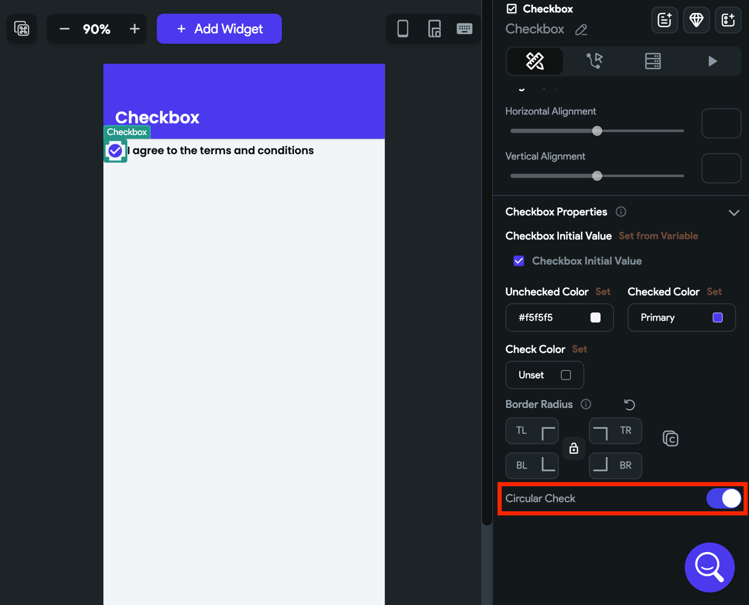
If you want to make the checkbox circular in shape, select the **Checkbox** widget, move to the properties panel, find the **Circular Check** property and enable it.
#### Disable Checkbox
You may need to disable a checkbox if certain conditions aren't met. For instance, users should only be able to use the 'Same as Shipping Address' checkbox when a shipping address is provided.
To disable a checkbox, move to the **Properties Panel** **>** turn on the **Checkbox Disable Options >** click **Unset,** and set the [**Condition**](https://docs.flutterflow.io/resources/functions/conditional-logic). Once set, you could also customize the disabled state colors using the *Disabled Check Color* property.
## CheckboxListTile
The **CheckboxListTile** widget combines the functionality of a checkbox with a [ListTile](https://docs.flutterflow.io/resources/ui/widgets/composing-widgets/list-grid#listtile-widget), providing a more comprehensive option for displaying checkboxes alongside additional information. Unlike the Checkbox this widget includes a title, and an optional subtitle, all within a single, cohesive element.
CheckboxListTile is ideal for use cases where you want to provide more context or descriptive text alongside the checkbox, such as in a settings menu or a form with detailed options.
## CheckboxGroup
The **CheckboxGroup** widget allows you to present a group of checkboxes as a single entity. This is particularly useful when you want users to select multiple options from a list. Each checkbox within the group can be checked or unchecked independently of the others.
### Adding CheckboxGroup
Here's an example of how you can use the CheckboxGroup widget in your project:
1. First, add the **CheckboxGroup** widget from the **Form Elements** tab or add it directly from the widget tree.
2. By default, the CheckboxGroup widget adds a single option named **Option 1**. To change the name, move to the properties panel (on the right side of your screen), and scroll down to the **Define Options** section. Find the **Option 1** property and change the **name**.
3. To add more options, move to the properties panel, and scroll down to the **Define Options** section.
1. Click on the **Add Option** text.
2. Enter the name in **Option 2 Text**.
4. To remove the option, click on the cancel icon displayed in the **Option name** property.
5. Click on the **Set from Variable** to show the options from a variable such as app state variable, API response variable, or Firestore Document.
### Trigger Action on Change
See how to [trigger an action when a selection changes](https://docs.flutterflow.io/resources/forms/form-triggers#on-selected) on this widget.
### Setting Initial Selection
Sometimes you might want to display the CheckboxGroup with some options already selected. For example, selecting the topping options that are already served with Pizza itself. You can do so by setting the initial selection for the CheckboxGroup.
To set initial selection manually:
1. Select the **CheckboxGroup** from the widget tree or the canvas area.
2. Move to the properties panel (on the right side of your screen) and scroll down to the **Initially Selected** section.
3. Click on the **Add Selected** and enter the option name that you would like to display as selected. **Note**: Make sure you enter the correct name and it matches with the option name added inside the define options section.
4. Similarly, you can display the other option(s) as selected.
### Clear/Select all items [Action]
You might want to allow users to clear or select all items in one go. You can do so by adding the following action.
Follow the steps below to add this action to any widget.
1. Select the **Widget** (e.g., Button) on which you want to add the action.
2. Select **Actions** from the properties panel (the right menu), If it's the first action, click **+ Add Action** button. Otherwise, click the "**+**" button below the previous action tile (inside *Action Flow Editor*) and select **Add Action**.
3. Search and select the **Clear All/Select All** (under *Widget/UI Interactions*) action.
4. **Choose Multiselect Widget** name from the dropdown.
5. Finally, set the **Action Type** to **Clear All** or **Select All**.
### Customization
You can use the Properties Panel to customize the appearance of your widget.
#### Set padding around the checkbox
To create empty space around the checkbox:
1. Select the **CheckboxGroup** from the widget tree or the canvas area.
2. Move to the properties panel and find the **Item Padding** property.
3. Set the padding for the L(Left), T(Top), R(Right), and B(Bottom) sides. Use the Lock button to change all values at the same time. Unlocking will allow you to modify each value separately.
#### Changing checkbox color
To change the checkbox color:
1. Select the **CheckboxGroup** from the widget tree or the canvas area.
2. Move to the properties panel and scroll down to the **Checkbox Style** section.
3. To change the active color (i.e. color when the checkbox is selected), find the **Active Color** property, click on the box next to the already selected color, select the color, and then click **Use Color** or click on **Unset** and enter a Hex Code directly. You can also choose the color by clicking the **Palette** and **Simple** button.
4. the Similarly you can change the check color (i.e color of the done/tickmark icon inside the checkbox).
#### Customizing checkbox border
To customize the checkbox border:
1. Select the **CheckboxGroup** from the widget tree or the canvas area.
2. Move to the properties panel and scroll down to the **Checkbox Style** section.
3. To change the checkbox border color, find the **Check Border Color** property, click on the box next to the already selected color, select the color, and then click **Use Color** or click on **Unset** and enter a Hex Code directly. You can also choose the color by clicking the **Palette** and **Simple** button.
4. To adjust the border corner, find the **Border Radius** property and enter the values in the TL (Top left), TR (top right), BL (bottom left), and BR (bottom right) boxes. Use the Lock button to change all values at the same time. Unlocking will allow you to modify each value separately.