# Card
> This page is about FlutterFlow Studio (the visual builder), not FlutterFlow (the app builder you use by describing your app).
URL: https://docs.flutterflow.io/resources/ui/widgets/built-in-widgets/card
Learn how to add and customize a Card widget in FlutterFlow Studio.
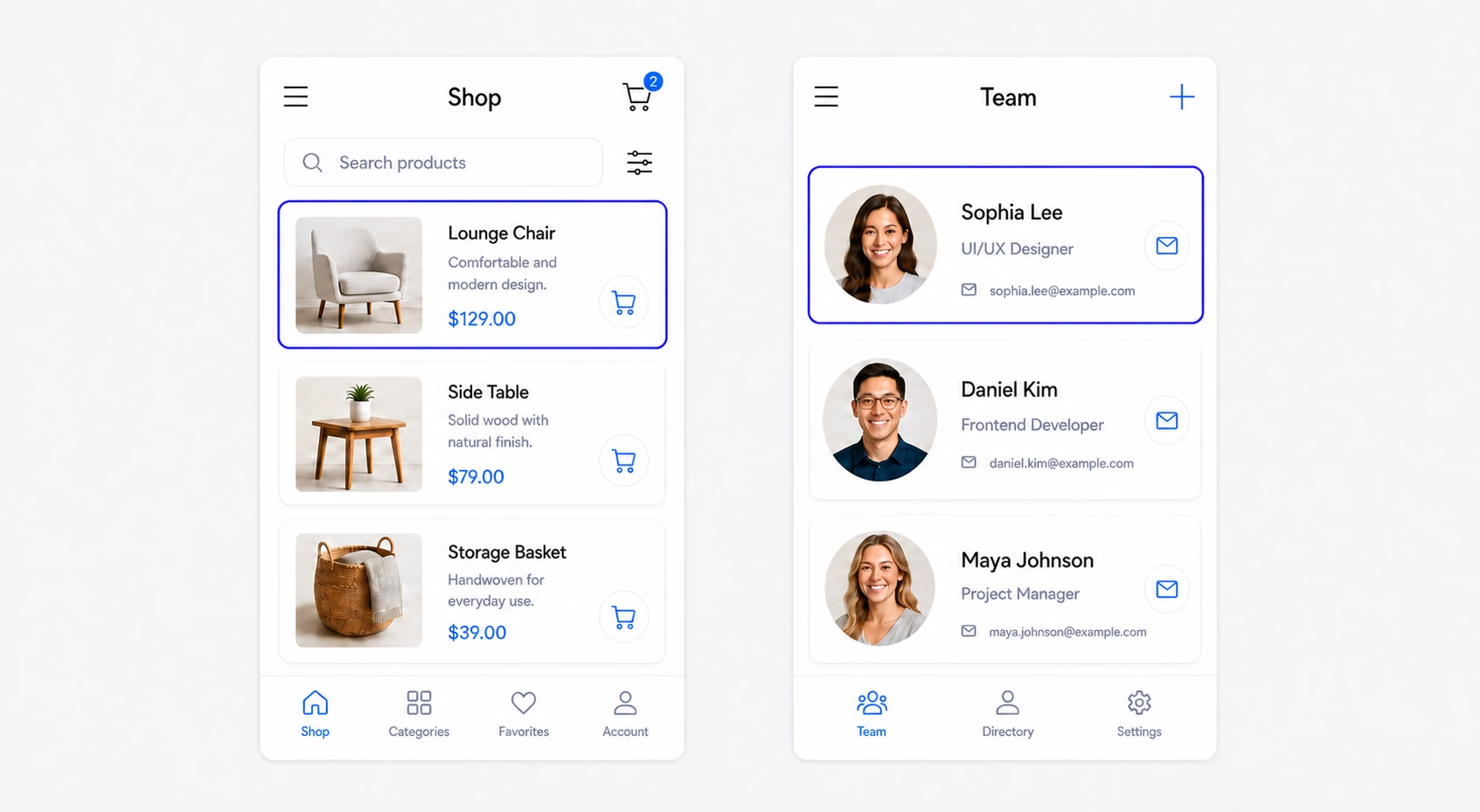
The [Card](https://api.flutter.dev/flutter/material/Card-class.html) widget displays related content on a surface with rounded corners and a shadow. Use it for product details, restaurant details, profiles, or other content that should appear as a single item.
## Adding a Card Widget
To add a Card widget:
1. Add the **Card** widget from the **Layout Elements** section of the [Widget Palette](https://docs.flutterflow.io/flutterflow-ui/widget-palette).
2. Add a layout widget, such as a **Row** or **Column**, as its child.
3. Add and arrange the content inside the layout widget.
## Card vs Container
Use a **Card** when you want a Material-style surface with built-in elevation, rounded corners, and a background color. Use a [**Container**](https://docs.flutterflow.io/resources/ui/widgets/container) when you need more control over dimensions, alignment, borders, gradients, or other decorations.
## Using Cards with Dynamic Data
To display repeated records, place a **Card** inside a **ListView** or **GridView**, then [**generate dynamic children**](https://docs.flutterflow.io/resources/ui/widgets/composing-widgets/generate-dynamic-children) from a list or backend query. Bind the widgets inside the Card to the current item to show information such as a product image, name, price, or user profile.
## Customizing a Card Widget
Select the **Card** widget and use the **Card Properties** section to customize its appearance:
- **Color:** Sets the card's background color.
- **Elevation:** Controls the card's shadow and visual depth. Use `0` to remove the shadow.
- **Border Radius:** Rounds the card's corners. Apply one value to every corner or configure each corner separately.