# Image
> This page is about FlutterFlow Studio (the visual builder), not FlutterFlow (the app builder you use by describing your app).
URL: https://docs.flutterflow.io/resources/ui/widgets/image
Images are a fundamental part of modern user interfaces, enhancing visual appeal and user
Images are a fundamental part of modern user interfaces, enhancing visual appeal and user
engagement. In app design, images can provide context, support content, and guide user
interactions. Different types of image widgets cater to various design requirements, ensuring flexibility and aesthetic integration across platforms.
- **Image Widget**: The Image Widget is a versatile component used to display images from a
variety of sources, including local assets and the internet. It's essential for adding visual elements to your applications, such as logos, icons, and photographs.
- **CircleImage Widget**: The CircleImage Widget specifically caters to scenarios where you need
to display images in a circular format, commonly used for profile pictures or branding elements.
The properties for the Image widget provide various customization options, from sizing and fitting to advanced animations.
## Common Image Properties
- **Width & Height:** Specify the dimensions of the image. Values can be in pixels (px) or as a
percentage (%) of the parent container's size, allowing for responsive design.
- In case of `CircleImage` widget, you can define the **diameter** of the widget instead.
- **Border Radius:** Adjusts how rounded the corners of the image are. You can define border radius
for TL (Top left), TR (top right), BL (bottom left), and BR (bottom right) separately or for all
corners together. A higher value results in more rounded corners.
:::caution[CIRCLEIMAGE]
This option is not available for `CircleImage` widget since it is circular in shape.
:::
### Image Type
Specifies the source of the image. Options include:
- **Network:** Enter the URL of the image in the Path input field. This is used for images
hosted online.
- **Cached:** Determines whether the image should be cached for performance optimization. When
toggled on, it stores the image locally to speed up load times on subsequent views.
- When cached is enabled for `Image` widget & `CircleImage` widget, you can also define the **Fade
in/out duration** (when blur hash is not enabled). This setting is not available for
Background Image of Container.
- **Asset:** Click the Upload Image + button to upload an image from your computer or select
from previously uploaded assets. When this option is selected, you can enable the **Set Dark
Mode** toggle to specify a separate background image for dark mode environments, enhancing the
visual experience under different lighting conditions.
- **Uploaded File:** Selecting this option allows for dynamic handling of image data within your
app, accommodating images that users upload during app usage. This makes it suitable for
applications requiring user-specific or user-generated content. Set this to use **Widget State >
Uploaded File** to manage the image as part of the app's state.
### Box Fit
Determines how this widget should take up the available space. The options are:
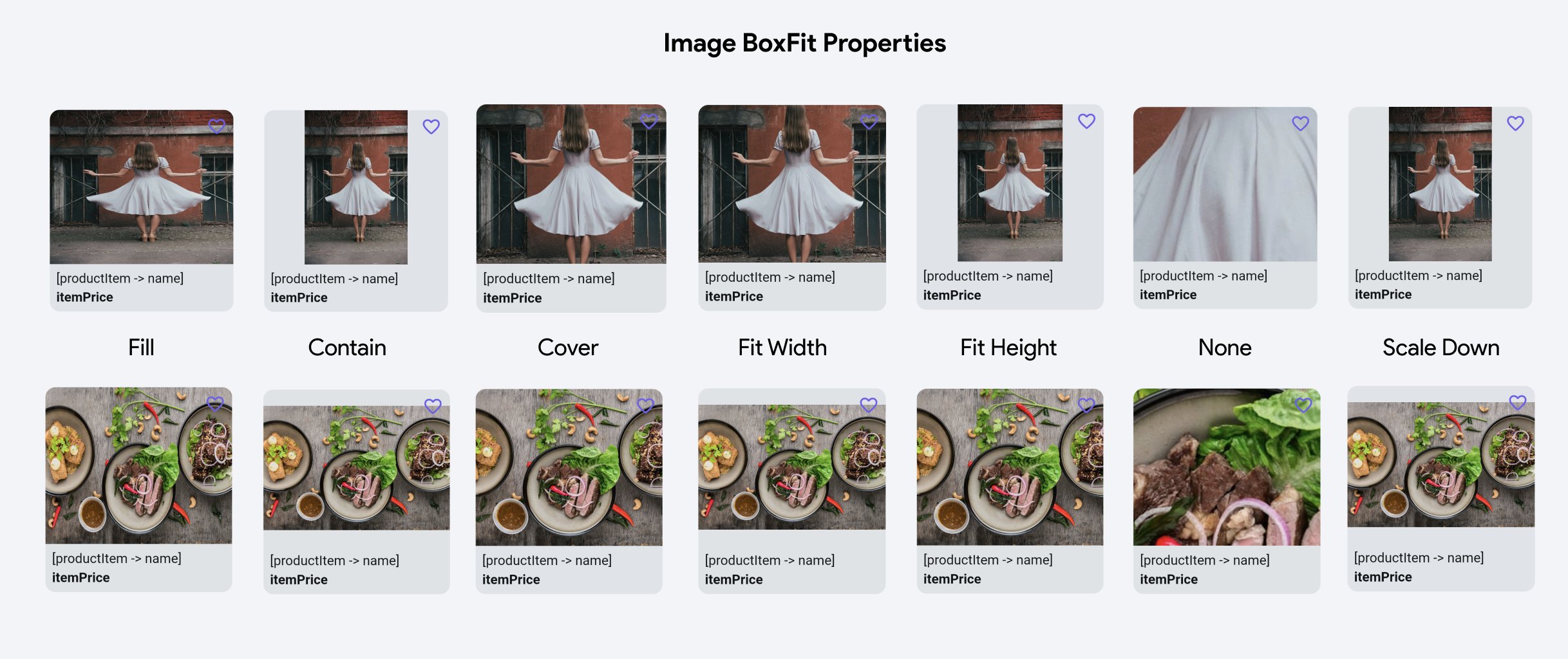
Example of a horizontal & vertical image in
different BoxFit options
- **Fill:** Scale the image to completely fill the container, which might distort the image.
- **Contain:** Scale the image to fit within the container without distorting it, which might
leave some empty space.
- **Cover:** Scale the image to completely cover the container without distorting it,
potentially cropping some parts of the image.
- **Fit Width:** Scale the image to fit the width of the container, possibly leaving empty space
vertically.
- **Fit Height:** Scale the image to fit the height of the container, possibly leaving empty
space horizontally.
- **None:** No scaling or adjustment, showing the image in its original size.
- **Scale Down:** Center the widget and scale it down until it fits within the available space.
### Image Alignment
Controls the alignment of the image within the container. This grid allows you
to position the image precisely within the container, with options to align it to the center, top,
bottom, left, right, and combinations of these.
- **X & Y:** Adjusts the fine positioning of the background image along the X (horizontal) and Y
(vertical) axes. This is useful for making precise adjustments to the image placement.
## Advanced Image Functionalities
- **Show Error Image on Failure:** When enabled, displays an error image if the main image fails
to load. This helps maintain a good user experience even when image retrieval issues occur.
- **Use Blur Hash:** When enabled, displays a blurred placeholder image while the main image is loading, based on a hash value representing the original image. This can enhance the perceived performance of image loading.
- **Make Expandable:** When enabled, the image can be expanded, usually to a larger view or a
full-screen mode, upon user interaction.
- **Use Hero Animation:** Enables a hero animation effect when transitioning between screens. This
can make the image appear to "fly" between screens for a smoother visual transition.