Global Properties
Global properties are built-in variables in FlutterFlow that you can use across all pages of your app. These properties are predefined by FlutterFlow, meaning you cannot create or modify them yourself. They are designed to help you perform common tasks efficiently, no matter what type of app you’re developing.
For example, global properties can be used to redirect users to another page if they are not logged in or to enable specific functionality based on the platform your app is running on.
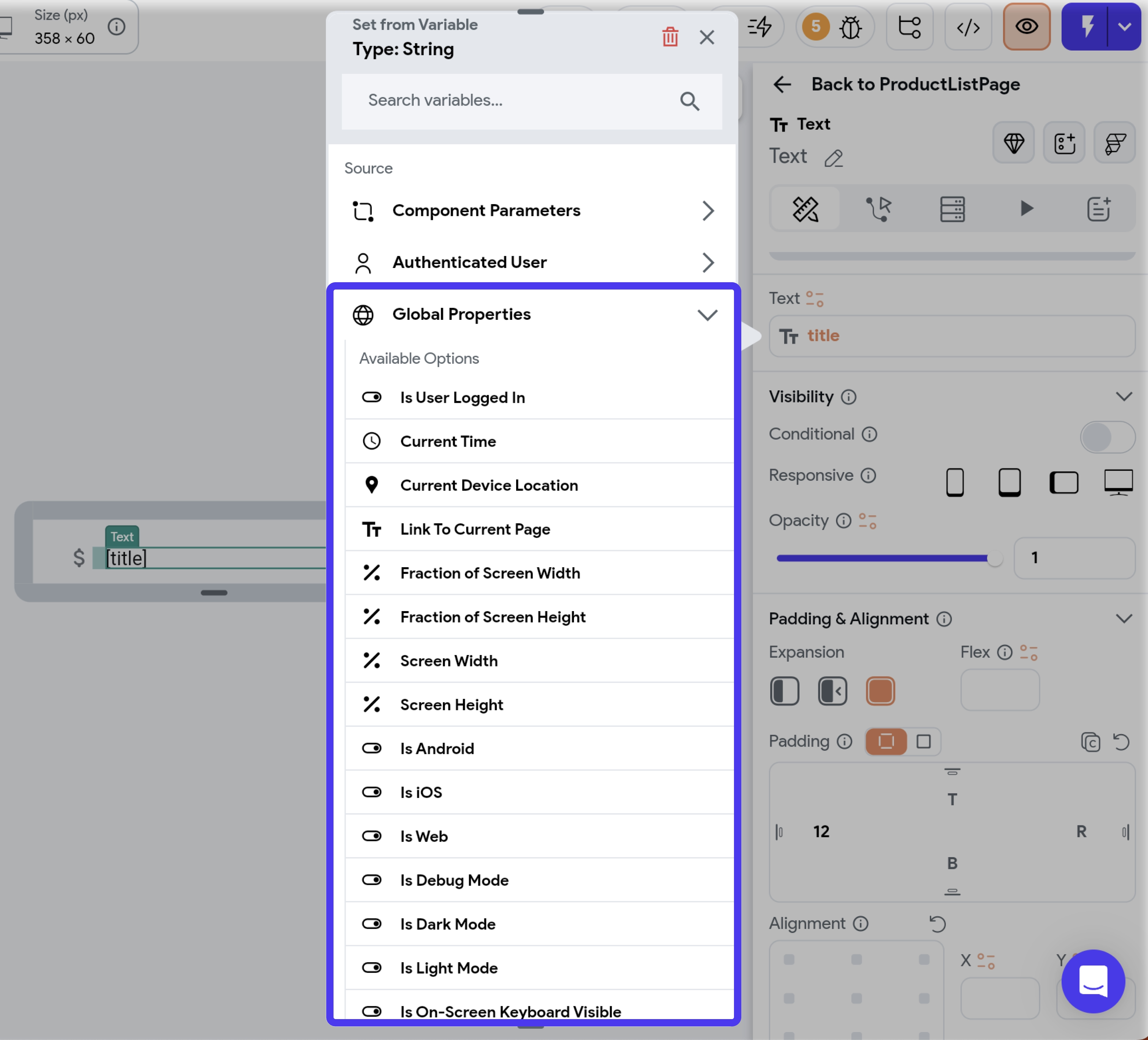
You can access these properties through the Set from Variable menu > Global Properties.

Global properties are built-in variables exposed by FlutterFlow. You can't create one by yourself.
List of Global Properties
A list of all the available global properties is as follows:
-
Is User Logged In: Indicates whether a user is currently logged into the app. Useful for providing exclusive features to registered users or adjusting UI elements based on login status. This property is only accessible if you have enabled authentication of any type.
-
Current Time: Fetches the current date and time. Explore custom formatting options to tailor the DateTime display to your needs.
-
Current Device Location: Returns the user's current location, ideal for updating their position on Google Maps or storing it in a backend database. Check out examples on how to retrieve and save the current device location.
-
Link To Current Page: Provides the Deep Link of the current page.
-
Current Route Path: Provides the route name of the currently active or visible page in your app. This property is especially helpful in scenarios where you want to adjust or block specific actions if the active page isn't the one you expect. For example, if you launch the app through a push notification, the home page might still run in the background, even if the notification directs you to a different page. Using this property, you can prevent unnecessary action triggers, such as On Page Load from the home page. See details on avoiding this issue.
-
Current Route Stack: Returns a list of route names representing every active page in your app’s navigation stack. It’s helpful for understanding how many pages deep the user is and what sequence of pages they’ve visited. You may need this data to manage custom back navigation, breadcrumb displays, or logging analytics. For instance, in an e-commerce app, you could examine the route stack to see if the user arrived at the checkout page from a specific page and tailor your promotional messages or apply discount accordingly.
-
Fraction of Screen Width: Determines the proportional width of the device's screen.
-
Fraction of Screen Height: Determines the proportional height of the device's screen.
-
Screen Width: Provides the total width of the current device's screen in pixels.
-
Screen Height: Provides the total height of the current device's screen in pixels.
-
Is Android: Determines if the user is accessing the app on an Android device. See example.
-
Is iOS: Determines if the user is accessing the app on an iOS device. See example.
-
Is Web: Determines if the user is accessing the app through a web browser. See example.
-
Is Debug Mode: Indicates if the app is currently running in debug mode, useful for displaying features or performing actions only during debugging.
-
Is Dark Mode: Checks if the app's current theme mode is set to dark.
-
Is Light Mode: Checks if the app's current theme mode is set to light.
-
Is On-Screen Keyboard Visible: Checks if the on-screen or soft keyboard is visible. This is helpful in making UI adjustments if keyboard is visible on screen. See a quick example.
-
Current Environment: Returns the current development environment value.
Learn more about the Generated Code behind Global Properties.
Current Time
The Current Time property allows you to retrieve the current date and time. This option is available when the Source is set to Global Properties.
You can use this property to display the current date and time on the screen or pass it to a FlutterFlow or custom widget for further processing.
Custom formatting
Sometimes, you might need to display dates and times in a format that we don't support. This is where the custom date and time formatting comes into play. Custom Format enables you to represent date and time data in a multitude of ways.
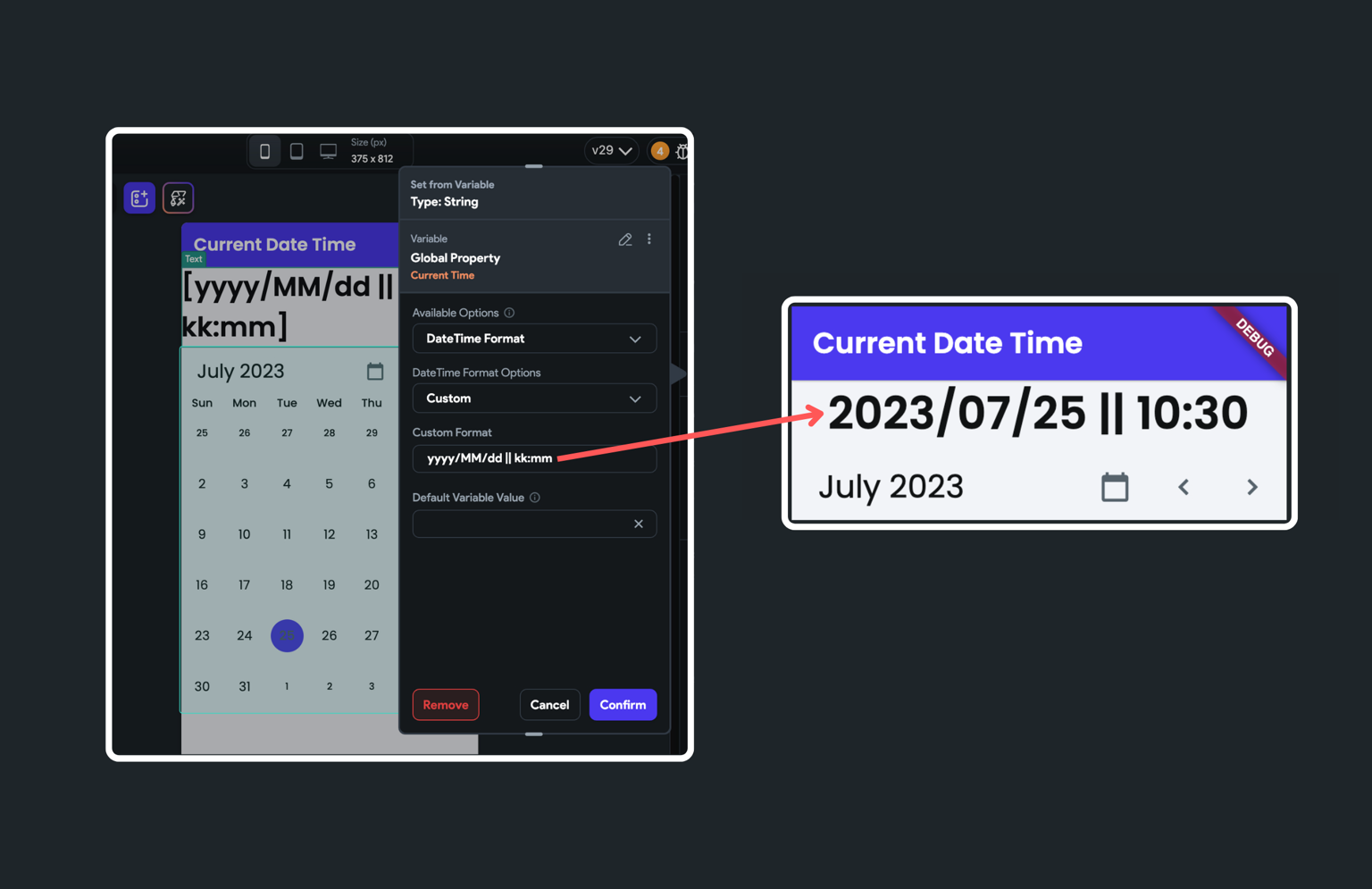
For example, you can enter the text like 'yyyy/MM/dd || kk:mm', and the date time will be displayed as '2023/07/25 || 10:30'.
In the above example, 'yyyy/MM/dd || kk:mm is the custom format. Here's what it stands for:
yyyyrepresents a four-digit year, like "2023".MMis a two-digit month, such as "07" for July.ddindicates a two-digit day, for instance, "25".kkis for a two-digit hour in 24-hour format, like "10".mmstands for a two-digit minute, such as "30".
Here are some more format specifiers that you can use the build the custom format:
d: Day of the month. E.g., "2" for February 2nd.E: Abbreviated weekday. E.g., "Mon" for Monday.EEEE: Full weekday. E.g., "Monday".LLL: Abbreviated standalone month. E.g., "Feb".LLLL: Full standalone month. E.g., "February".M: Month of year. E.g., "2" for February.Md: Month and day. E.g., "2/2".MEd: Abbreviated weekday, month, and day. E.g., "Mon, 2/2".MMM: Abbreviated month. E.g., "Feb".MMMd: Abbreviated month and day. E.g., "Feb 2".MMMEd: Abbreviated weekday, month, and day. E.g., "Mon, Feb 2".MMMM: Full month. E.g., "February".MMMMd: Full month and day. E.g., "February 2".MMMMEEEEd: Full month, weekday, day. E.g., "Monday, February 2".QQQ: Abbreviated quarter. E.g., "Q1".QQQQ: Full quarter. E.g., "1st quarter".y: Year. E.g., "2023".yM: Year and month. E.g., "2023/2".yMd: Year, month, day. E.g., "2023/2/2".yMEd: Weekday, year, month, day. E.g., "Mon, 2023/2/2".yMMM: Abbreviated month and year. E.g., "Feb 2023".yMMMd: Abbreviated month, day, year. E.g., "Feb 2, 2023".yMMMEd: Weekday, month, day, year. E.g., "Mon, Feb 2, 2023".yMMMM: Full month and year. E.g., "February 2023".yMMMMd: Full month, day, year. E.g., "February 2, 2023".yMMMMEEEEd: Weekday, full month, day, year. E.g., "Monday, February 2, 2023".yQQQ: Abbreviated quarter, year. E.g., "Q1 2023".yQQQQ: Full quarter, year. E.g., "1st quarter 2023".H: Hour in day (24-hour). E.g., "15" for 3 PM.Hm: Hour, minute (24-hour). E.g., "15:30".Hms: Hour, minute, second (24-hour). E.g., "15:30:45".j: Hour in day (12-hour). E.g., "3 PM".jm: Hour, minute (12-hour). E.g., "3:30 PM".jms: Hour, minute, second (12-hour). E.g., "3:30:45 PM".m: Minute in hour. E.g., "30".ms: Minute, second. E.g., "30:45".s: Second in minute. E.g., "45".G: Era designator. E.g., "AD" in "AD 2023".L: Standalone month. E.g., "7" for July.c: Standalone day. E.g., "2" for Tuesday.h: Hour in AM/PM (1~12). E.g., "3" for 3 AM.H: Hour in day (0~23). E.g., "15" for 3 PM.S: Fractional second. E.g., "123" for 123 milliseconds.D: Day in year. E.g., "50" for the 50th day of the year.a: AM/PM marker. E.g., "AM" or "PM".k: Hour in day (1~24). E.g., "24" for midnight.K: Hour in AM/PM (0~11). E.g., "0" for 12 AM.Q: Quarter. E.g., "4" for the fourth quarter.
For more detailed information, please refer to the DateFormat class documentation.

Current Device Location
This property is used to get the current device location (aka geolocation). You can access this when the Source is set to Global Properties.
You can use this property to get the user's current location to update on Google Maps or store it in the backend database.
At present, testing this property isn't possible in Test mode, but you can use the Run mode for this purpose. To run it on Android, iOS or desktop platforms, use Local Run.
Get Current Device Location: Example
Let's see an example of getting the current device location and passing it to a widget (that supports accepting LatLong, for example, Google Maps).
Here is an example of how you can retrieve the current device location:
- Select the widget (e.g., GoogleMap) from the widget tree or canvas area.
- Move to the properties panel, find the Initial Location property, and click on Set from Variable.
- Set the Source to Global Properties.
- Set the Available Options to the Current Device Location.
- Click Confirm.
Save the Current Device Location: Example
Here's how you can save the user's current location (Geolocation) in the Firestore document.
- Create a LatLng field in your Firestore Schema.
- After this, you need to set this field from a variable source and select Current Device Location from the Global Properties.
Is Android/iOS/Web
Use these properties when you want to tailor the user experience for specific platforms. These properties determine whether the user is accessing the app on Android, iOS, or the Web. Knowing the user's platform is essential for customizing functionality to suit each environment. For instance, certain custom widgets or actions might be exclusive to Android.
These properties allow you to implement platform-specific features and ensure your app behaves optimally across different devices. Some examples:
-
Is Android: Enable a custom push notification feature that only works on Android devices. By checking if the platform is Android, you can conditionally display a setup screen for this feature.
-
Is iOS: Optimize custom animations or gestures specifically for iOS. By detecting if the user is on an iOS device, you can enable these iOS-specific interactions while providing alternatives for other platforms.
-
Is Web: Implement a file upload feature with a drag-and-drop interface optimized for desktop environments. By checking if the platform is Web, you can provide an enhanced file handling experience that suits web users.
Is On Screen Keyboard Visible
This property helps check if the on-screen or soft keyboard is visible on screen. You can access this when the Source is set to Global Properties.
Hiding bottom navigation bar when a keyboard is visible: Example
Consider an app where users can input dog details, and a custom bottom navigation bar is present. When users enter dog details, the on-screen keyboard appears, causing the bottom navigation bar to appear over the keyboard. To optimize screen space and improve the user experience, you might want to hide the bottom navigation bar in such instances.
Here's how it looks:
To build such behavior, you can add Conditional Visibility on the bottom navigation. While adding, use the "Is On-Screen Keyboard Visible" that will hide the bottom navigation bar whenever the keyboard is displayed. Using "Is On-Screen Keyboard Visible" to hide bottom navigation