Canvas
The Canvas shows the screen of the device, which could be mobile, iPad, web, or desktop. It allows you to add widgets via drag-and-drop. You can select, move, and position widgets anywhere on the Canvas.
It allows zoom level adjustments and previews in light or dark mode. It also includes features for multi-language preview, adding App Bar and Nav Bar, simulating larger font visualization, and more.
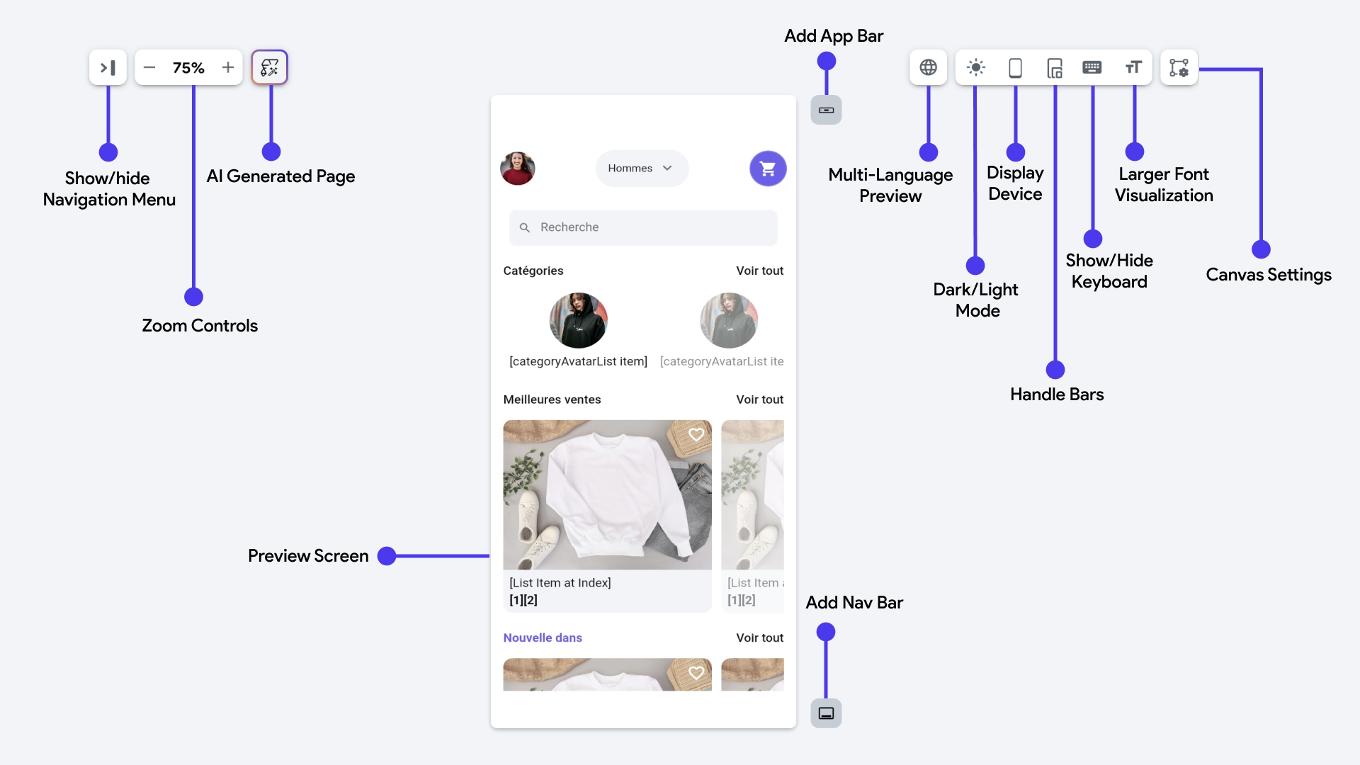
Preview Screen
This is the canvas of the device screen where you can build the user interface. You can customize the screen by adding widgets using drag and drop from the Widget Palette and by applying properties present in the Properties Panel.
Show or hide Navigation Menu
From here, you can open or close the Navigation Menu.
Zoom Controls
There's a zoom in ( + ) and a zoom out ( - ) button to control the zoom level of the canvas. While working on complex user interface designs, this comes in handy to give you a better preview of the widgets by zooming in to a particular area and then zooming out to have an overview.
AI Generated Page
From here, you can create a page using AI.
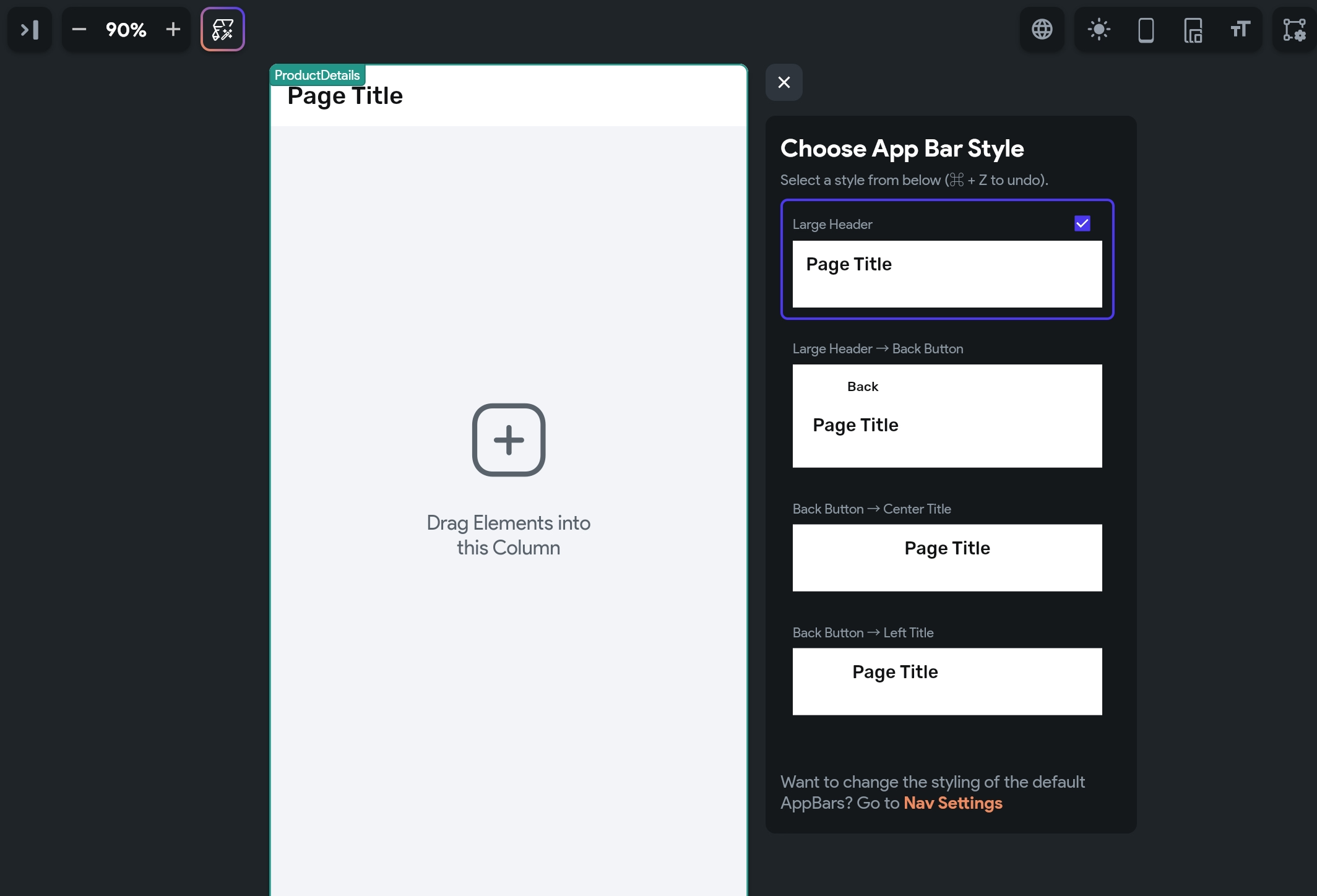
Add App Bar
From here, you can add an App Bar to your page. Clicking this button opens a popup displaying different App Bar styles for you to choose from. Just select any App Bar style from the list and it will appear in the Preview Screen.
Multi-Language Preview
If you've enabled the multi-language feature for your project, you can use this to preview your app in different languages. Just select the language from the dropdown menu, and the text in your app will be translated accordingly.
This feature is valuable for testing your app across multiple locales without needing to run your app.
Dark/Light Mode
This toggle lets you switch between light and dark mode in your app, allowing you to ensure your design looks great in both modes. This feature is only available if you've enabled dark mode support in your project.
Display Device
You can use this to show the device frame in the preview. This is particularly useful for checking how your screen will look with device-specific features such as the safe area or notches on iPhones and Android devices.
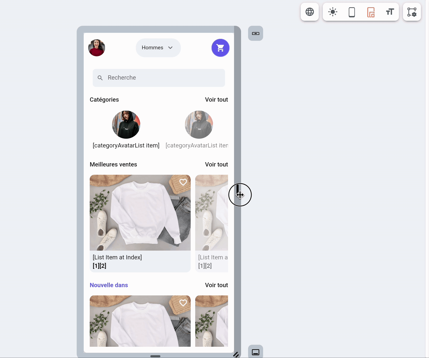
Handle Bars
Enabling the Resize Handle Bars will show the handle bars at the right and bottom sides of the preview screen. This allows you to change the size of the preview screen to better test your app on a screen with a custom resolution and the overall responsiveness of your app.
Show or Hide Keyboard
This option, when enabled, displays a virtual keyboard on the device preview screen. This is particularly useful for visualizing the user interface with the keyboard displayed.
Larger Font Visualization
This enables you to simulate how your app appears when users adjust text scale or accessibility settings on their devices. It's vital for developing an app that's visually appealing and also accessible, especially for those requiring larger text sizes.
Canvas Settings
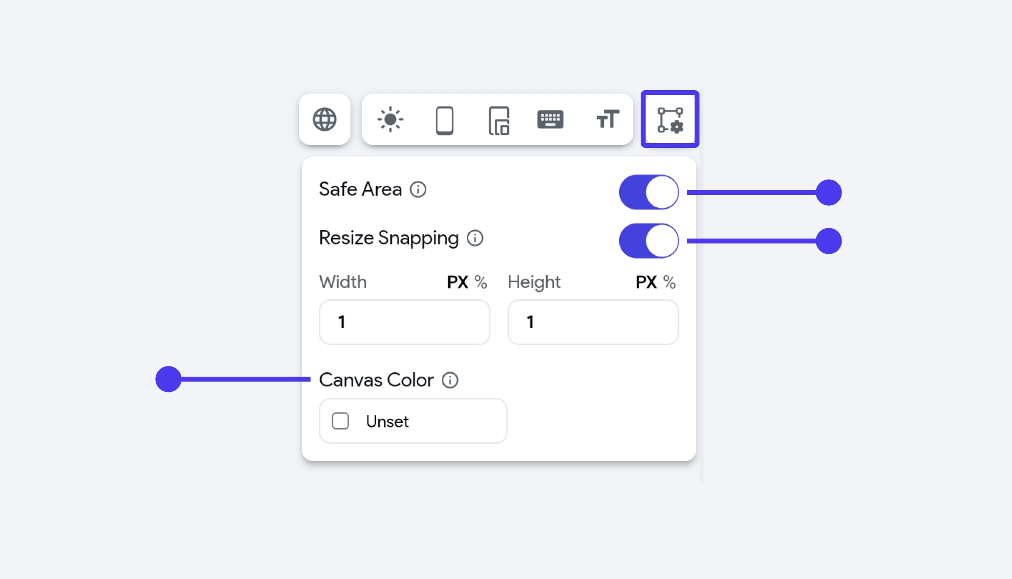
Safe Area
The Safe Area is a concept in mobile design that prevents content from being obscured by physical features of the device, such as camera notches, sensors, or rounded display edges. In this context, the FlutterFlow offers a Safe Area switch which allows you to enable or disable this feature as needed.
Resize Snapping
When resizing a widget, you can snap its size to the specific pixel values or a percentage of the screen size.
Change canvas color
Changing the canvas color can be helpful when creating components, especially when you want to preview them against the background color of the page. For example, if you have a text component that is black or dark-colored, and the default background is also dark, changing the canvas color to a lighter shade can improve visibility and make the design process easier.
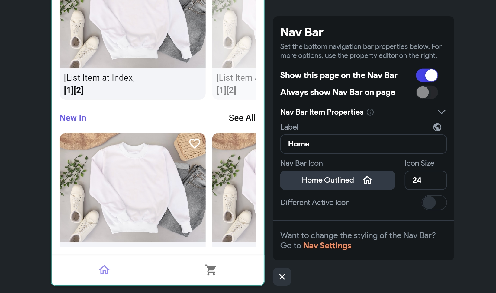
Add Nav Bar
This button allows you to add the Nav Bar to your page. Clicking on this button opens the popup that allows you to enable Nav Bar for your project. Once the Nav Bar is enabled, you can customize it to match your design.
Video guide
Watch this video if you prefer watching a video tutorial.