Resource Hierarchy Overview
This guide aims to help you understand the structure and elements of a typical FlutterFlow project. It will walk you through some important parts of the app, from the overall project down to individual design elements, explaining their purpose and how they relate to traditional Flutter app components.
FlutterFlow App Parts
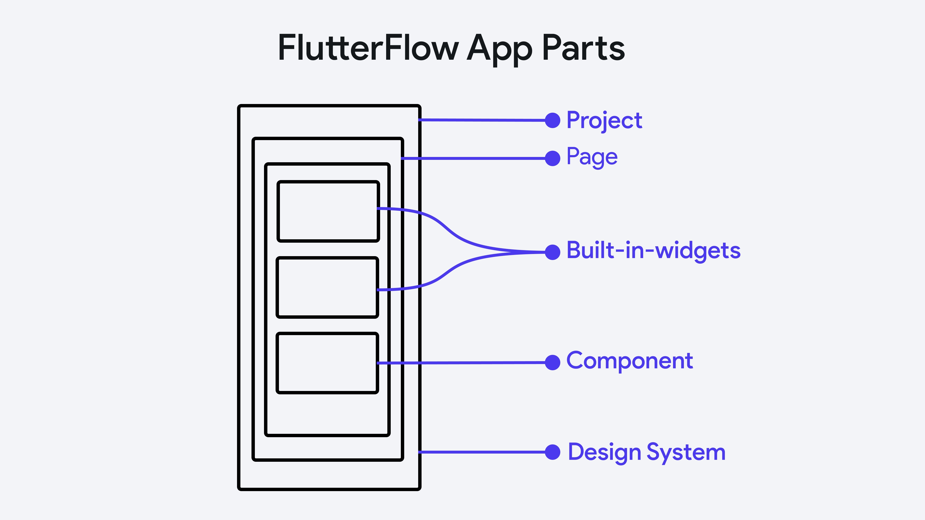
The diagram below illustrates how a FlutterFlow app is structured.

- Project: Represents the overall application you are building in FlutterFlow. It encompasses all the other elements listed below and serves as the container for your entire app development effort within FlutterFlow. Learn more about creating a project here.
- Page: Refers to individual screens within the FlutterFlow project. Each page represents a part of the user interface where users can interact with the app. Multiple pages collectively make up the complete user interface of your application. Learn more about pages in FlutterFlow here.
- Built-in-widgets: These are pre-designed widgets provided by FlutterFlow that you can use to build your app’s user interface. Built-in widgets simplify the development process by offering common UI elements such as buttons, text fields, sliders, etc.
- Component: A component in FlutterFlow is a reusable UI block that can be used across different pages within the project. Components are useful for maintaining consistency and reducing redundancy in the app design, as the same component (like a custom dialog box) can be inserted wherever needed. Learn more about creating a component here.
- Design System: This refers to a set of standards for design within your FlutterFlow project. A design system in FlutterFlow includes predefined styles that ensure visual consistency throughout the app. Learn more about design system here.
Flutter to FlutterFlow
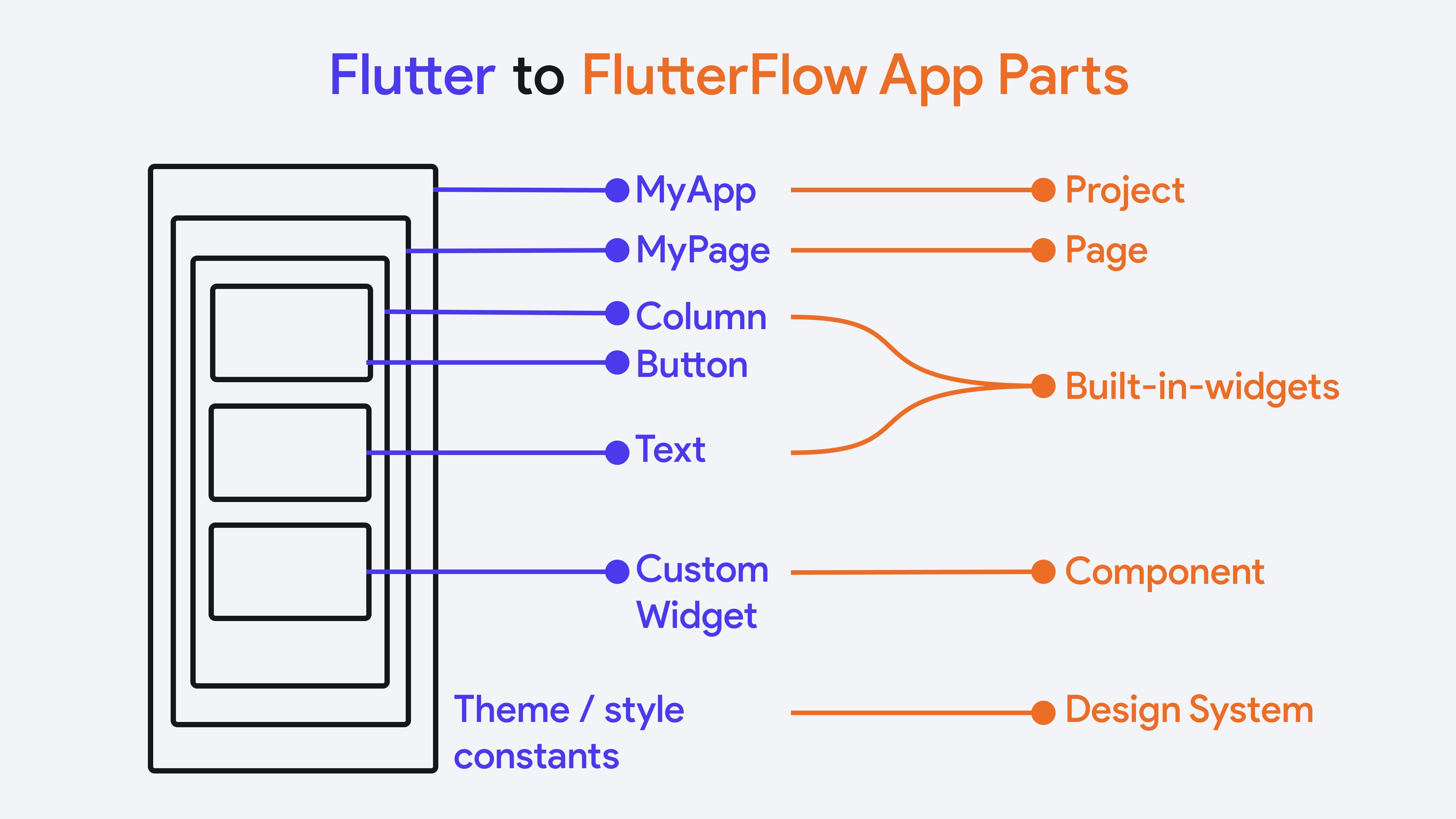
If you are coming from Flutter, it is beneficial for you to understand the Flutter to FlutterFlow mapping. The diagram below illustrates the correlation between traditional Flutter app components and their equivalents within FlutterFlow.

- MyApp to Project: In Flutter,
MyApptypically represents the root of your application, where you set up routes and other global configurations. In FlutterFlow, the equivalent is the "Project," which encompasses the entire application you are building, including its configurations and settings. Learn more about creating a project here. - MyPage to Page:
MyPagein Flutter represents a specific screen in the app. Similarly, In FlutterFlow, each "Page" corresponds to a screen, where you build the layout and functionality specific to that page of the project. Learn more about pages in FlutterFlow here. - Column, Button, Text to Built-in widgets: In FlutterFlow, widgets are categorized under "Built-in widgets," which users can drag and drop onto their canvas to build the UI. Learn more about widgets here.
- Custom widget to Component:
CustomWidgetin Flutter indicates user-defined widgets that serve specific functions not covered by built-in widgets. FlutterFlow translates this into "Component" allowing you to create and use custom components within your projects. Learn more about creating a component here. - Theme/style constants to Design System: In Flutter, theme and style constants are used to ensure consistent styling across an app. FlutterFlow uses a "Design System" to manage and apply uniform styles and themes throughout the application. Learn more about design system here.
Resource Description
A Resource Description is a brief text note that explains the purpose, usage, or key details of a particular resource. By supplying clear, concise descriptions, you create better project documentation and a smoother development experience—both for yourself and any collaborators.
Here are some reasons why resource descriptions can be helpful:
- Team Collaboration: When multiple developers or designers work on the same project, concise descriptions help everyone understand each element’s role without guesswork.
- Better Search: Descriptions are indexed in the FlutterFlow search. This helps locate pages, components, and other resources quickly, especially in large projects.
- Project Documentation: Acts as built-in documentation of your app, which makes future updates easier.
You can add a description for each of the following resources in FlutterFlow:
- Project: Use the project-level description to summarize the overall goals or scope of your app. For instance, "A delivery management app for small businesses" helps keep the team aligned on the primary objective.
- Page: Explains a page’s main function. Example: "Displays the user’s shopping cart and checkout options."
- Component: Clarifies the functionality or design intention of a reusable component. Example: "Reusable card component to be used as ListTile."
- Action Blocks: Provide a concise description of what the set of actions does (e.g., "Sends a notification to the user’s email address upon form submission").
- Custom Functions: Describe the logic or purpose behind the function. Example: "Calculates shipping costs based on weight and distance."
- Custom Actions: Specify the custom behavior you’ve created, such as "Opens a QR scanner and returns the scanned value."
- Custom Widgets: Explain the widget’s purpose or structure. Example: "Carousel widget for displaying multiple images with pagination."
- Data Type: Summarizes the purpose of a custom data model. Example: "Represents a user’s order including items, total cost, and status."
- Parameters: Provide context for how a parameter is used, including expected data types or value ranges. Example: "String to store the user’s phone number—must include country code."
- Page/Component State Variables: Clarify what state data is being stored and why. For instance, "Tracks the currently selected tab in this component."
- App State Variables: Describe the global data shared across pages. Example: "Stores the user’s authentication token for all network requests".
- Constant: Add the intended purpose of any fixed value used throughout the app. Example: "Base API URL for all network calls".
- Enum: Provide a rationale for the enumerated values. Example: "Defines possible user roles—admin, editor, viewer".
- Firestore Collection: Explain what data the collection holds and how it relates to your app’s functionality. Example: "Stores all user profiles with fields for name, email, and profile photo URL".
In FlutterFlow, you can read descriptions as tooltips when hovering over the green note icon.
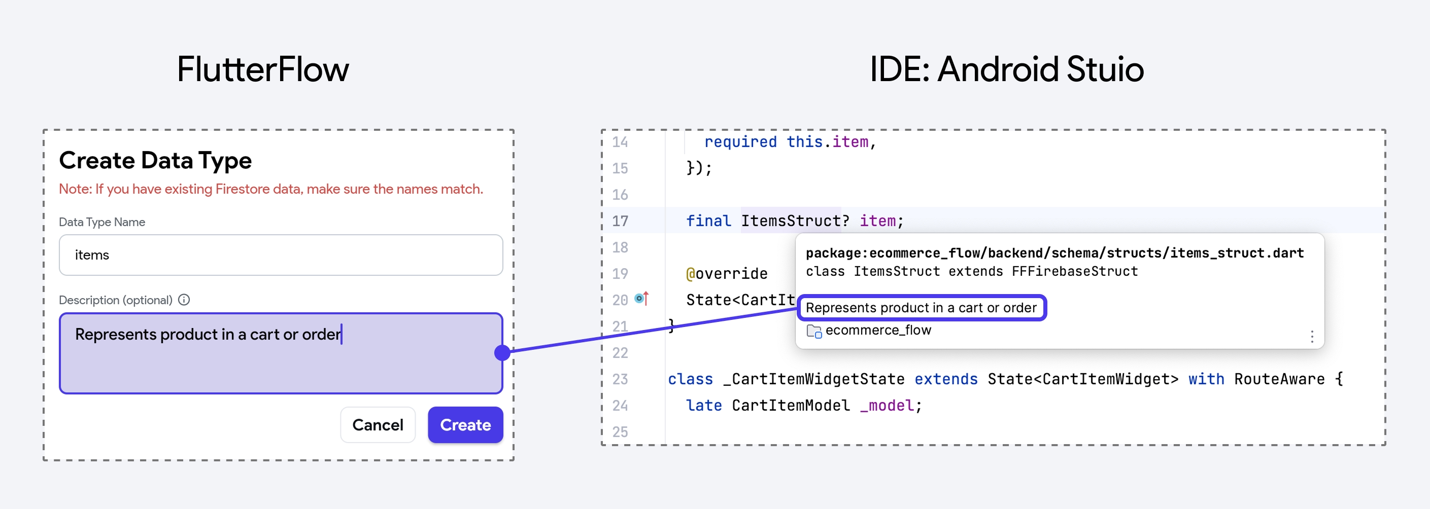
In the generated code, FlutterFlow inserts descriptions as docstring-like comments near the relevant classes, methods, or properties. For instance, a data type named OrderInfo with a description of “Represents a user’s order, including items, total cost, and status” will have that text added above the class declaration:
/// Represents a user’s order, including items, total cost, and status.
class OrderInfo {
/// The total price in USD for this order.
double totalAmount;
List<String> items;
// ...
}
In a standard IDE (e.g., VS Code or Android Studio), if you place your mouse over a custom data type class name, the description set in FlutterFlow appears as a tooltip, helping you quickly grasp the purpose of a resource.
