App Builder
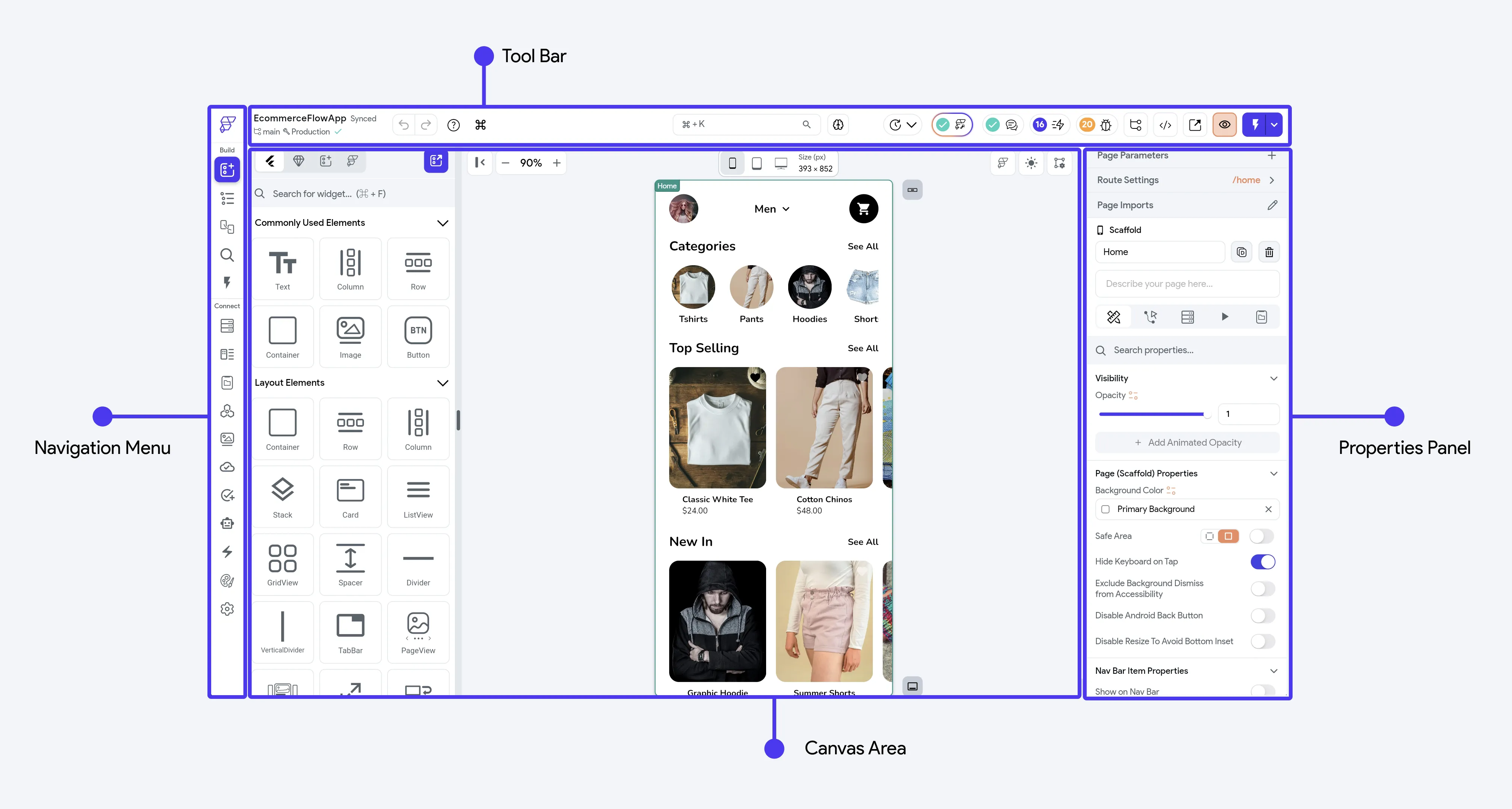
On opening the project, you’ll see the App Builder, which consists of four main sections: Navigation Menu, Toolbar, Canvas, and Properties Panel.
Classic and New Builder
FlutterFlow Studio has two versions of the App Builder: the classic builder and the new builder. Projects open in the classic builder until you switch. Your builder preference is saved to your account and applies to all your projects.
Try the New Builder
When you open an existing project in the classic builder for the first time, a dialog prompts you to try the new builder. You can choose one of these options:
- Click Keep classic builder to stay in the classic builder. FlutterFlow Studio doesn’t show this prompt again.
- Click Switch to new builder to switch and continue to a short tour of the new builder.
- Review the tour before switching, then click Switch to new builder on the final tip.
Switch Builders
You can switch builders at any time.
To switch from the classic builder to the new builder:
- Open the project menu.
- Click Switch to New Builder.
Alternatively, open App Settings and click the Try the new builder card at the top of the settings list.
To switch from the new builder to the classic builder:
- Open the project menu.
- Click Switch to Classic Builder.
Alternatively, click New builder in the status bar at the bottom of the builder, then select Classic builder. This menu also includes a New builder option.
Navigation Menu
The Navigation Menu, located on the left side of the builder, allows you to switch between various FlutterFlow Studio features. These include designing the UI, managing databases, setting up API, adjusting app settings, adding integrations, and more.
Here is a list of all the features accessible from the navigation menu:
- Dashboard: Manage projects, access account info, and FlutterFlow Studio resources.
- Widget Palette: Access all widgets for your app.
- Page Selector: Manage pages, components, and custom code files, and organize them using folders.
- Widget Tree: Get an overview of all widgets on a selected page.
- Storyboard: Visualize app’s design and navigation.
- Search: Search across your project and filter results by Data, Design, State, Code, or Pages & Components.
- Test Mode: Test your app in a live debugging environment.
- Firestore: Create collections and adjust Firestore-related settings.
- Data Types: Create custom data types for your app.
- App Values: Manage App State variables and Constants.
- API Calls: Define API calls.
- Media Assets: Upload assets for your app and team.
- Cloud Functions: Write and deploy cloud functions for Firebase.
- Tests: Add automated tests.
- Agents: Create, configure, and manage AI Agents to integrate conversational AI interactions into your app.
- App Events: Define and manage App Events that allow different parts of your app to communicate without being directly connected.
- Theme settings: Customize visual appearance.
- Settings and Integrations: Access app-related settings and integrations.
ToolBar
From ToolBar, you can search for project resources, change canvas size, see project history, branching, optimization and enhancements, view-download code, and run your app.
Canvas Area
In the Canvas Area, you can see a preview of a device’s screen and build your app page.
Properties Panel
The Properties Panel lets you modify both the visual appearance and interactive behavior of UI elements on the canvas. It allows you to add Actions, set up a Backend Query, add Animations and more.
The Properties Panel will vary slightly depending on the entity you have selected. To explore the details of each Properties Panel, click on the following:
- Page Properties (when you have selected a Page)
- Widget Properties (when you have selected any widget, including built-in components)
Last updated on