Widgets

Widgets are essential in creating the user interface of your app. On this page, you will learn what is widget, its types, how to work with them, and how to use widget options.

What is Widget

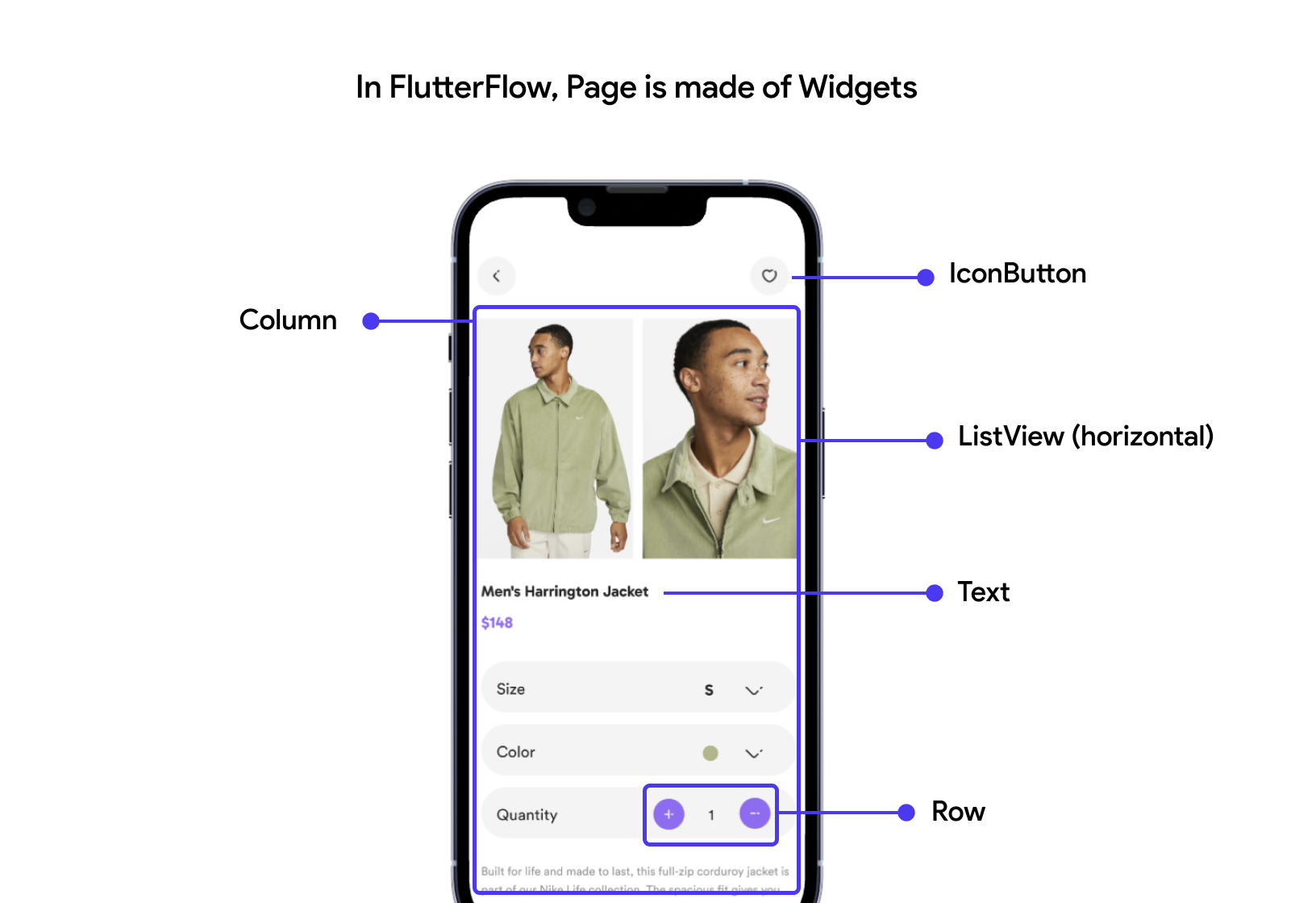
In FlutterFlow, The widget is the UI element that helps you build the layout of your page. Almost everything that you see on the page is a widget. You build the UI by combining the widgets in a parent-child relationship.

Text, Row, Column, Stack, and Container are the most basic types of widgets. Learn more about using them to build a layout here.


Widget tree

When you put widgets together or place them inside another widget, they create something called a "Widget Tree." This tree can be found in the navigation menu on the left side of your screen. It shows how many widgets are on a page and how they're connected (as a parent-child relationship). This helps you understand your app's structure and how things fit together visually.

As the complexity of a UI increases, the widget tree tends to become longer and deeper, making it challenging to locate specific widgets. However, with the search feature, you can easily find the desired widget within the widget tree.

While navigating within the widget tree, you can use the up and down arrow keys to move between parent and child widgets. To traverse siblings within a parent widget, use the left and right arrow keys.

Lock widget tree scrolling

When you select a widget on the canvas, the corresponding widget is automatically highlighted and selected in the widget tree. If the widget is located outside the visible area of the widget tree, it automatically scrolls down to reveal its location.

However, there might be situations where you prefer to prevent the widget tree from scrolling and simply focus on selecting the widget. To achieve this, you can click on the lock icon present in the widget tree.

Stack pages and widget tree views

While constructing your page, you may find yourself switching back and forth between the Pages and Widget Tree views frequently. To enhance your workflow, we provide the ability to stack both views together, eliminating the need to switch tabs. This consolidated view allows you to simultaneously see the Pages and Widget Tree, facilitating seamless navigation and editing.

Additionally, you can adjust the size of each view using the handle to accommodate your preferred layout.

Collapse or Expand widgets

You might add many widgets to your page, which may overwhelm you. To overcome this, you can always collapse or expand the widgets in the widget tree. You can use this feature to stay focused on building the specific part of the UI.

To collapse or expand the specific widget, use the arrow icon (right side of the widget name). To collapse or expand all the widgets together, use the collapse/expand view icon at the top right side of the widget tree.


Types of widgets

Types of widgets you can add to your page.


Working with widgets

In this section, you will learn how to add & remove widgets and what you can do with them.

Adding widget

You can build the UI by adding different widgets to the canvas. Here's how you can add widgets:

1. From the widget tree

The widget tree shows a list of all the widgets added to a page. But that's not all. You can also add the new widgets directly from the widget tree.

To add the widget from the widget tree:

  1. Select the Widget Tree from the Navigation Menu (left side of your screen).

  2. Search or select the desired widget from the popup. This will add a new widget to the widget tree and will appear on the canvas.

2. From Widget Palette

To add widgets from the Widget Palette:

  1. Select the Widget Palette from the Navigation Menu (left side of your screen).

  2. Search or select the widget from the list, and then drag and drop it at a suitable place into the canvas area.

  3. You can also have a floating widget palette by clicking on the arrow icon button in widget plaette.

If you see a popup while dropping the widget, you can select the widget under which you would like to add a new widget.

Renaming widget

When you add widgets, they're given default names based on their type. For example, a Text widget is named "Text," and a TextField widget is named "TextField."

But when there are many widgets of the same kind, it can get tricky to find the right one, especially when linking them to data. To clear up confusion, it is advisable to rename widgets with names that describe them better. This makes it simpler to spot and manage them, especially when things get more complex.

To rename a widget:

  1. Select a widget and head over to the properties panel on the right side of your screen.

Changing widget properties

You can change the appearance and behavior of the widget by modifying its properties from the properties panel. This includes customizing widget, adding actions, adding backend queries, generating dynamic children, and adding animations. These properties vary based on the widget you have added.

Moving or rearranging widgets

While building the UI, you might want to move a widget to another location; For example, take it outside of its current parent widget and make it a child of another, swap its position, etc. You can move or rearrange the widgets inside the widget tree and the canvas area.

To move the widget in the widget tree, select the widget, drag it upwards or downwards, and drop it at the desired location.

To move the widget in the canvas area, select a widget, drag it to the desired location, and drop it there. A blue line will show up when you drag the widget to indicate where it will be placed.

The color of the bar indicates how the widget will be added.

  • If you see an orange line, the target widget can accept the child widget. If you drop it there, the current widget will be placed as a child of the target widget.

  • If you hold on for a couple of seconds, you'll see a purple line that means the current widget will be placed below/next (or as a sibling) to the target widget.

View widget hierarchy

Sometimes you might want to see the widget hierarchy that shows all the parent widgets till the topmost widget in the widget tree. Viewing the widget hierarchy gives you an idea of how the UI is structured.

To view the widget hierarchy, select the widget from the canvas area and click on the green-colored box showing the widget name. You can also select a particular widget by clicking on its name.

Document a widget

There's a good chance that in the future, you'll forget how or why a specific widget was added. Additionally, if you're working in a team, others might want to know more about why a widget is there, especially if it's a custom one.

By documenting a widget, you may assist future you and others in remembering why it was added and learn more about the widget. It helps you to make any change with confidence and ultimately produces fewer bugs.

We will add the documentation inside the code as a comment.

Add semantic labels (Accessibility feature)

You might want to provide additional information about the widget, its purpose, and its functionality to assistive technologies, such as screen readers and accessibility features. It helps make the app more accessible to users with disabilities by providing meaningful descriptions.

Moreover, to add a semantic label for every widget in your app that has an action, you can enable the Add Warning for Semactic Widgets. By doing so, you'll get a warning if any widget has action but doesn't have a semantic label added yet. Tip: You can click on the warning item to directly navigate to that widget.

Drag to resize

To give you better control over sizing the widget, we allow you to resize the widget, such as Container and Image, directly inside the canvas. Simply select the widget and use the handles to resize it.

You can also customize the resize snapping.

Widget menu options

This section will teach you how to copy-paste, duplicate, wrap, replace widgets, and more.

Cut, copy, and paste the widget

To enhance the speed of building the UI, you have the convenient options of cutting, copying, and pasting widgets. Simply select the desired widget, right-click on the widget, and choose the appropriate action: cut, copy, or paste.

Delete widget

To delete the widget, right-click on the widget from the widget tree or the canvas area and press the Delete icon.

Duplicate widget

To effortlessly create a replica of a widget without the need for copy-pasting the entire widget, you can utilize the convenient duplicate widget option. This feature lets you quickly generate an identical copy of an existing widget positioned below or next to the original widget.

To duplicate a widget, select the desired widget, right-click on the widget, and choose the Duplicate option from the menu.

Wrap widget

Using the wrap widget option, you can add the new parent widget to the current widget. This is the opposite of adding a widget (where you add child widgets). This is useful when you want to add the widgets in between at a later stage—for example, wrapping the TextField widgets inside the Form widget after building the UI.

To wrap a widget:

  1. Select the widget from the widget tree or the canvas area.

  2. Right-click and select the Wrap Widget option. This will open a popup.

  3. Select the widget under which you would like to wrap the current widget.

Replace widget

This feature allows you to quickly replace an existing widget with another widget without manually removing and adding the widgets.

For example, when you have a list of items in a scrollable view (e.g., Column, Row, ListView) and want to replace it with another scrollable view, you can use the replace widget option.

To replace a widget:

  1. Select the widget from the widget tree or the canvas area.

  2. Right-click and select the Replace Widget option. This will open a popup.

  3. Select the widget you would like to replace with.

Remove Widget

Sometimes, you might want to remove a specific widget and keep its children unaffected. Or you might want to replace a widget that is not supported by the Replace widget option.

For example, replace the item card wrapped in a Container widget with the actual Card widget.

This is different from the Delete widget option, which would delete the widget and its children as well.

To remove a widget, select the widget from the widget tree or the canvas area, right-click, and select the Remove Widget option.

Remove widget

Add comment

You can also add comments to a specific widget using the right-click menu.

Copy-paste widget style

You can also copy-paste widget style to create consistent visual elements. To do so, select the widget > right-click> select Copy Widget Style. Now select the widget on which you want to apply copied style > right-click > select Paste Widget Style.

Copy widget code

You can use this option to copy the code snippet of a selected widget and try it out on your local IDE or any other online code editor.

To copy the widget code:

  1. Select the widget from the widget tree or the canvas area.

  2. Right-click and select the Copy Widget Code option.

  3. Open your IDE or online editor and paste the code at the desired location.

Get bug report code

When you encounter an issue with any widget, you should submit a bug report. While you do so, you'll have to send us the bug report code, which you can get by right-clicking on a widget and selecting the Get Bug Report Code. This provides us the detailed information for troubleshooting and resolving the issue effectively.

Convert to component

Components are the reusable elements you can create out of any widget in your project.

To convert the widget into a component:

  1. Select the widget from the widget tree or the canvas area.

  2. Right-click and select the Convert to Component option. This will open a popup.

  3. Enter the component name and click on the Create Component.

  4. To see the newly created component, select the Widget Palette from the navigation menu and select the Components tab. Your component will appear inside the Custom Components section.

Save as template

We offer you a wide variety of ready-to-use widgets as a template, but you can also create your own by saving the widget as a template.

To save to the widget as a template:

  1. Select the widget from the widget tree or the canvas area.

  2. Right-click and select the Save as Template option. This will open a popup.

  3. Enter the Template Name and click on the Save Template.

  4. To see the newly created template, select the Widget Palette from the navigation menu and select the Templates tab. Your template will appear inside the My Templates section.

Save as theme style widget

You can also create a theme widget out of any widget by following the instructions below:

  1. Select the widget from the widget tree or the canvas area.

  2. Right-click and select the Save as Theme Style Widget option. This will open a popup.

  3. Enter the Theme Widget Name and click on Create Style.

  4. To see the newly created theme widget, navigate to Theme Settings > Theme Widgets.

Insert widget before or after

This option gives you precise control in arranging widgets, allowing you to strategically place any widget before and after an existing widget.

To do so, simply copy the widget, select the target widget where you want to position it (either before or after), right-click on the target widget, and choose the Insert Before or Insert After option from the menu.


Video guide

If you prefer watching a video tutorial, here's the one for you:


Last Updated Date: December 14, 2023

Last updated