Form Triggers
Form Triggers in FlutterFlow allow you to respond dynamically to user input on widgets like dropdowns, sliders, toggles, and text fields. Whether it’s selecting an option, toggling a switch, or typing in a field, these triggers help you create interactive, responsive experiences by executing actions based on user interaction.
On Selected
The On Selected action trigger is used to perform actions when a user selects or changes a value from a widget that presents multiple options. This trigger is associated with form widgets where selection input is required, such as Dropdown, RadioButton, CheckboxGroup, ChoiceChips, and Slider.
- Dropdown – Shipping Method Selection: User selects a shipping method from options like "Standard", "Express", or "Next Day". Action under the On Selected trigger sets the app state variable
shippingOption, which updates pricing or estimated delivery time dynamically. - Slider – Show Volume Level in Snackbar: User adjusts a Slider from 0 to 100. The On Selected trigger displays a Snackbar showing the current volume: Volume set to: [sliderValue].
- ChoiceChips – Filter Products by Category: User taps a chip like "All", "Electronics", or "Clothing". The On Selected trigger might set an app state variable (e.g.,
selectedCategory) and update the product list to match the chosen category.
To use the On Selected trigger:
- Start by selecting a supported widget, such as a Dropdown.
- Open the Actions tab in the properties panel and click + Add Action.
- You will notice that the Type of Action (aka callback) is already set to On Selected. That means actions added under this will be called whenever the selection changes.
- Finally, define the actions you want to perform when the user makes a selection, such as setting a variable, navigating to another page, or displaying a message.

On Toggled On / On Toggled Off
The On Toggled On and On Toggled Off action triggers are used to perform actions when a user turns a toggleable widget on or off. These triggers are supported by widgets such as Checkbox, CheckboxListTile, Switch, and SwitchListTile, any widget that represents a binary state.
These triggers are especially useful when you want to conditionally execute different actions based on whether a user enables or disables a setting, preference, or feature.
- Switch – Enable Dark Mode: User toggles a Switch to enable Dark Mode. Action under the On Toggled On trigger sets the dark mode.
- Checkbox – Agree to Terms: User checks a Checkbox labeled “I agree to the terms and conditions.” The On Toggled On trigger enables the Submit button. If the user unchecks it, the On Toggled Off trigger disables the button again.
- CheckboxListTile – Select Notification Channels: User checks or unchecks options like Email, SMS, or Push Notifications. Each toggle fires either On Toggled On or On Toggled Off to update selected preferences in the backend.
To use the On Toggled On or On Toggled Off trigger:
- Start by selecting a supported widget, such as a Switch.
- Open the Actions tab in the properties panel and click + Add Action.
- Choose On Toggled On to define actions when the toggle is switched on, or On Toggled Off to define actions when it's switched off.
- Add your desired actions, such as updating a variable, showing a message, enabling a button, or triggering a backend call.

On Change
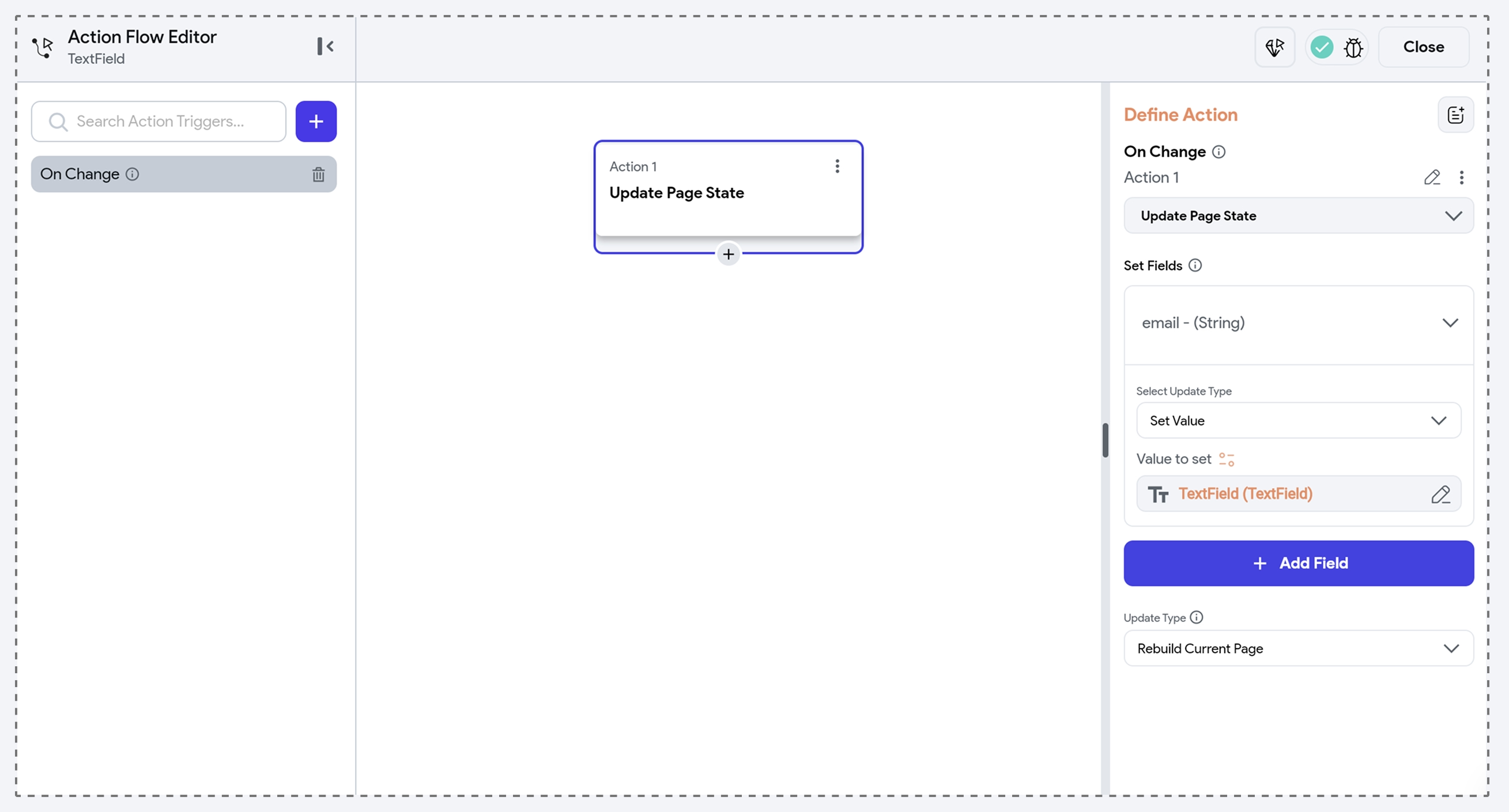
The On Change action trigger is used to respond to real-time user input as they type or modify the contents of an input field. This trigger is supported by widgets such as TextField and Pincode.
It’s ideal for enabling live form validations, updating app state as the user types, or enabling/disabling UI elements based on the current input.
- TextField – Enable Button When Email Is Entered: As the user types in an email TextField, action under the On Change trigger checks if the input is a valid email. If it is, it enables the Continue button.
- Pincode – Auto Submit When Complete: When a user finishes entering a 6-digit code in a Pincode widget, action under the On Change trigger checks if the full code is entered and triggers form submission or a backend call.
To use the On Change trigger:
- Start by selecting a supported widget, such as a TextField.
- Open the Actions tab in the properties panel and click + Add Action.
- Choose On Change from the list of available triggers.
- Define the actions to trigger, such as setting a variable, showing a message, or calling an API.

On Focus Change
The On Focus Change trigger fires whenever an input field gains or loses focus, like when a user taps into or out of a TextField and Pincode widget. It’s useful for providing user guidance (on focus) or performing validations.
- TextField – Show Hint on Focus: When the TextField gains focus, action under the On Focus Change trigger displays a helper text or tooltip with input instructions (e.g., “Enter your phone number without dashes”).
- Pincode – Validate on Exit: When the user finishes entering the code and the Pincode widget loses focus, action under the On Focus Change trigger runs validation logic to check if the input is complete or valid, and displays an error if it's not.
To use the On Focus Change trigger:
- Start by selecting a supported widget, such as a TextField.
- Open the Actions tab in the properties panel and click + Add Action.
- Choose On Focus Change from the list of available triggers.
- Define the actions to trigger, such as showing helper text, validating input, or updating the UI based on focus.
