Form Validation
You can add validations to input fields by wrapping them inside the Form widget. The Form widget enables you to validate user inputs and display appropriate messages when validation criteria are not met.
For example, you could use it to check if a user has given a valid email and password. This makes it easy to handle user input and ensure that the data is correct before it is submitted to the server or stored locally.
Adding Form widget
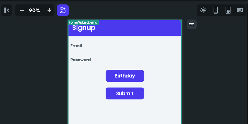
Let's see how to add a Form widget by building a signup example. Here's how it looks:
Building and validating a Form includes the following steps:
1. Adding input fields
A form widget can only validate if there are any input fields. Here's an example of adding input fields for the signup form.
- First, add the Form widget itself from the Form Elements.
- Inside the form, add the Column widget from the Layout Elements tab.
- Now, add two TextFields (one for email and one for password).
- Add a Button widget and then add Date/Time Picker action to get the date of birth.
- Add one more Button to validate and submit the form.
Here's how it looks:

2. Adding validations
Validation refers to the process of checking user input for correctness and ensuring that it meets certain criteria or requirements. This can include checking for the presence of required fields, verifying that a value is within a certain range or format, or validating against the custom pattern.
After adding input fields, they will be available to be validated using the form widget properties. Here's how you do it:
- Select the Form widget, and move to the Properties Panel > Validate section.
- Identify the TextField on which you would like to add the validation and tick the box on the right side.
- Inside the Error Message input box, provide the message that will be displayed (below the TextField) if a user leaves the TextField empty.
- You can also specify the Min Required Character and Max Allowed Characters.
- Min Required Character: This is the minimum character required for the validation to pass. For example, If you provide a value as 9 and a user enters the value as a@a.com (which is 6 characters), **then the validation fails, and an error message will be displayed.
- Inside the Minimum Character Error Text input box, provide the message that will be displayed if a user doesn't provide the min required characters.
- Max Allowed Characters: This is the maximum number of characters allowed for the validation to pass. For example, If you provide a value of 15 and a user enters a password that exceeds 15 characters, then the validation fails, and an error message will be displayed.
- Inside the Max Allowed Characters Error Text input box, provide the message that will be displayed if a user enters more than the maximum allowed characters.
- Min Required Character: This is the minimum character required for the validation to pass. For example, If you provide a value as 9 and a user enters the value as a@a.com (which is 6 characters), **then the validation fails, and an error message will be displayed.
- You can also choose to validate the input using our predefined validators or by creating the custom one. To do so, you can set the Text Validator to the one you need.
-
If the required validation is not on the list, you can select Custom Regex and specify your own Regex (Dart/JS). Here are some examples of Custom Regex:
Examples Regex (Dart/JS) IP address (e.g., 192.168.1.1) ^\d3.\d3.\d3.\d3$ Time in the 24-hour format (e.g., 13:45) ^([01]?[0-9] -
Also, provide a message in Invalid Text Error Text. This will be displayed If validation for the Custom Regex fails.
-
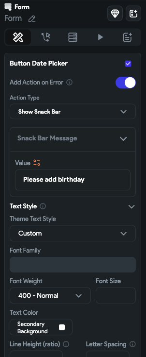
- You can also add validation on certain actions that can be used inside the form, such as Date/Time Picker and PlacePicker. To do so, find the action name and tick the box on the right side.
- Now you must enable Add Action on Error and set the Action Type to the appropriate one. This will be triggered if the validation fails. For example, in this case, if a form is submitted without selecting the birth date, you can add a Show Snackbar action asking a user to select the date.

3. Adding validate [Action]
Follow the steps below to add this action to any widget.
- Select the Widget (e.g., Container, Button, etc.) on which you want to add the action.
- Select Actions from the properties panel (the right menu), If it's the first action, click + Add Action button. Otherwise, click the "+" button below the previous action tile (inside Action Flow Editor) and select Add Action.
- Search and select the Validate Form (under Widget/UI Interactions) action.
- Set the Select Form to Validate to your Form name.
- You can chain the next action that will be triggered if the validation passes.
Auto validating
Rather than displaying an error message after the user submits the form, you can provide real-time feedback as they type in the TextField widget to indicate validation errors. This feature can be particularly useful for lengthy forms where it can save the user's time and effort.
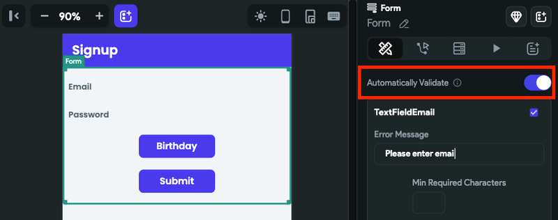
To auto validate a form, select TextField > move to the Properties Panel > Add validations > and then enable the Automatically Validate.

Validating a Form on TextField On Submit�
You can also validate a form when you are done entering a value inside the TextField using the On Submit action.
To validate a form on TextField On Submit:
- Select the TextField widget and select Actions from the Properties panel.
- Click + Add Action button, and ensure that the Type of Action is set to On Submit.
- Search, and select the Validate Form (under UI Interactions) action.
- Set the Select Form to Validate to your Form name.
Video guide
If you prefer watching a video tutorial, here's the one for you: