ChoiceChips
The ChoiceChips widget allows users to select a single option from a group of chips. Each chip is presented with an icon and accompanying text, making it easy to represent various choices.
You could use this widget to implement a filter feature in an e-commerce app to let users select different product attributes like size, color, or price range.
Before diving into form widgets, check out our guide on Widget States to efficiently manage the state and behavior of your form elements.
Adding ChoiceChips widget
To add the ChoiceChips widget to your app:
- Add the ChoiceChips widget from the Form Elements tab.
- By default, this widget adds a single option named Option 1. To change the name, move to the Properties Panel, and scroll down to the Define Options section. Find the Option 1 property and change the name and icon.
- To add more options, click on the Add Option text and set the name and icon for new options.
- To set any chip as selected by default, find the Initial Option property and enter the chip name.
- To set this value dynamically, open the Set from Variable menu and set the variable.
- When multiselect is enabled, you can also set the list of options to pre-select.
Trigger Action on Change
See how to trigger an action when a selection changes on this widget.
Select or Clear All Choices [Action]
Users may need to swiftly deselect all chips or choose all available choice chips at once. You can do so by adding the Clear All/Select All action.
Before you add this action, ensure you allow multiselect on this widget.
Customizing
You can customize the appearance and behavior of this widget using the various properties available under the properties panel.
Allow Multiselect
You might want to allow users to select multiple choices to filter the result.
To allow multiselect, select the ChoiceChips widget, move to the properties panel, find the Allow Multiselect property and enable it.
Disable ChoiceChips
Sometimes, you may want to present the choices in a read-only mode, preventing users from making any changes.
To do so, move to the Properties Panel > turn on Disable > click Unset, and set the Conditions. This can be the Single Condition or Combine Conditions based on your requirement. Note: The ChoiceChips widget will be disabled only when condition(s) is true.
Adding Space between Chips
To add a space between the chips, you can use the Chip Spacing ad Row Spacing property.
- Chip Spacing: This adds horizontal gaps between individual chips.
- Row Spacing: This adds vertical gaps between the chips in a row.
Align Chips
When you have chips in multiple rows, you can align them using the Alignment property. This is similar to setting main axis alignment for the Row widget.
Customizing Selected and Unselected Chip Style
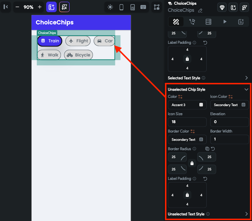
Various properties under the Selected Chip Style and Unselected Chip Style section allow you to customize chips to match your design. Here's how you do it:
- To change the background color, use the Color property.
- To change the icon's color and size, use the Icon Color and Icon Size property.
- To add a shadow or to create a sense of depth for the chip, you can use the Elevation property.
- To customize the border, use the Border Color, Border Width (thickness), and Border Radius (rounded corner) properties.
- To create some space around the label, use the Label Padding property.
- To change the label text styling, use the Selected Text Style property.
- Similarly, you can customize the properties under the Unselected Chip Style.
