Components
Components in FlutterFlow are reusable widgets. You design the widget once and can use it throughout your app to save time, ensure consistency, and make it easier to maintain.
When you add a component to a Page, it becomes part of that page's Widget Tree. This allows the component to interact with other widgets, inherit properties, and respond to state changes as part of the page's structure.
Components help in the following ways:
-
Consistency: Components provide a consistent look and behavior, reducing the likelihood of discrepancies that can occur when the same UI elements are created multiple times.
-
Centralized Updates: By creating a component once and reusing it across different parts of your app, you ensure that any design or functionality changes are made in one place. When that component is updated, all instances of that component across the app automatically reflect those changes. This significantly reduces the effort required to maintain and update the app.
CLasses vs InstancesLearn more about Classes and their Instances and what they mean in FlutterFlow.
-
Error Reduction: Since components reduce design duplication, the risk of errors decreases. Fixing an issue in a component means it is fixed everywhere, leading to fewer bugs and inconsistencies.
-
Scalability: As your app grows, maintaining a DRY codebase through components makes it easier to scale. Adding new features or modifying existing ones becomes more straightforward and less prone to introducing errors.
DRY PRINCIPLEThe DRY (Don't Repeat Yourself) principle is a software development concept that emphasizes the importance of reducing repetition within code and design.
Leveraging components effectively helps you build a consistent, efficient, and maintainable app.
Common Use-cases
Components can be used in various scenarios to accelerate your app development process. Here are some common use-cases.
-
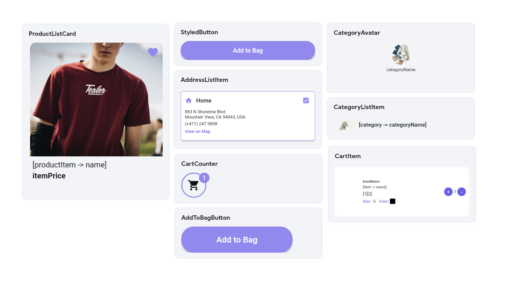
Design a standard button once and reuse it across multiple screens to maintain a cohesive look.
-
Utilize components for card designs frequently used in your app, such as product cards, user profiles, or news articles.
-
Standardize input forms for tasks like user registration, login, or feedback collection, ensuring a consistent user experience.
-
Design pop-up messages or dialogs that match the overall theme of your app, enhancing visual consistency.
-
Build interactive elements such as custom sliders, ratings, or progress bars, and use them across various parts of your app.
-
Design sections of a screen that are frequently repeated, such as testimonials, image galleries, or feature highlights, and reuse them to maintain a cohesive layout.
Here's an example of all the widely used components used in the EcommerceFlow demo app.
