Components
Components are reusable widgets you create to meet the specific needs of your app. This approach ensures consistency, saves time, and simplifies maintenance across your project.
Creating a Component from Scratch
To create a component from scratch, click the Add Button in the Page Selector or Widget Tree tab. Then choose New Component.
Convert into a Component
If you have already built a complex widget in your page, you can convert that entire widget into a component and reuse it throughout your app.
To convert a complex widget into a reusable component, right click on the root widget that contains the entire widget tree you want to convert, then select Convert to Component.
Creating a Component from a Popular Template
FlutterFlow offers multiple popular templates for components across various use cases that you can apply to your project in seconds, saving you a lot of time.
Create an AI Generated Component
You can quickly create a component using FlutterFlow AI by describing what you want in natural language. The AI uses your description or visual reference, along with your project context, to build the component.
To create and add an AI-generated component, open the Widget Tree, click Generate with AI (magic wand) button and select the Component tab. Next, describe the component you want to build, and hit the Send (up arrow) button.
FlutterFlow will process your request and display progress in the AI Generation History panel in the toolbar. Once the component is ready, you can preview it in both light and dark themes and apply various color schemes. If you're happy with the result, give it a name and add it to your project.
- You can also upload a screenshot or image of the component you want to build. FlutterFlow AI will use it as a reference to generate the layout.
- While the AI is generating your component, you can continue working on other tasks within FlutterFlow, but make sure you don’t close the FlutterFlow app.
Import from Figma Frame
You can also quickly turn your Figma designs into functional components in FlutterFlow. By providing a Figma Frame URL, FlutterFlow AI will analyze the design and automatically generate UI layouts that closely match your mockup.
To import from a Figma Frame, first, connect your Figma account, import the Figma theme, and map your colors and typography accordingly. Next, open the Generate with AI dialog and click the Plus (+) button. Select Import from Figma, enter your Figma frame URL, and press Send.
A preview of the frame you are importing will appear. To finalize the import, click Send again. Once completed, the component will appear in the AI Generation History, where you can preview and add it to your project.
Currently, we don't support importing SVG elements from Figma frames. However, you can manually add the SVGs directly to your project assets after generation is complete, or replace them in Figma with supported image formats like PNG or JPEG.
Component Properties Panel
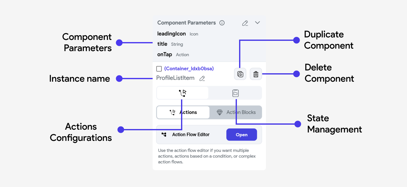
When you select a component from the widget tree, the properties panel opens up on the right side of the interface. It plays a crucial role in configuring and managing the various aspects of your components.
Here’s a detailed look at what you can typically find and modify in this panel:

Component Parameters
Component parameters are values that a component receives from its parent entity, such as a page or another component. These parameters allow the component to be dynamic and adaptable based on the context in which it is used. By using parameters, you can customize components for different scenarios without altering the base design or functionality.
Creating a Component Parameter
To create a component parameter, go to the root widget in the component's widget tree.
Bind the Parameter
Once you have created a component parameter, you can link data from the parent entity to your component.
Here's a small example of how we can bind the parameters created in ProfileListItem to their
respective widgets and action triggers.
Aside from standard data types used throughout FlutterFlow, you can also create parameters that are of type:
-
Action (callback): This allows you to pass in actions into the component. The component can then invoke the action, usually referred to as a callback, in its own action flows. Callbacks are often using to handle events, like updating a parent's state when a button has been pressed. You can learn more about how to use callbacks here.
-
Widget Builders: Widget builders allows you to pass in widgets to be used within the component's widget tree. This is especially useful when you want to dynamically substitute content for some part of a component - like displaying an item in a custom dropdown, or creating a component for some consistent layout. You can learn more about how to use Widget Builders here.
Actions
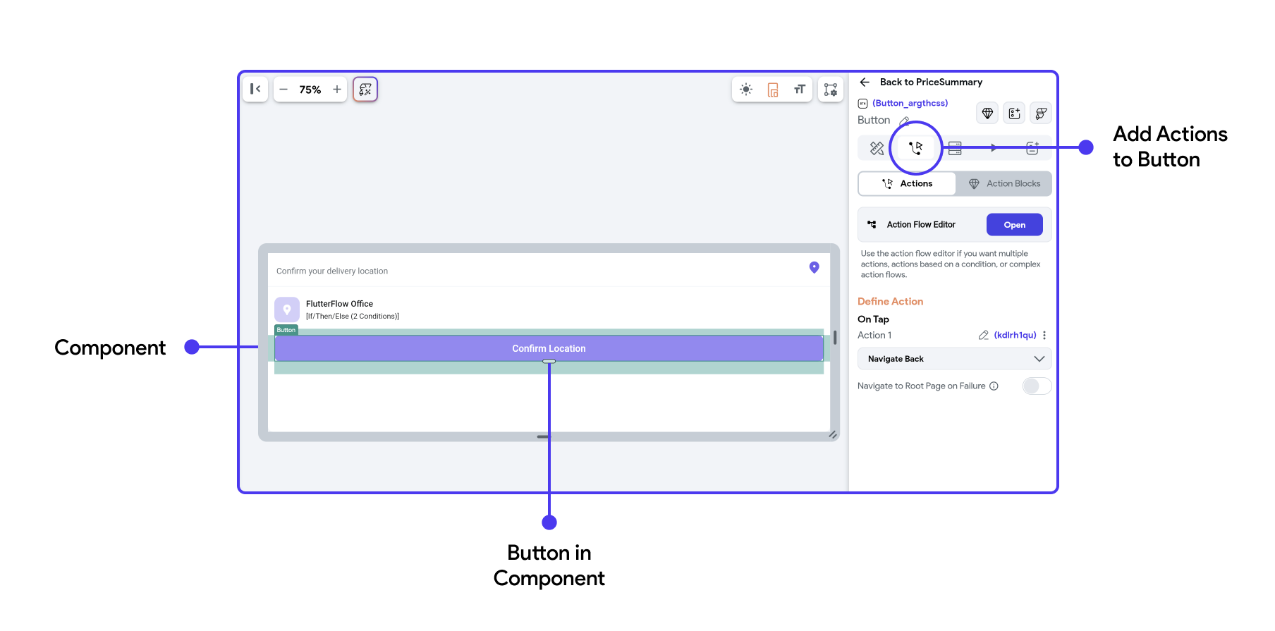
This tab allows you to define and manage interactions or events triggered by user actions. For example, you can configure a button to navigate to another page or execute a callback action from the page using the current component.
Adding an action to a component element is exactly the same experience as adding actions to any page elements. Here's a quick overview:

For component actions, you can establish specific behaviors or functions that are triggered by certain events related to the component's lifecycle, such as On Initialization.
To learn more about component lifecycle and adding On Initialization action to your component refer here.
State Management
Components can have their own internal state variables that track information like form inputs, toggles, or other user interactions. Components can update their state in response to user actions (e.g., clicking a button) or external events (e.g., receiving new data from an API).
Effective state management ensures that components dynamically update their UI to reflect changes in state, providing a responsive user experience.
Learn how to Create a State variable for your components and how to Update them.