Tooltip
The Tooltip widget provides additional information or visual cues of a widget in a small popup box. It appears when the user taps or long-presses the widget or hovers over it. It's typically used to provide an explanation about the function of a widget.
It is not frequently used on touch devices where tapping or long-pressing can initiate other actions. But they can be incredibly useful in the desktop environment where hover functionality is available.
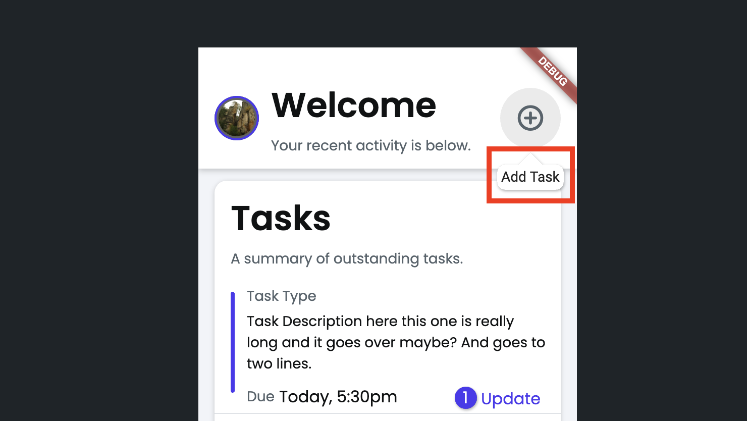
Adding Tooltip widget
To add the Tooltip widget to your app:
- Identify the widget you want to provide a description for and right-click on it. Select Wrap Widget and then select Tooltip widget.
- Now select the Tooltip widget, move to the Properties Panel > Message > Text, and enter the message you want to display.
Customizing
You can customize the appearance and behavior of this widget using the various properties available under the Properties Panel.
Component as Tooltip
Sometimes, you may want to display more than just text in a tooltip—such as images, icons, buttons, or other custom components. For example, in an e-commerce app, a tooltip could show a detailed breakdown of customer reviews when users hover over the overall rating.
To achieve this, simply set the Tooltip Type to Component and select the custom component you'd like to display.
To display dynamic content in tooltips, you can create a wrapper component that accepts a WidgetBuilder as a parameter and use this component within the tooltip.
Here’s exactly how you do it:
Change trigger mode
On touch devices, the Tooltip opens on tap. To make it open on long press instead, use the Trigger Mode property.
Change tooltip alignment
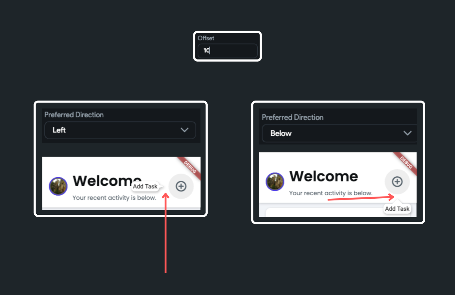
By default, the Tooltip appears below the target widget. You can change this setting using the Preferred Direction property. This allows you to open the Tooltip Above, Left, and Right directions in addition to the Below.
Customize tail size
To change the tail's size, you can use the Tail Width and Tail Lenght properties.
Changing background color
You can change the Tooltip's background color using the Background Color property.
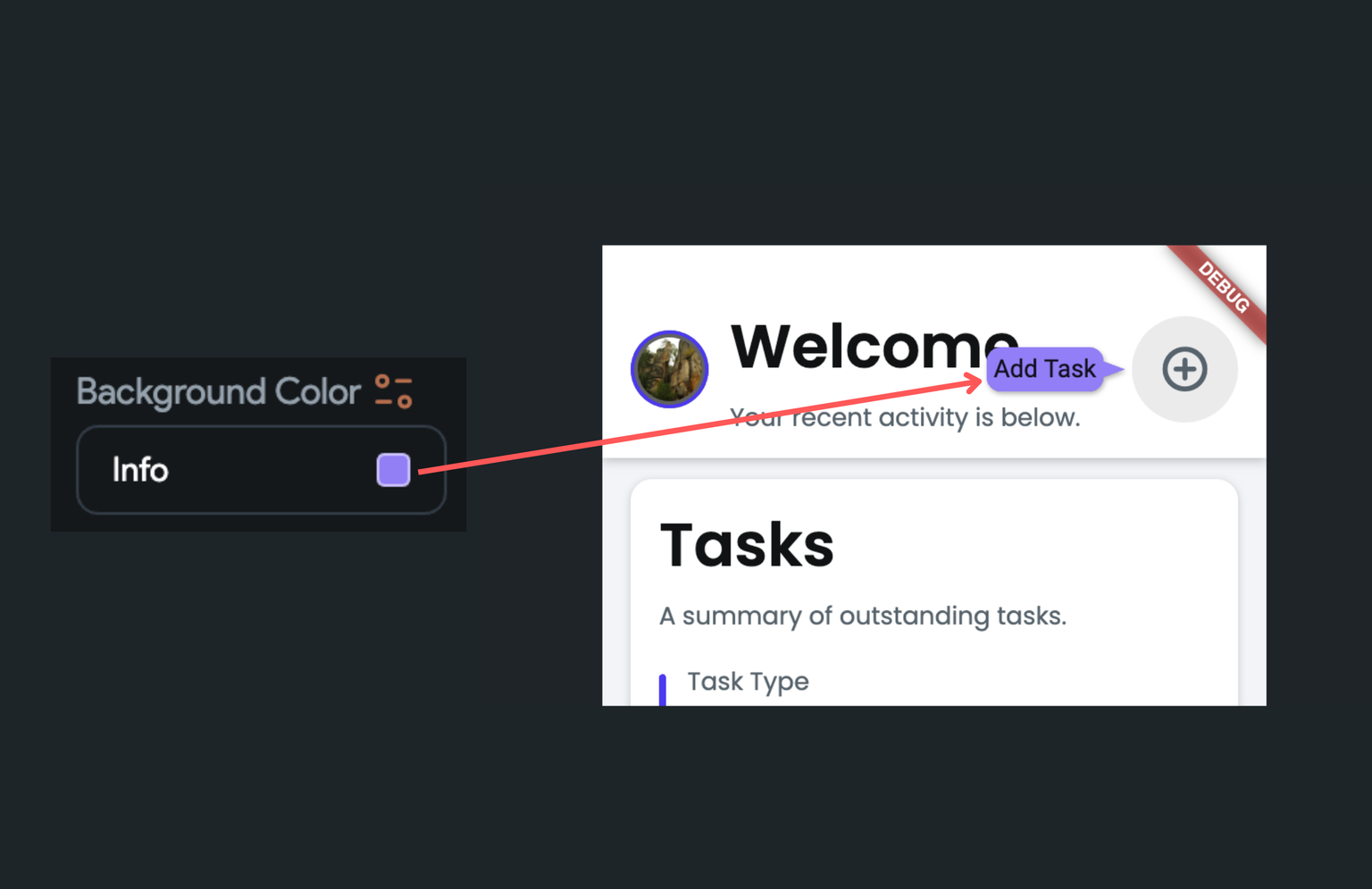
Set tooltip offset
By setting the tooltip offset, you can adjust the space between the tooltip and the target widget. To do so, move to the Properties Panel > set the Offset value.
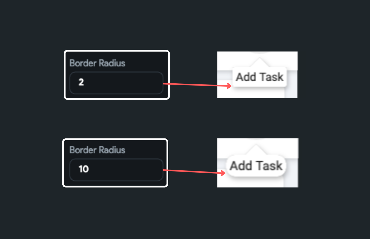
Customize border radius
To change the rounded corner of the Tooltip widget, move to the Properties Panel > set the Border Radius property.
Elevate tooltip
To add a shadow or to create a sense of depth on this widget, you can use the Elevation property. It allows a widget to stand out, making it appear like it's floating above the surface of the UI, ultimately making the tooltip more noticeable.
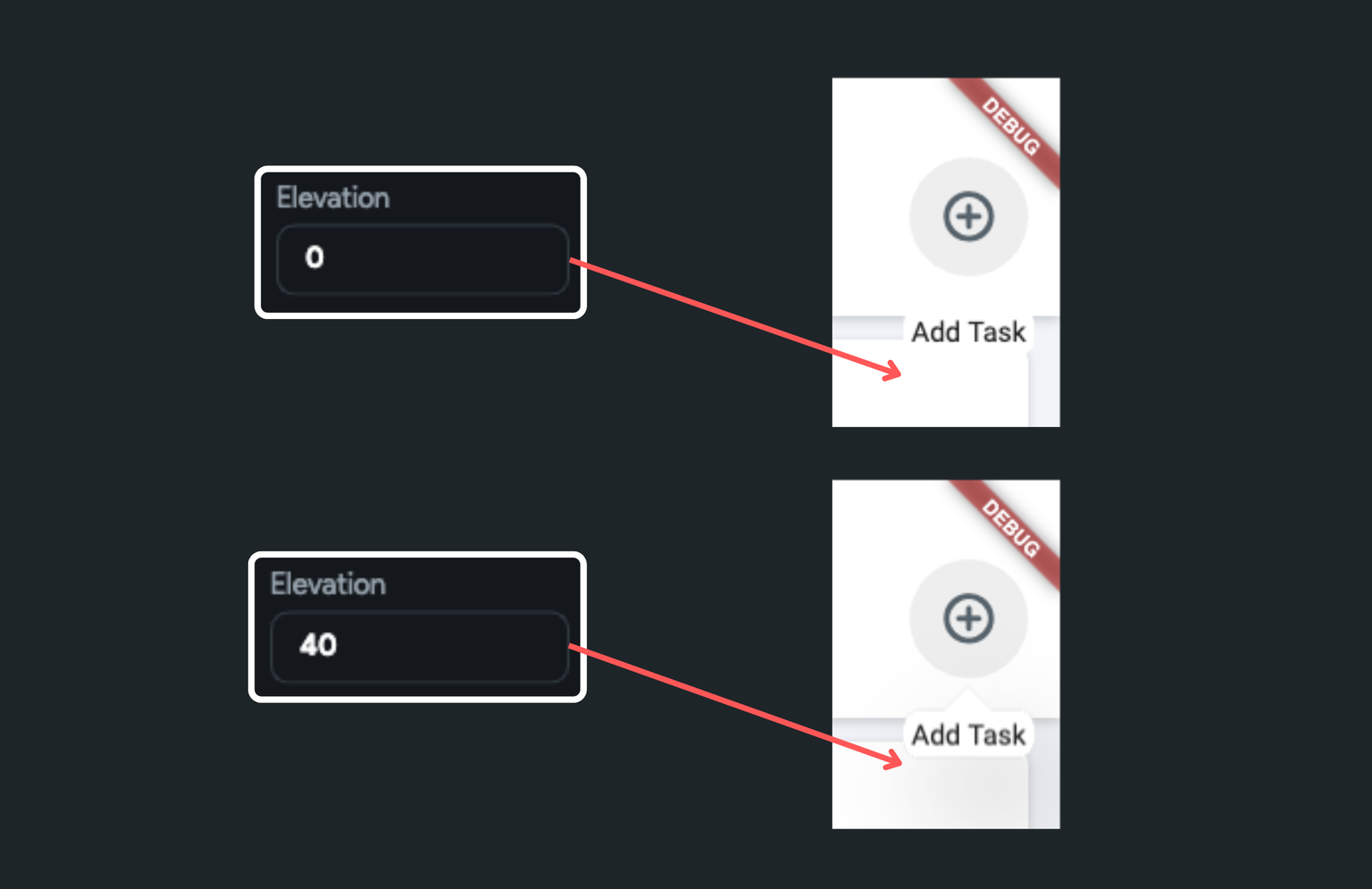 toolt
toolt
Set internal padding
In case you want to add some space around the tooltip message, navigate to the Properties Panel > set the Padding property.
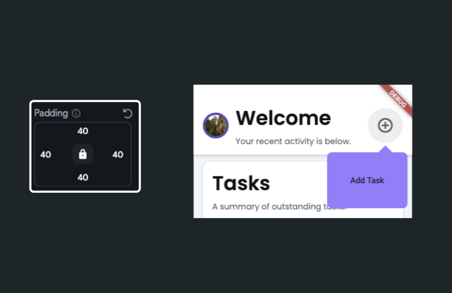
Change wait duration
The wait duration specifies the amount of time that the Tooltip widget waits before it displays. To change this setting, move to the Properties Panel > set the Wait Duration value.
Change show duration
The show duration specifies the duration for which the Tooltip widget continues to be displayed on the screen, even after the user has navigated away from it. As a best practice, it's often recommended to set this value to zero. This ensures that the tooltip disappears instantly once the user navigates away.
To change the default duration, move to the Properties Panel > set the Show Duration value.