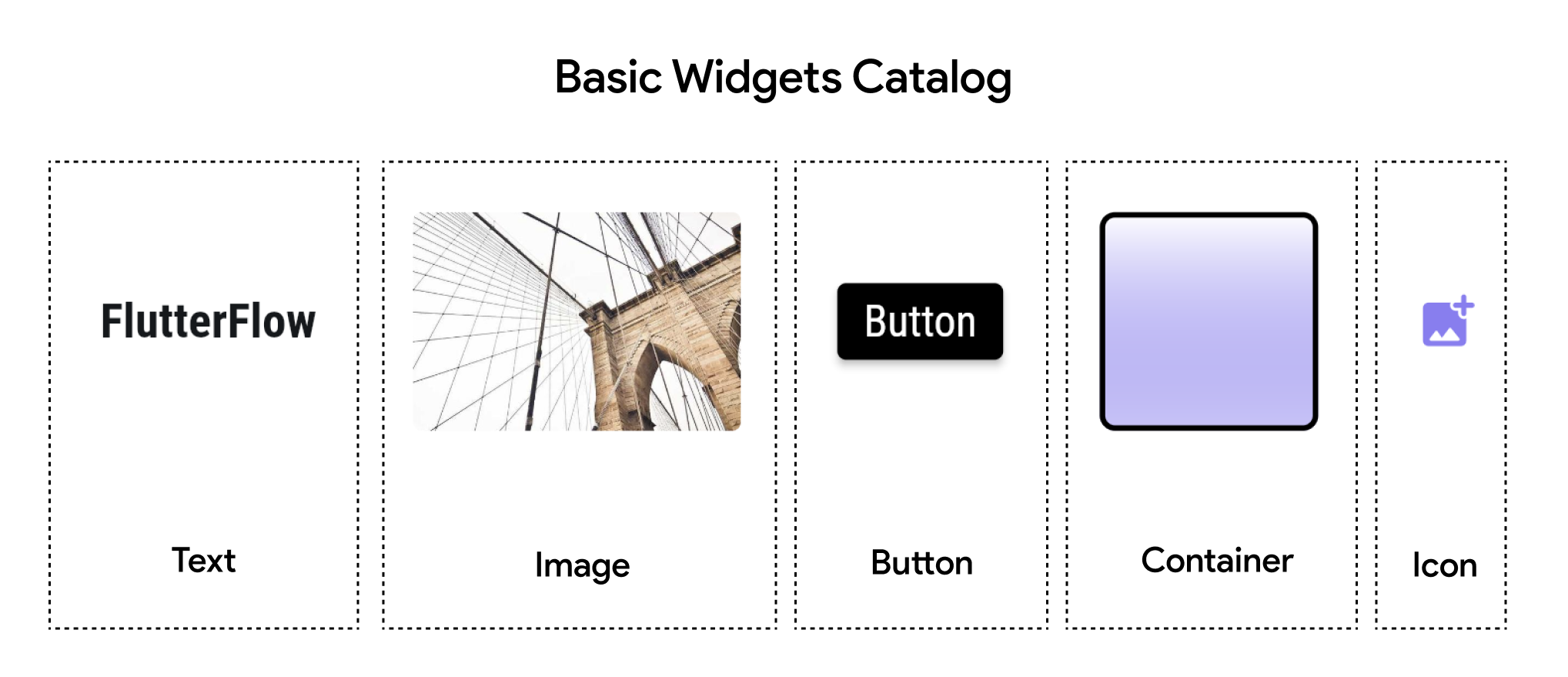
Basic Widgets
FlutterFlow offers a range of basic widgets that are the building blocks of a Page or Component. In this guide, we'll cover five fundamental widgets: Container, Text, Icon, Button, and Image. Understanding these widgets is crucial for building any FlutterFlow app.

Some basic widgets include:
-
Container: The Container widget is one of the most commonly used widgets in FlutterFlow. It allows you to create a rectangular or circular box that is allowed to have one single child - any other basic or advanced widget, and you can style it with various properties such as padding, margins, borders, and colors, etc.
-
Text: The Text widget is used to display a string of text with single style. It’s a basic yet powerful widget that allows you to customize text appearance, alignment, and behavior.
-
Icon: The Icon widget is used to display an icon from the Material Icons, Font Awesome or your own custom icons set. Icons are essential for building user-friendly interfaces, providing visual cues to users.
-
Button: In FlutterFlow, Button widgets are specialized interactive elements that come with built-in visual feedback and default hover properties.
-
Image: The Image widget is used to display images in your app. FlutterFlow supports various sources for images, including assets, network URLs, and uploaded files.