Badge
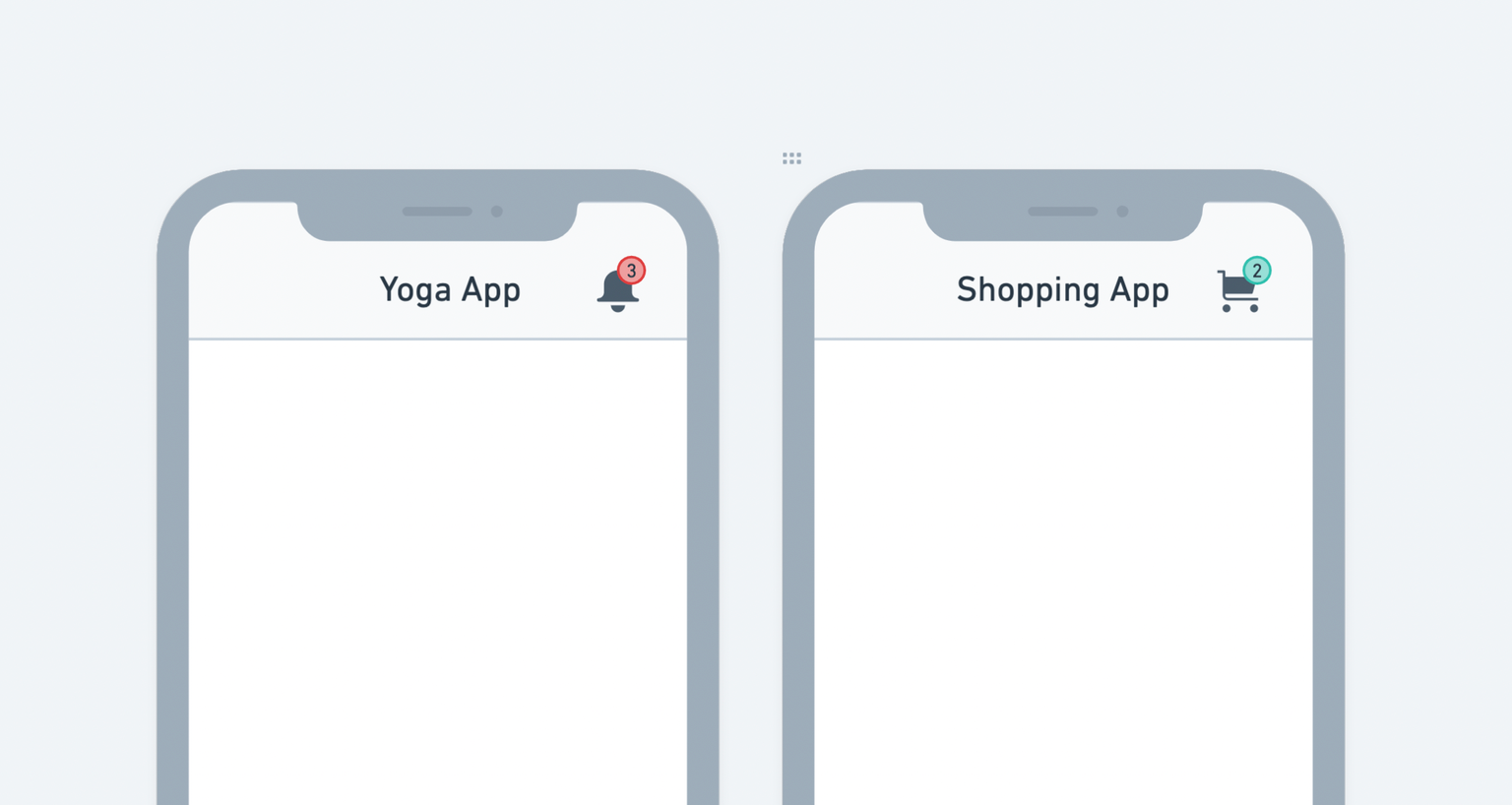
The Badget widget indicates the number of items that need your attention. Typically it's a medium-sized dot that floats over other widgets such as IconButton.
For example, You could use the badge widget to show the number of unread notifications and items in your shopping cart.

Adding Badge widget
Here's an example of how you can add the Badge widget to your project:
- First, drag the Badge widget from the Base Elements tab and carefully drop it into the Actions section of the AppBar.
- Now, add the IconButton widget inside the Badge widget. Customize the Icon and its color as per your requirement.
- Select the Badge widget, move to the properties panel, and set the top side padding to 5 and right side padding to 15.
Customizing
You can customize the appearance and behavior of the badge widget using the various properties available under the Properties Panel.
Setting badge text
You can set the badge text that appears inside the badge. Usually, it's a numeric value.
To set the badge text:
- Select the Badge widget from the widget or the canvas area.
- Move to the properties panel (on the right side of your screen), and scroll down to the Badge Properties section.
- Find the Text property and enter a value. You would probably set this value from the variable or field from the backend database, such as the API response variable and Firestore document field. To do so, click on the Set from Variable.
Styling badge text
To change the badge text style:
- Select the Badge widget from the widget or the canvas area.
- Move to the properties panel (on the right side of your screen), and scroll down to the Badge Properties section.
- Find the Theme Text Style property and change the style as per instructions here.
Show/hide badge
You might want to hide the badge widget initially and only show it when some items need the user's attention—for example, showing the notification badge only when there are new/unread notifications.
To show/hide the badge widget:
- Select the Badge widget from the widget or the canvas area.
- Move to the properties panel (on the right side of your screen), and scroll down to the Badge Properties section.
- Find the Show Badge property and check/uncheck to show/hide the badge. Most probably, you would set this value from the variable such as the app state variable and variable from API response. To do so, click on the Set from Variable.
Changing badge color
To change the badge color:
- Select the Badge widget from the widget or the canvas area.
- Move to the properties panel (on the right side of your screen), and scroll down to the Badge Properties section.
- Find the Badge Color property, click on the box next to the already selected color, select the color, and then click Use Color or click on an already selected colorand enter a Hex Code directly. You can also choose the color by clicking the Palette and Simple button.
Changing elevation
To change the elevation (depth or Z-axis) of the badge:
-
Select the Badge widget from the widget or the canvas area.
-
Move to the properties panel (on the right side of your screen), and scroll down to the Badge Properties section.
-
Find the Elevation input box and enter the value to see the drop shadow effect below the badge. The Higher value sets the bigger size of the shadow, and the 0 value removes the shadow.
Changing badge position
By default, the badge is displayed on the top right side of its child widget. You can change its position and bring it to the left side.
To change the badge position:
- Select the Badge widget from the widget or the canvas area.
- Move to the properties panel (on the right side of your screen), and scroll down to the Badge Properties section.
- Find the Position (Start or End) property and click on the icons to change the position.
Allow animating badge
By default, the badge widget animates whenever the value is changed.
To allow/disallows animating badge:
-
Select the Badge widget from the widget or the canvas area.
-
Move to the properties panel (on the right side of your screen), and scroll down to the Badge Properties section.
-
Find the Animate toggle, and then turn it on or off.