Chart
The chart widget is used to represent the information in a graphical format. You can use it to display complex information in an easily understandable format.
Types of chart
You can add the following types of charts:
Customizing chart
Using Chart Properties (inside the properties panel), you can customize the appearance and behavior of the widget.
The following instructions will have a similar effect on the Bar chart.
Showing legend
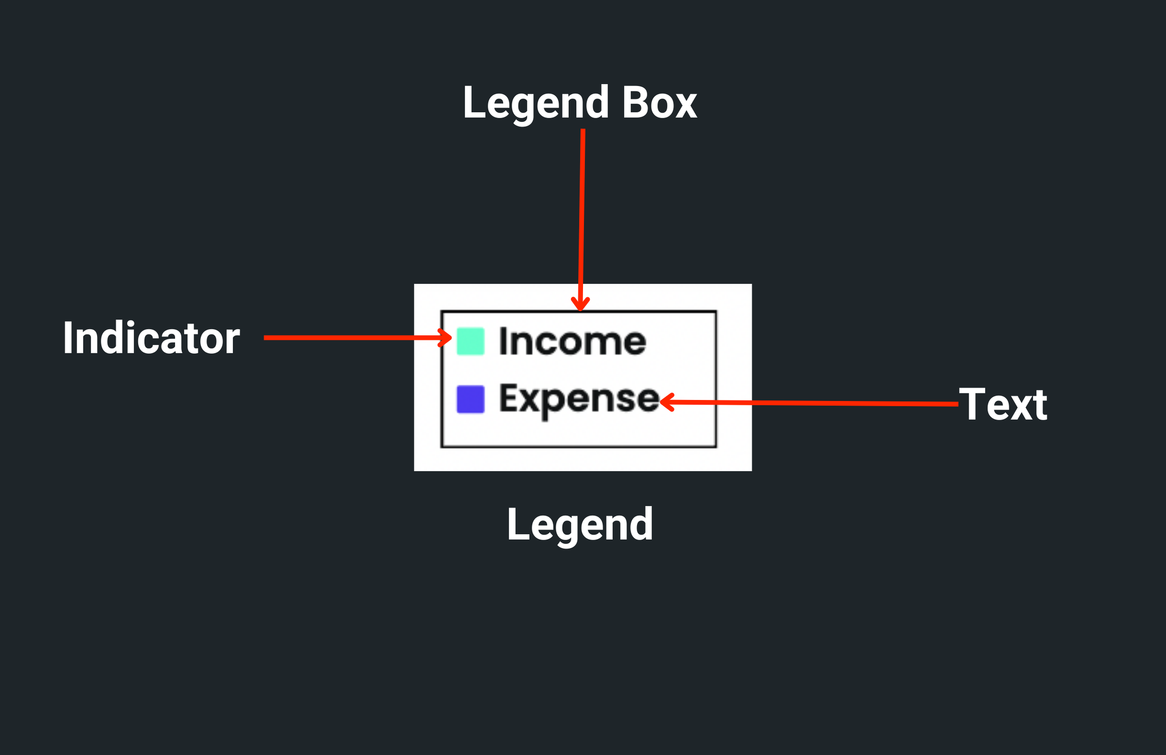
Legend helps users identify the data drawn over the chart. It's a small box that shows the chart data name/text next to its color (a color used to draw a line or bar).

To show legend:
- Select the Chart widget from the widget tree or the canvas area.
- Move to the properties panel and open Chart Data 1.
- Enter the Legend name. This will be displayed as the name of the line or bar.
- If you have multiple chart data (e.g., Chart Data 1, Chart Data 2, and so on), set the legend for them as well.
- Scroll down to Chart Properties and enable the Show Legend property.
Customizing legend box
You can change the appearance of the legend box by following the instructions below:
- First, enable the legend.
- Scroll down to the Legend Properties section.
- To change the dimension of the legend box, enter the Width and Height values.
- The legend box typically appears over the chart on the bottom right side. To change its position, use the Horizontal and Vertical Alignment slider.
- To change the background color, find the Background Color property and click on the box next to Unset, select the color, then click Use Color or click on Unset and enter a Hex Code directly.
- To customize the border, use the Border Color, Border Width, and Border Radius.
- To add space between legend text and its box border, adjust Padding property.
Customizing legend text and indicator
To customize the legend text and indicator:
- First, enable the legend.
- To style the legend text, scroll down to the Legend Properties > Legend Text Properties and change the style as per here.
- To add space between the indicator and the text, adjust the Text Padding property.
- You can change the indicator size by entering a value inside the Indicator Size property.
- To create rounded corners around the indicator, you can use the Indicator Border Radius property.
Changing background color
The default background color for the chart widget is white. To change the background color:
- Select the Chart widget from the widget tree or the canvas area.
- Move to the properties panel, and scroll down to the Chart Properties section.
- Find the Background Color property, click on the box next to Unset, select any dark/light color, and then click Use Color or click on Unset and enter a Hex Code directly. You can also choose the color by clicking on the Palette and Simple buttons.
Set axis bounds
Axis Bounds specify limits on the axis. You can set the minimum and maximum limits on the X and Y axes.
You can set four types of bounds on a chart:
- Min X (only applicable in Line Chart): Specifies a number at which the X-axis should start.
- Min Y: Specifies a number at which the Y-axis should start.
- Max X (only applicable in Line Chart): Specifies a number at which the X-axis should end.
- Max Y: Specifies a number at which the Y-axis should end.
If you don't specify the axis bounds, the start and end numbers for the X and Y axis are set as per the min and max of the actual data.
To set the axis bounds:
- Select the Chart widget from the widget tree or the canvas area.
- Move to the properties panel, and scroll down to the Chart Properties section.
- Find the Axis Bounds section and enter the Min X, Min Y, Max X, and Max Y values.
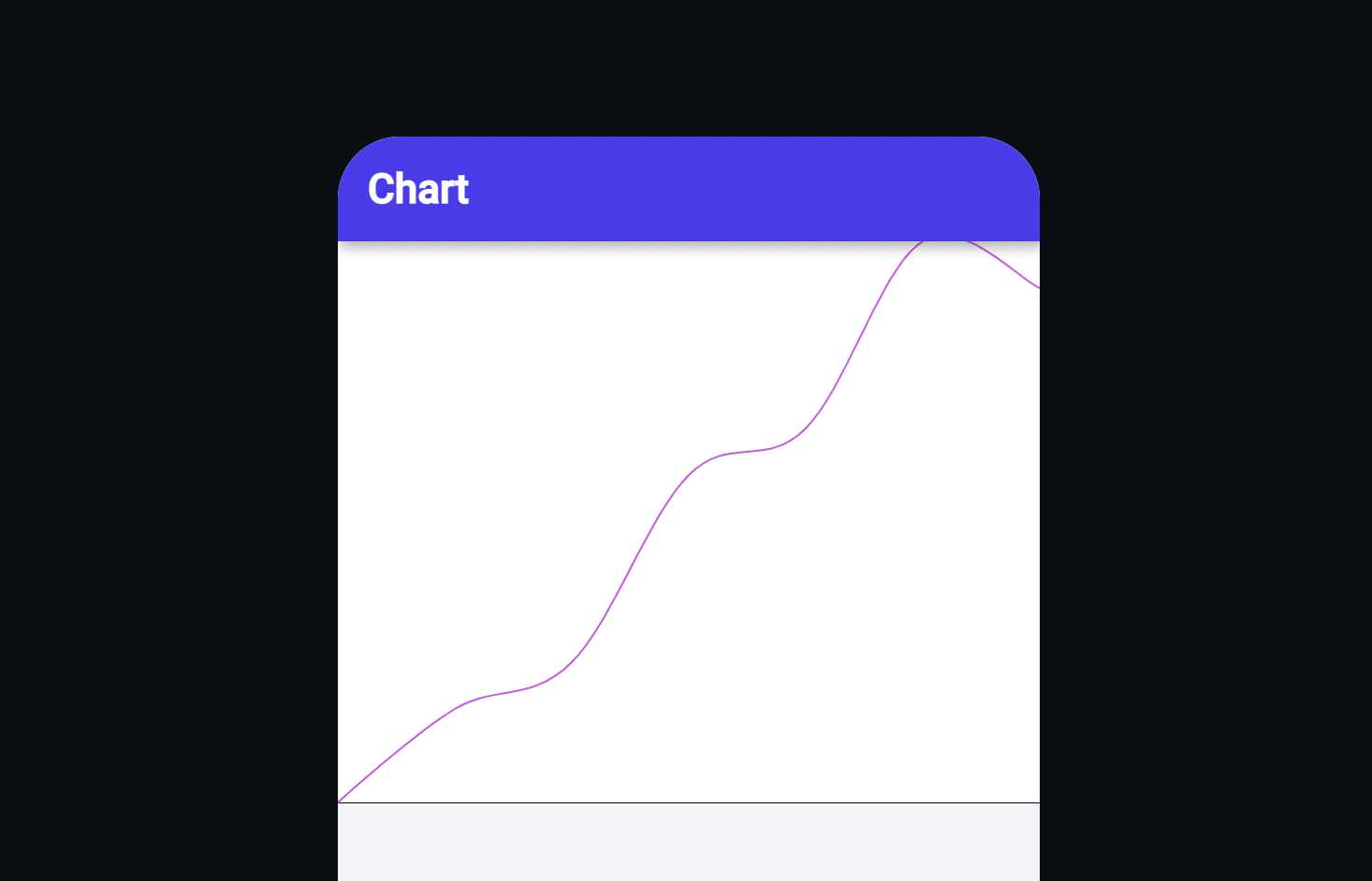
- Chart without axis bounds
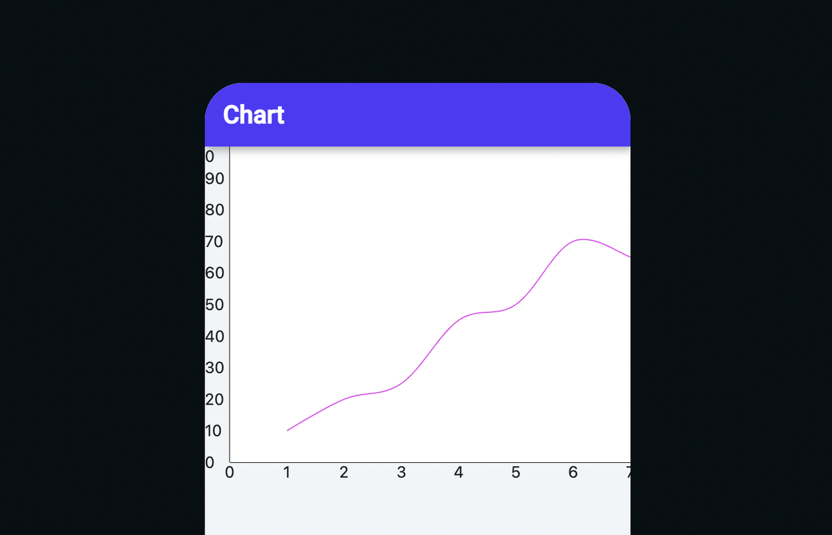
- Chart with axis bounds

The line chart with bounds set to Min X:0 ,Min Y:0, Max X:7 and Max Y:100 looks like this:

Showing grid
To display the grid on the chart background:
- Select the Chart widget from the widget tree or the canvas area.
- Move to the properties panel, and scroll down to the Chart Properties section.
- Find the Show Grid toggle and enable it.
Showing border
To display a border around the chart:
- Select the Chart widget from the widget tree or the canvas area.
- Move to the properties panel, and scroll down to the Chart Properties section.
- Find the Show Border toggle and enable it.
- Find the Border Color property, click on the box next to Black, select the color, and then click Use Color or click on Black and enter a Hex Code directly.
- Now, find the Border Width property below and enter the value. (e.g. 2,5,10)
Showing tooltip
Sometimes it becomes difficult to identify the exact Y value. To overcome this, you can enable the tooltip. Enabling the tooltip will display the Y value when you interact with the chart. You can also add background color to the tooltip.
To enable tooltip:
- Select the Chart widget from the widget tree or the canvas area.
- Move to the properties panel, and scroll down to the Chart Properties section.
- Find the Show Border toggle and enable it.
- To change the background color, find the Tooltip Background Color property, click on the box next to Unset, select any dark/light color, and then click Use Color or click on Unset and enter a Hex Code directly.
Customizing X axis (Show name, number, and labels)
You can customize the X axis to display names and numbers on it.
Displaying name on X-Axis
To show the name on the axis, such as day, week, and month:
- Select the Chart widget from the widget tree or the canvas area.
- Move to the properties panel, and scroll down to the Chart Properties section.
- Scroll down to the X Axis Properties and enter the value in the Text input box. You can also set the name from a variable by clicking on the Set from Variable text.
- You can also customize the appearance of the name text.
Displaying numbers or labels on the X axis
Displaying numbers or labels on the axis helps you quickly understand the graph.
For Line Chart
If you have set the Axis bounds, the start and end numbers are displayed as per the value set in Min X and Max X. Otherwise, they are shown as per the min and max values of the actual data. You can also specify the intervals between the numbers.
To display numbers on the X-axis:
- Select the Chart widget, head over to the properties panel, and scroll down to the Chart Properties section.
- Scroll down to the X Axis Properties and enable the Show Label option.
- When it comes to displaying numbers, it's usually acceptable to show up to two digits as is. However, if the number exceeds that limit, it's recommended to set the Label Format Type to Number and configure the appropriate Number Format Options.
- Enter the value in the Label Interval input box.
- You can also customize the appearance of the numbers.
- Displaying numbers on the X axis
- Displaying numbers (with formatting) on the X axis
For the bar chart, you can only display labels on X-axis.
Customizing Y axis (Show name and numbers)
You can customize the Y axis to display names and numbers on it.
Displaying name on Y-axis
To show the name on the axis, such as progress, number of users, and sales:
- Select the Chart widget from the widget tree or the canvas area.
- Move to the properties panel, and scroll down to the Chart Properties section.
- Scroll down to the Y-Axis Properties and enter the value in the Text input box. You can also set the name from a variable by clicking on the Set from Variable text.
- You can also customize the appearance of the name text.
Displaying numbers on the Y axis
Just like X-axis, If you have set the Axis bounds, the start and end numbers are displayed as per the value set in Min Y and Max Y. Otherwise, they are shown as per the min and max value of the actual data. You can also specify the intervals between the numbers.
To display numbers on the Y axis:
- Select the Chart widget, head over to the properties panel, and scroll down to the Chart Properties section.
- Scroll down to the Y Axis Properties and enable the Show Label option.
- When it comes to displaying numbers, it's usually acceptable to show up to two digits as is. However, if the number exceeds that limit, it's recommended to set the Label Format Type to Number and configure the appropriate Number Format Options.
- Enter the value in the Label Interval input box.
- You can also customize the appearance of the numbers.
- Displaying numbers on the Y axis
- Displaying numbers (with formatting) on the Y axis