Bar Chart
The Bar Chart shows the rectangular bars on a graph whose height varies as per its numeric value and has equal width. This can be used to display categorical information.
For example, you could use the Bar chart to display each year's income and expense value together.
Adding bar chart
Adding a chart comprises of following steps:
1. Preparing data
Before adding the chart widget, you need to prepare the data in the format that the chart widget accepts. The bar chart widget requires label values (runs horizontally from left to right) and Y coordinate values (runs vertically from bottom to top). Together these values (labels and Y coordinate) are used to draw bars on a chart. You can store and retrieve these values in the following ways:
1.1 Firestore Documents
If you use Firebase as the backend, you can create a collection and add the list of documents. Each document entry can be used to draw bars on the chart. Hence you must add at least two fields (one with DataType String and another with DataType Double) in a document that will act as the labels, and the Y coordinates value to draw a bar.
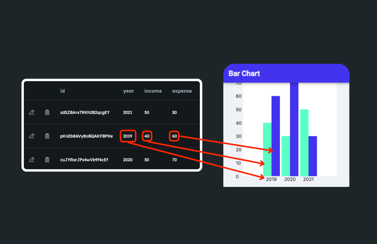
The figure below illustrates the sample collection that draws the two bars (income and expense) for each year.
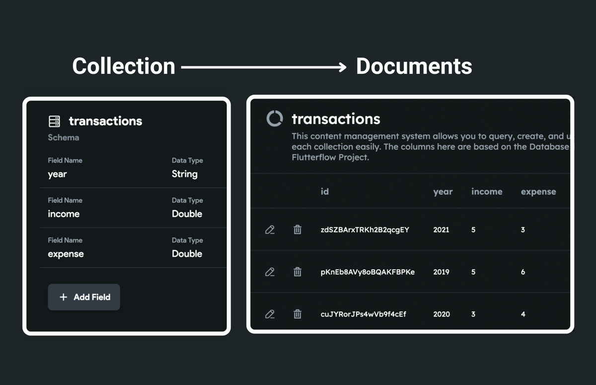
The above collection schema is used for simplification. You are free to have your own schema that works best for you.
Here's how the data is used to draw bars on a chart:
1.2 Numbers Lists
The bar chart widget can draw a bar using a list of labels and numbers. You need at least two separate lists with DataType String and Double. One list stores a list of labels to be displayed on the X-axis, whereas the other stores a list of values on the Y-axis. The chart widget uses both variables to draw the bar.
The variable can be an app state variable or the action output variable of an API call.
The figure below illustrates the sample app state variables that draw the two bars (income and expense) for each year.
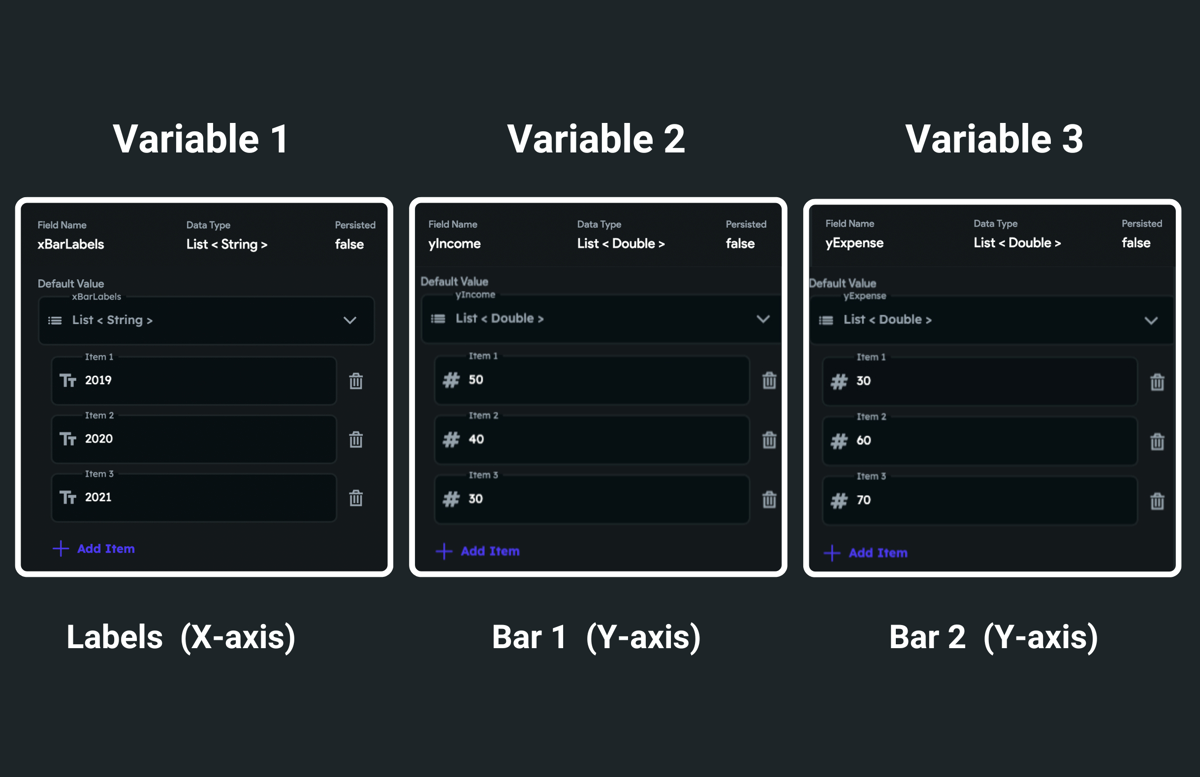
A number of values in the Y-axis variable should match the number of labels in the X-axis variable.
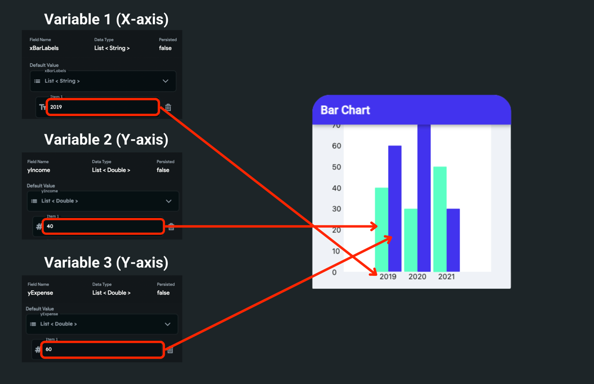
Here's how the number list is used to draw bars on a chart:
To create the app state variable, please find the instructions here.
2. Adding bar chart widget
To add the bar chart widget to your project:
- Drag the Chart widget from the Base Elements tab (in the Widget Panel) or add it directly from the widget tree.
- Move to the property panel and set the Chart Type to Bar.
- For the Bar Chart, a single Chart Data is a Bar drawn on the chart. The bar is drawn by providing the data to this. To show the first bar, open the Chart Data 1 section, and set the Data Source to Firestore Documents or Numbers List.
- If you select Firestore Documents:
- Make sure you have access to a list of documents. The list of documents can be retrieved by querying a collection at any top-level widget, such as the Page or Column widget. You can also query a collection on the Chart widget itself. To query collection on a page:
- Select the page and then click on the Backend Query tab (on the right side of your screen).
- Set the Query Type to Query Collection.
- Scroll down to find the Collection dropdown and set it to your collection.
- Set the Query Type to List of Documents.
- To order the labels, you can perform Ordering on a query.
- Click Save.
- Set the Source to the collection_name Documents > Documents (List/
) and click Confirm (e.g. transactions Documents > Documents (List/ )). - Set the Bar Labels Field, whose values will be used as labels, and lay out horizontally from left to right (e.g., day, week, month, year).
- Set the Bar Values Field, whose values will be used to draw bars on a chart. This will draw bars for the first chart data (e.g., income data).
- Make sure you have access to a list of documents. The list of documents can be retrieved by querying a collection at any top-level widget, such as the Page or Column widget. You can also query a collection on the Chart widget itself. To query collection on a page:
- If you select Numbers Lists:
- Under the Bar Labels, click on the UNSET and set it to a variable whose values will be used as labels and lay out horizontally from left to right (e.g., day, week, month, year).
- Further options are displayed as per the selected source. For example, if you choose App State, The Available Option field is displayed that allows you to select the actual variable.
- Under the Bar Values, click on the UNSET and set it to a variable whose values will be used to draw bars on a chart. This will draw bars for the first chart data (e.g., income data).
- Click Add Data to show bars for multiple categories (e.g., income and expense). The bars for each new category are displayed next to the previous one. Note: When you click Add Data, you can only set Bar Values Field since the Bar Labels Field is already provided in the first Chart Data.
- Scroll down to the Chart Properties section and adjust the Width and Height properties.
- Using Firestore Documents
- Using Numbers Lists
Customizing bars
You can customize the look and feel of bars to match your design.
Customize bar for an individual chart data
You can customize the bar for each specific chart data to help users easily identify the information.
To customize the bar for each chart data:
- Select the Chart widget from the widget tree or the canvas area.
- Move to the properties panel, and open the Chart Data > Bar Properties.
- To change the Bar Color, click on the box next to the already selected color, select any dark/light color, and then click Use Color or click on an already selected color and enter a Hex Code directly.
- To add a border around the bar, enter the Border Width value and change its Border Color.
Customize all bars
To customize all bars together:
- To change the bar width, scroll down the Bar Styling properties > Bar Width and enter the value.
- To add space between two bars or two bars category (if you have multiple chart data), enter the value in the Group Spacing property.
- If you have multiple chart data and want to add space between two adjacent bars, you can enter a value in the Bar Spacing property.
- To combine multiple chart data and display it as a single bar, enable the Stack Bars.
- To change how the bars should be distributed horizontal direction, choose from the Main Axis Alignment options.
Customizing chart
You can customize the chart to match your design by changing the background color, setting axis bounds, showing grids, displaying borders, and more.