Pie Chart
The Pie Chart divides the circle (aka Donut) into slices/sections representing different categories. Each section shows the size of the data. It is typically used to display how a total amount is distributed between sections.
For example, you could use the Pie Chart to show which animal dominates the pet world.
Adding pie chart
Adding a pie chart comprises of the following steps:
1. Preparing data
Before adding the chart widget, you need to prepare the data in the format that the chart widget accepts. The pie chart widget requires labels and section values. Together these values are used to draw slices on a chart. You can store and retrieve these values in the following ways:
1.1 Firestore Documents
If you use Firebase as the backend, you can create a collection and add the list of documents. Each document entry can be used to draw sections on the chart. Hence you must add at least two fields (one with DataType String and another with DataType Integer or Double) in a document. The field with String DataType will be used as labels, whereas the field with Integer or Double DataType will be used as section values.
The figure below illustrates the sample collection that draws three sections on the pie chart.
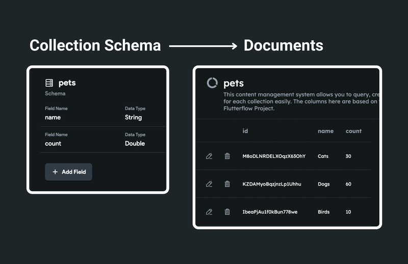
The above collection schema is used for simplification. You are free to have your own schema that works best for you.
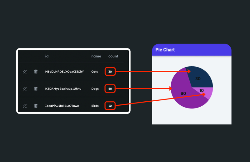
Here's how the data is used to draw sections on a pie chart:
1.2 Numbers Lists
The pie chart widget can draw sections using a list of labels and numbers. You need at least two different lists with DataType String and Integer or Double. One list stores a list of labels, whereas the other stores a list of section values.
The variable can be an app state variable or the action output variable of an API call.
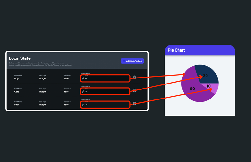
The figure below illustrates the sample app state variables that draw three sections on the pie chart.
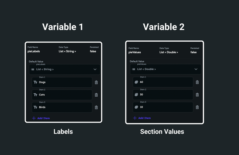
The number of section values should match the number of labels.
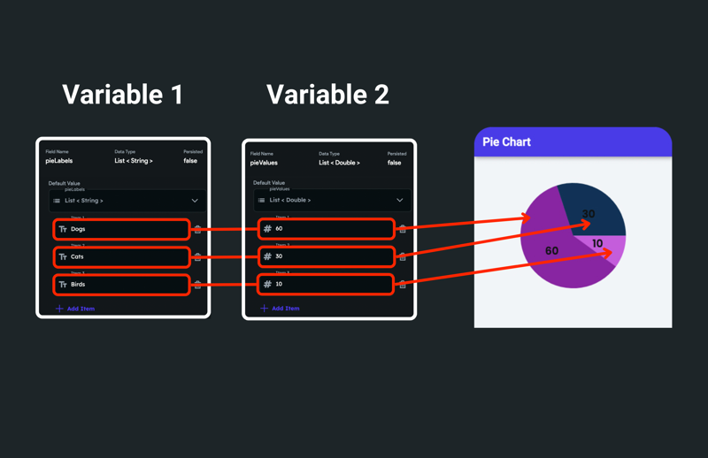
Here's how the number list is used to draw sections on a chart:
To create the app state variable, please find the instructions here.
1.3 Single Value
When you have a fixed number of labels (aka static labels, which won't change over time), you can use this option. This option allows you to define labels and their section value from a variable.
The variable can be an app state variable or the action output variable of an API call.
Here's how the three separate app state variables are used to draw sections on a chart:
2. Adding pie chart widget
To add the pie chart widget to your project:
- Drag the Chart widget from the Base Elements tab (in the Widget Panel) or add it directly from the widget tree.
- Move to the property panel and set the Chart Type to Pie.
- For the Pie Chart, a single Chart Data is a Section drawn on the chart. The section is drawn by providing the data to this. Open the Chart Data 1 section, and set the Data Source among the Firestore Documents, Numbers List, and Single Value.
- If you select Firestore Documents:
- Make sure you have access to a list of documents. The list of documents can be retrieved by querying a collection at any top-level widget, such as the Page or Column widget. You can also query a collection on the Chart widget itself. To query collection on a page:
- Select the page and then click on the Backend Query tab (on the right side of your screen).
- Set the Query Type to Query Collection.
- Scroll down to find the Collection dropdown and set it to your collection.
- Set the Query Type to List of Documents.
- Click Save.
- Under the Data, click on the UNSET and set the source to the collection_name Documents > Documents (List/
) and click Confirm (e.g., pets Documents > Documents (List/ )). - Set the Legend Labels Field, whose values will be used as labels.
- Set the Section Values Field, whose values will be used to draw sections on a chart.
- To set the section color, scroll down to Pie Chart Properties > Pie Chart Color and click on Add Color. Note: Make sure the number of colors you have must be equal to or greater than the number of labels. Otherwise, all sections would have the same colors.
- Make sure you have access to a list of documents. The list of documents can be retrieved by querying a collection at any top-level widget, such as the Page or Column widget. You can also query a collection on the Chart widget itself. To query collection on a page:
- If you select Numbers Lists:
- Under the Legend Labels, click on the UNSET and set it to a variable whose values will be used as labels.
- Further options are displayed as per the selected source. For example, if you choose App State, The Available Option field is displayed allowing you to select the actual variable.
- Under Section Values, click on the UNSET and set it to a variable whose values will be used to draw sections on a chart.
- To set the section color, scroll down to Pie Chart Properties > Pie Chart Color and click on Add Color. Note: Make sure the number of colors you have must be equal to or greater than the number of labels. Otherwise, all sections would have the same colors.
- If you select Single Value:
- Under Section Value, click on the UNSET and set it to a variable whose value will be used to draw the first section.
- Further options are displayed as per the selected source. For example, if you choose App State, The Available Option field is displayed allowing you to select the actual variable.
- Click Add Data to show multiple sections (e.g., Dogs, Cats, Birds). Note: This option is only available when using Single Value.
- Scroll down to the Chart Properties section and adjust the Width and Height properties.
- Using Firestore Documents
- Using Numbers Lists
- Using Single Value
Customizing section
You can customize the look and feel of each section to match your design by following the instructions below:
- Select the Chart widget from the widget tree or the canvas area.
- Move to the properties panel, and open the Chart Data > Pie Chart Properties.
- To change the size of the circle, enter the value in the Pie Chart Radius property.
- To add a border around the section, enter the Border Width value and change its Border Color.
- To create an inner circle (hole) inside the main circle(Donut), enter the size into the Donut Hole Radius property.
- To change the Donus Hole Color, click on the box next to the already selected color, select any dark/light color, and then click Use Color or click on an already selected color enter a Hex Code directly.
- To display the section value or its percentage, set the Section Lable Type to Value or Percent respectively.
Showing legend
Legend helps users identify the data drawn over the chart. It's a small box that shows the chart data name/text (label) next to its color (a color used to draw a section).
To show and customize the legend follow the instructions here.