MouseRegion
The MouseRegion widget lets you know whenever the mouse pointer enters or exits from a widget. You could use it to build a user experience (UX), such as animating buttons when a user hovers over them and revealing or hiding menu items when a user hovers over the menu icon.
On this page, you will learn how to add the MouseRegion widget, use it to show/hide elements, and customize it.
Adding MouseRegion widget
Here are the step-by-step instructions to build such an example:
- First, click on the + Add Widget and drag the MouseRegion widget from the Base Elements tab or add it directly from the widget tree.
- Add a Button (inside MouseRegion) with On Action Trigger animation.
- Select the MouseRegion widget, select Actions from the Properties Panel (the right menu), and click Open. This will open an Action flow Editor in a new popup window.
- Select the On Mouse Enter tab. Actions added under this will be triggered whenever the mouse enters the MouseRegion widget.
- Add the Widget Animation action to start the animation on a Button.
- Select the On Mouse Exit tab. Actions added under this will be triggered whenever the mouse leaves the MouseRegion widget.
- Add the Widget Animation action to stop the animation on a Button.
Show/hide elements using MouseRegion
Using the callbacks provided by the MouseRgion widget, you can show or hide a widget. The idea is to update the App State variable when the mouse pointer enters or exits the widget. And then use the same app state variable to add Conditional Visibility on a widget.
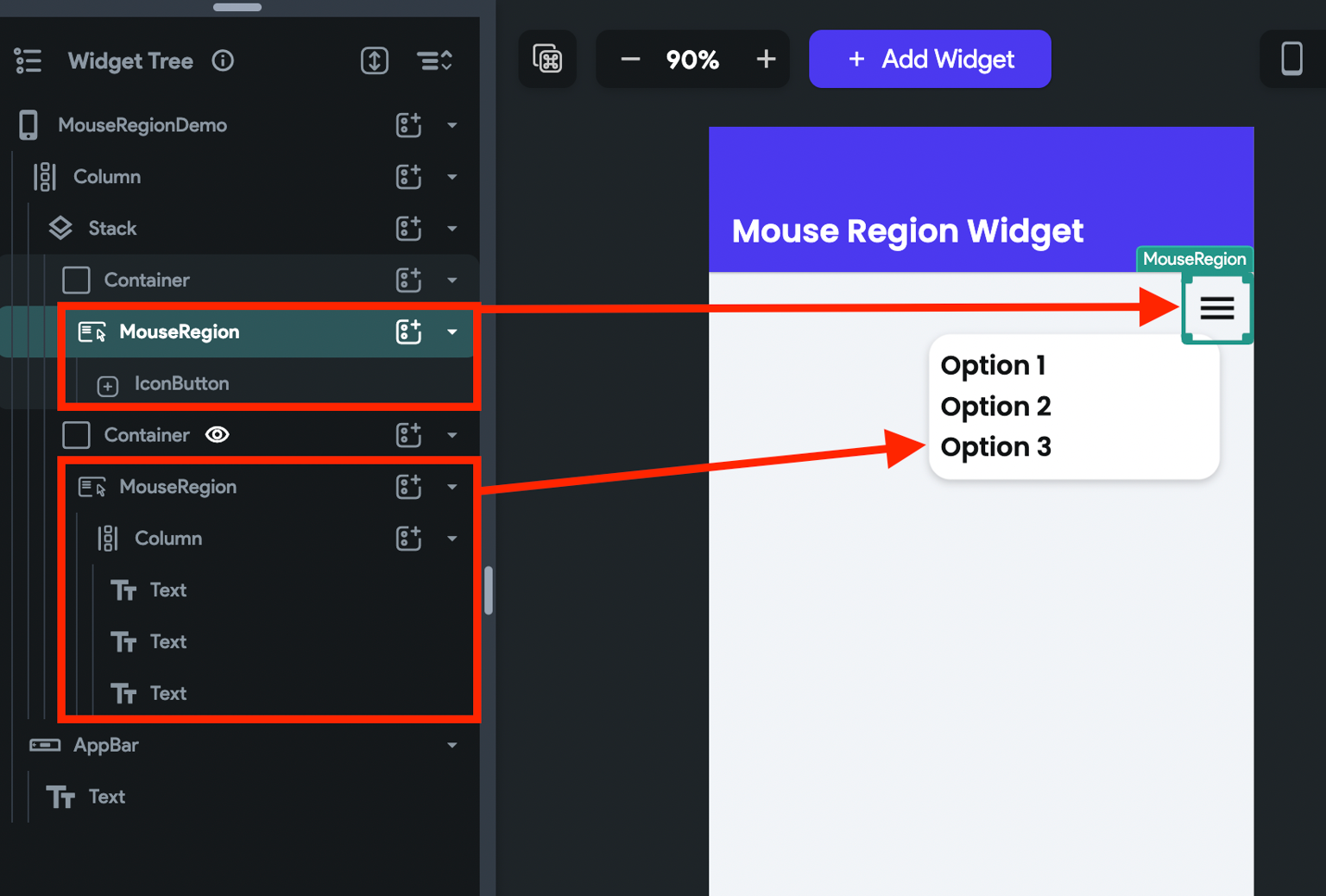
Let's see how to build the following example:
Here are the step-by-step instructions:
- First, add the Stack > Container > MouseRegion > IconButton to display the menu icon.
- Add the Container > MouseRegion > Column (with some menu items/options) inside the same Stack widget.
Note that we wrapped the menu icon and its options inside the MouseRegion widget. In the next step, we will add the same actions for both MouseRegion widgets so that the menu options stay visible as long as you hover over them.

- Create a boolean App State variable and use it to add conditional visibility on menu options.
- On both MouseRegion widgets, add an update app state variable action to set True when the mouse enters and False when the mouse exit.
Customizing
You can customize the appearance and behavior of this widget using the various properties available under the Properties Panel.
Customize mouse cursor
When a mouse enters the widget, its cursor will change to the appropriate one by default. However, you can also set it to a custom one if you wish to.
To customize the mouse cursor, select the MouseRegion widget, move to the properties panel, find the Mouse Cursor dropdown select the one you think fits best.