Accessibility
Accessibility is about making your app usable for everyone, including individuals with visual, auditory, cognitive, or motor impairments. Ensuring your app is accessible not only benefits users with disabilities but also improves the overall user experience and usability of the app for everyone.
Here are some examples of how accessibility can help users with disabilities:
- Screen Readers for Visually Impaired Users: Screen readers like TalkBack (Android) and VoiceOver (iOS) help visually impaired users navigate and understand the app by reading aloud on-screen content.
- Large Touch Targets for Motor Impairments: Large touch targets make it easier for users with motor impairments to interact with buttons and other UI elements.
- Color Contrast for Visual Impairments: High-contrast color schemes ensure text and interactive elements are easily readable for users with visual impairments.
- Keyboard Navigation for Physical Impairments: Users unable to use touchscreens can navigate the app effectively with keyboard controls.
- Haptic Feedback: Tactile responses help users with visual or motor impairments understand when interactions are successful.
In FlutterFlow, you can enhance the accessibility of your app by incorporating various accessibility features, such as semantic labels, keyboard navigation, haptic feedback, responsive fonts, and proper color contrast.
Here are some key accessibility features you can use:
Semantic Label
Semantic Labels enhance your app’s accessibility and SEO by providing meaningful context about widgets for screen readers and search engines. These descriptions are especially helpful for users relying on assistive technologies.
For example, in an e-commerce app, you can add a semantic label to an 'Add to Bag' button with a message like 'Add the selected item to cart', which helps users better understand the button's action.
To add a semantic label for any widget, select the widget, move to the properties panel (right side), tap the document icon inside the Accessibility & Semantic Label section, add the message, and click Save.
You can also dynamically set semantic labels using variables or expressions. This allows the label to change based on the app context, so screen readers announce exactly what’s on the screen instead of generic terms like "image" or "button." For example, a product image can read out the product name (e.g., "Red Running Shoes" pulled from Firestore) instead of just saying "image."
Advanced Semantic Settings (Enterprise Only)
These settings help make your app more accessible by giving you better control over how screen readers interpret and describe your UI.
These settings are only available to Enterprise users.
Here’s what each option does:
- Is Container: Indicates the widget acts as a grouping for other semantic widgets.
- Is Image: Tells screen readers the widget represents an image.
- Is Button: Declares that the widget behaves like a button.
- Is Header: Identifies a widget as a heading for better navigation.
- Explicit Child Nodes: Forces semantics to include all child nodes, even if normally ignored.
- Exclude Semantics: Prevents screen readers from announcing this widget.
- Is Live Region: Tells assistive tech that the widget’s content may change dynamically and should be re-announced.
- Hint Text: Provides an additional hint for users (e.g., "Double tap to open").
- Tooltip Text: Provides descriptive text about the widget to screen readers, giving extra context beyond the primary label.
- Ordinal Sort Key: Controls the order in which widgets are accessed by screen readers.
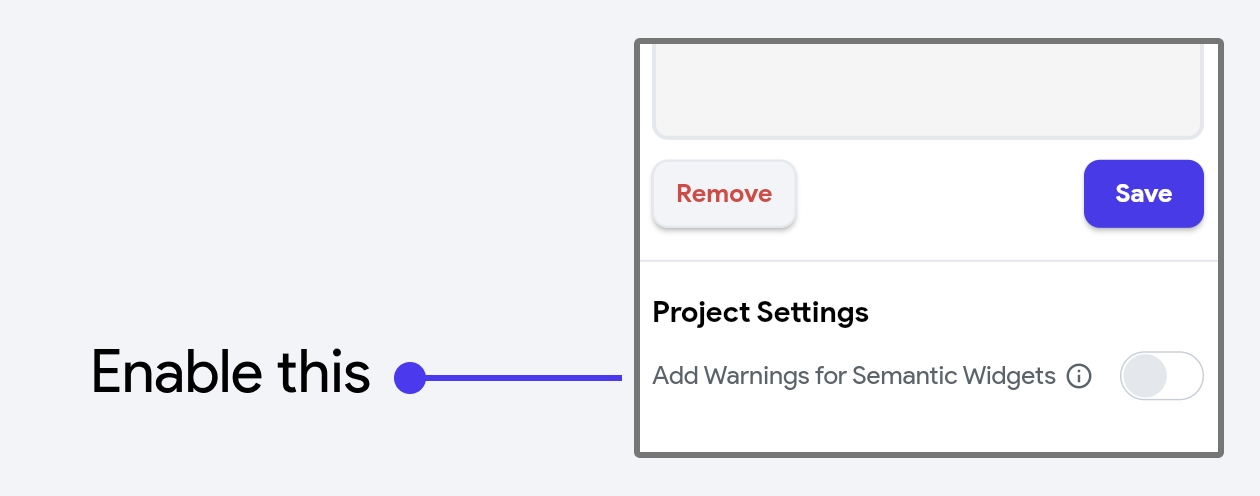
You can add a semantic label for every widget in your app that has an action trigger OnTap or onLongPress, by enabling the Add Warning for Semantic Widgets.
By doing so, you'll get a warning if any widget has an action but doesn't have a semantic label added yet. You can click on the warning item to directly navigate to that widget.

After you add semantic labels, enable TalkBack on Android or VoiceOver on iOS to test how screen readers interact with your app. These screen readers will help you verify that all UI elements are read clearly, descriptions are meaningful, and users can navigate logically without getting lost.
Learn more about enabling screen reader on your device.
Semantic Announce [Action]
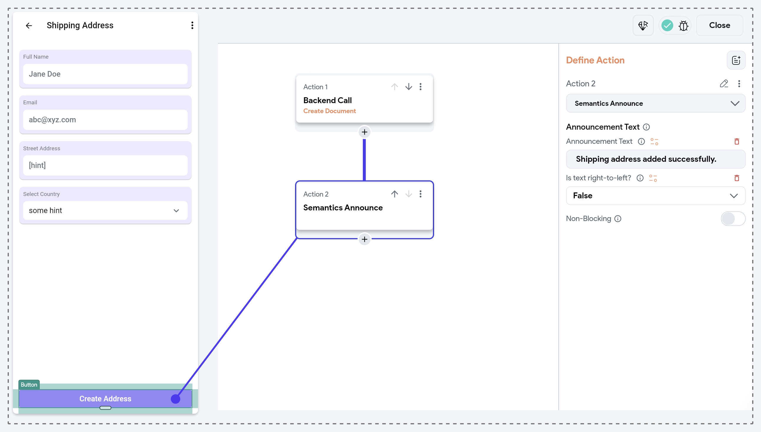
The Semantic Announce action lets you notify screen reader users about important UI changes or provide contextual updates. It sends a request to the device’s accessibility service (TalkBack/VoiceOver) to speak the text out loud.
It significantly improves accessibility by allowing screen reader users to receive timely and meaningful feedback. This is especially helpful when visual feedback might be missed or unavailable.
- Form Submission: After a user submits a form, you can trigger a screen reader announcement like "Your form has been submitted successfully," giving immediate feedback without requiring visual cues.
- Dynamic Content Updates: When new content is added or changed on the screen—like loading new chat messages or refreshing a feed—you can announce messages like "3 new messages loaded" to ensure screen reader users are aware of the update.
- Error or Validation Messages: If a user enters invalid input, you can announce helpful validation feedback like "Please enter a valid email address".
The Semantic Announce action allows you to trigger screen reader announcements with the following settings:
- Announcement Text: The message you want the screen reader to speak aloud (e.g., "Item added to favorites").
- Is Text Right to Left: Set this to True for right-to-left languages like Arabic or Hebrew. It defaults to False, which is appropriate for left-to-right languages like English.

- Long announcements can overwhelm the user. Aim for a concise phrase like "Search complete — 3 results."
- Too many announcements can confuse or irritate the user. Only announce critical or timely changes that aren’t otherwise discoverable.
- Use the correct language direction of the message. If your app supports multiple locales, dynamic direction binding can help.
- Screen reader behavior can vary across Android (TalkBack) and iOS (VoiceOver). Test thoroughly on real hardware to confirm the experience.
Focus Configuration
Focus Configuration helps improve keyboard and remote-control navigation in your app—especially important for web, desktop, TV, and kiosk apps. It controls how users move through widgets using the Tab key or other navigation inputs (like arrow keys or D-pad on TV or remote).
You can control the Focus Configuration using the following properties:
- Wrap in Focus Traversal Group: It places a widget (and all its children) in a dedicated group so focus cycles within that region before moving on. For example, if you have a login form with two fields: Email and Password, enabling this option ensures that pressing Tab will cycle only between them (and not jump to unrelated parts of the screen).
- Focus Traversal Order: This sets the exact sequence in which widgets receive focus using numeric values (e.g., 1, 2, etc.). For example, In a sign‑up form, set
Name = 1,Email = 2, andPassword = 3so pressing Tab moves logically down the form rather than following the raw widget tree. - Show Border on Focus: Enabling this toggle highlights the widget with a visible border when it receives focus, making navigation clearer. Once enabled, you can customize the border’s appearance using Border Width, Border Color, and Border Radius to match your design.
While you can assign a value for the Focus Traversal Order of any widget, it won’t take effect unless you enable Wrap in Focus Traversal Group on the current widget or one of its parent widgets.
The Focus Traversal Group defines a context or scope for focus traversal, and Focus Traversal Order only applies within that group. Without it, there's no defined order for the traversal logic to follow.
Update Text Scaling Factor [Action]
The Update Text Scaling Factor action in FlutterFlow allows you to dynamically adjust the text size across your app during runtime. This is particularly useful for improving accessibility by letting users control the size of the text without having to manually change system settings.
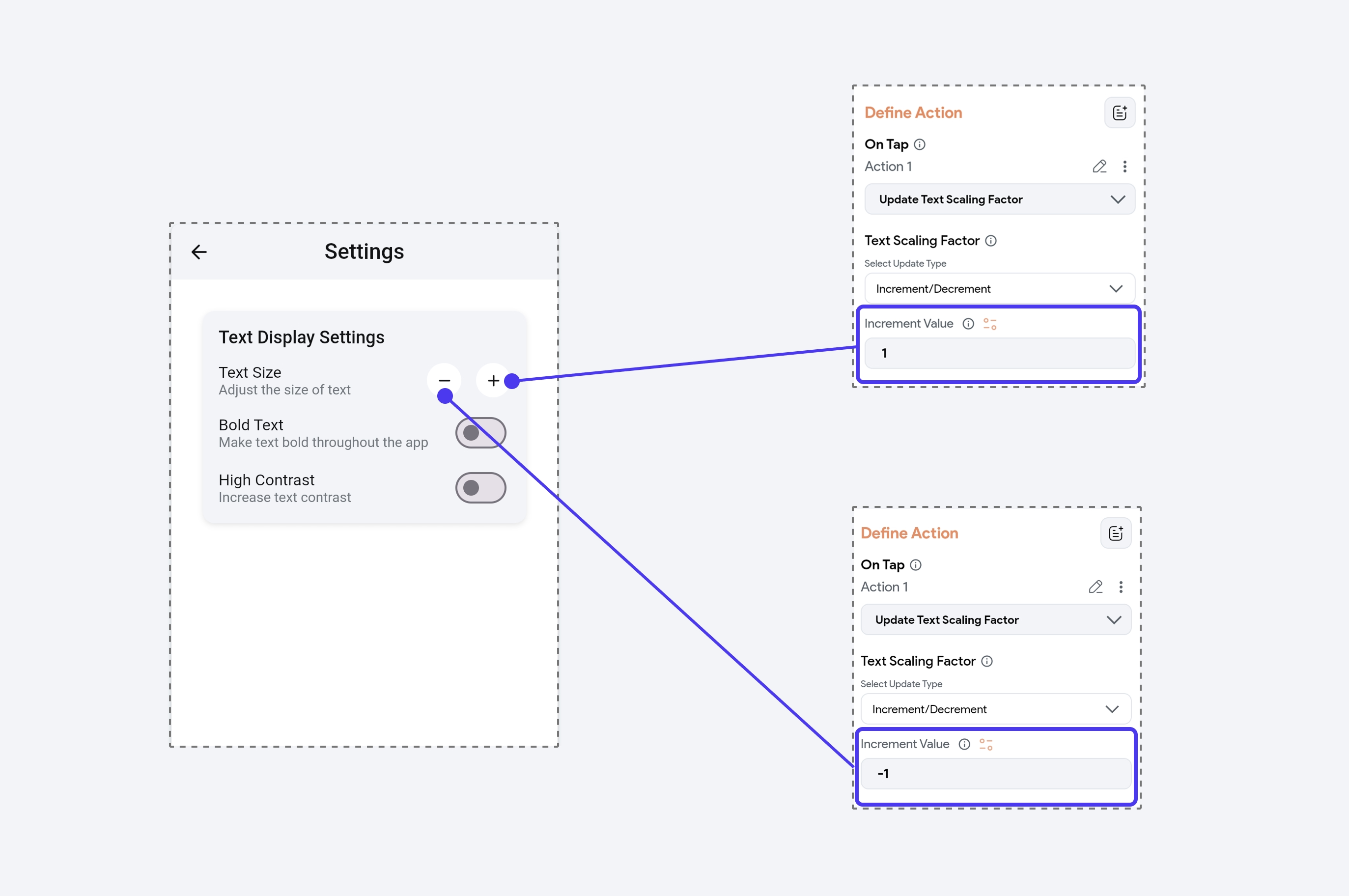
Imagine you have a "+" and "-" button on a page to help users adjust text size. When the user taps the "+" button, the text scaling factor increases by 1, making the text larger. Tapping the "-" button decreases the text scaling factor by 1, making the text smaller. Additionally, a Reset button can be provided to return the text scaling back to its default value.
This action works in conjunction with the Display Settings configured at the project level, such as Min Text Scaling Factor and Max Text Scaling Factor.
When configuring the Update Text Scaling Factor action, you can choose from three update types:
- Set Value: Directly assigns the text scaling factor to a specific value.
- Increment/Decrement: Adjusts the current scaling factor by a specified amount. A positive value increases scaling, and a negative value decreases it.
- Reset: Restores the text scaling factor to the project's default setting.

Keyboard Navigation
You can use the On Shortcut Press action trigger to bind keyboard shortcuts to specific actions. This makes it easier for users with disabilities to navigate your app, especially in web and desktop environments.
It enhances accessibility by allowing users to interact without relying solely on a mouse or touchscreen, making the experience more inclusive and efficient.
Haptic Feedback
Using Haptic Feedback, you can vibrate the user's device, which is particularly helpful for users with visual or cognitive impairments. It provides a tactile response to indicate that an action has been completed.
For example, vibrating the user's device when successfully submitting a form.
Responsive Fonts
When developing an app, it's important to consider the different platforms on which it will run. Text may appear smaller on devices with higher screen resolution, such as tablets, web, or desktops, which can negatively impact accessibility for users with visual impairments.
Adding responsive text that adjusts font size based on the platform helps make content more readable, improving accessibility for users who need larger or more legible text.
Color Contrast
Use sufficient color contrast to make text and interactive elements readable for users with visual impairments or color blindness. This helps ensure that content is easily distinguishable, even for users with limited vision. Learn more about using various ways to add colors in your FlutterFlow app.
You can use tools like WCAG Contrast Checker to validate the color contrast ratio.
Best Practices
- Accessibility should be considered from the start of the design and development process, not added as an afterthought.
- While adding semantic labels:
- Avoid ambiguous labels like "Click here" or "Press this"; instead, use descriptive phrases such as "Submit form" or "Navigate to settings."
- Instead of just showing an icon, add semantic labels like "Back button" or "Search button" to provide context for screen readers.
- Ensure that interactive widgets have a minimum touch target size of 48x48 logical pixels. This helps users with motor impairments easily interact with buttons, switches, and other components.
- Always test your app with screen readers enabled to verify that it behaves as expected.
- Don't use color as the only means to convey important information. Include text, icons, or patterns to supplement color, making the content accessible to colorblind users.
- Verify your app's UI under high contrast or larger text sizes to ensure it remains readable and usable.
- Use simple gestures like taps and double-taps instead of multi-finger swipes or long presses. Provide alternate ways to perform actions, such as using a button in addition to a swipe gesture.
- Perform usability tests with individuals with disabilities. Real user feedback is invaluable for identifying issues that might not be caught during standard testing.