Icons
Icons are integral elements in user interfaces, providing visual cues that enhance user interaction and aesthetic appeal. They communicate action, represent functionality, and improve navigation efficiency within applications.
![]()
Types of Icon widgets
FlutterFlow allows a bunch of widgets and components:
-
Icon Widget: The Icon widget in FlutterFlow is used for displaying symbols from a variety of available icon packs like Material Icons. It's straightforward to use, allowing for quick integration of visual symbols into your app.
-
Icon Button Widget: The IconButton widget combines the functionality of an icon with the capabilities of a button, making it a clickable icon. It's commonly used for actions like opening a menu, submitting a form, or any other interactive task.
-
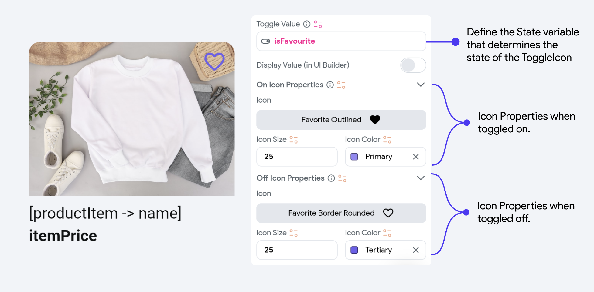
Toggle Icon Widget: The ToggleIcon widget offers a specific functionality where the icon toggles between two states based on a boolean condition. This widget is ideal for "favorite" or "like" buttons, where the icon state changes to represent an active or inactive state. The ToggleIcon reacts to user taps, changing its appearance and also allowing for callback functionality to handle the state change.
Common Icon Properties
Upon selecting the Icon, you can modify properties such as Icon color and Icon size from the Properties Panel on the right. Additionally, you can set the Icon value by selecting from a vast catalog of Material Icons and FontAwesome Icons provided by FlutterFlow.
You can also upload your own licensed Custom Icons. Check out this video to learn more.
Icon Button Properties
The Properties Panel for your IconButton allows you to modify the Icon Properties, Button Styling, Disabled state, and Hovered state properties. It also lets you determine if you want a loading indicator when the icon button is clicked.
To get a quick demo of the styling changes, check this out:
Toggle Icon Properties
ToggleIcon is a special component created for you that lets you add a toggle on and toggle off icon, and define a State variable that determines the state of the Toggle icon. The properties are straightforward and include the following:

On Toggle [Action]
By default, FlutterFlow handles the toggling of the State variable from true to false and vice versa when the button is clicked. However, you can also add another action under the On Toggle action trigger to perform extra tasks.