TextField
The TextField widget allows users to enter text, numbers, and symbols in your app. You can use the TextField widget to build forms, send messages, dialogs, search, etc.
Before diving into form widgets, check out our guide on Widget States to efficiently manage the state and behavior of your form elements.
Adding TextField Widget
Let's see how to add a TextField widget and see an example of displaying its value in an Alert Dialog.
Here are the steps:
- First, add the TextField widget, move to the properties panel and give it a name.
- Add the Button widget and on tap of it, add an Alert Dialog action. While adding this action, provide the Message From Variable > Widget State > [TextFieldName].
Customizing
You can customize the appearance and behavior of this widget using the various properties available under the properties panel.
Changing Width
By default, the TextField widget takes all the available space in the horizontal direction. You might want to limit its width to match your design. See how to change the width of this widget.
Adding Multiline/auto Expand Support
By default, a TextField is only one line. So when you type in a long text that won't fit in one line, you'll be able to see an entire message using a horizontal scrollbar. You can change this default behavior and show the full message (without a horizontal scrollbar) by making the TextField multiline/auto-expand.
To make a TextField multiline/auto-expand, move the Properties Panel > find the Max Lines and Min Lines properties.
- To make the TextField auto-expand as long as its parent allows, remove the Max Lines value and set the Min Lines to 1.
- To make the TextField auto-expand up to a few lines and then show a vertical scrollbar to see the full message, set Max Lines to a value up to which you like to show an entire message (e.g., 3,5) and Min Lines to 1.
Setting Prefilled Value
You might want to display a TextField with some initial value. This can be any specific value such as "What are you looking for", "Input your Email", or a value from any variable.
To set the initial value, move to the Properties Panel > TextField Properties > Initial Value and enter the specific value or Set from Variable.

Adding Label
Showing a label helps users understand what should be entered into the TextField. If you don't have an initial value set, the Label Text will appear as full size in the TextField. Once the user taps the TextField, the Label Text will become smaller, and the Hint Text will appear.
To set the label, move to the Properties Panel > Label Properties > enter the Label Text.

When the TextField is set to Multiline the label appears in the center. To get it closer to the hint text, switch on the Align Label With Hint property.
Setting Hint Text
Showing a hint text helps users know what information is needed to enter into the TextField. For example, showing hint text as "Enter Your Email Here" clearly informs the user to enter their email.
To set the hint text, move to the Properties Panel > Hint Properties > enter the Hint Text.

Decorating TextField
Various properties under the Input Decoration Properties allow you to customize the TextField to match your design.
Changing TextField Background Color
To change the background color, move to the Properties Panel > Input Decoration Properties > enable Filled > set the Fill Color.
Adding Border
Here's an example of how you can add a border around the TextField:
- Select TextField widget, move to the Properties Panel > Input Decoration Properties > select the Input Border Type.
- Choose Outline to place a border around the entire field.
- Choose Underline to place a border only on the bottom of the field.
- Choose None to completely remove the border.
- You can also set a color to the border for various states, such as when TextField is in a Focused or Error state. To do so, use the Border Color, Focused Border Color, and Error Border Color.
- To increase the border thickness, use the Border Width property.
- To create the rounded border, use the Border Radius property. By default, any value your enter will be set for all corners, which are TL (Top left), TR (top right), BL (bottom left), and BR (bottom right). Click on the lock icon to change each corner separately. Use the refresh icon to reset the values.
Add Content Padding
Content Padding adds space between the test and the border of your TextField.
To add content padding, move to the Properties Panel > Input Decoration Properties > enter the Content Padding value.
Reducing TextField Height
To reduce TextField's height to as minimum as possible, select the TextField widget, move to the Properties Panel > enable the Dense property.
Changing Error Message Styling
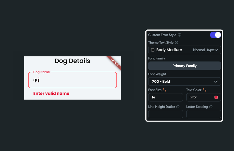
You can also change the text styling for the error message. To do so, head over to Properties Panel > Input Decoration Properties > enable Custom Error Style and change the text styling.
Adding Icon
You might want to add an icon inside the TextField, either at the start or end. You can do so using the Leading and Trailing Icon property.
To add a leading or trailing icon, move to the Properties Panel > find the Leading and Trailing Icon property > Click on the None button > search and select the icon.
You can also customize the icon's size and color.
![]()
Using TextField for Passwords
To make a TextField a Password Field, move to the Properties Panel > Additional Properties > enable the Password Field.
When you enter a password, it will be obscured with the dot (•). You can see and confirm the entered password by clicking on the
Toggle Hide Password Icon. You can also customize its size and color.

Clear TextField
A clear field icon inside the TextField allows the users to quickly remove the entered text.
To clear a TextField, move to the Properties Panel > Additional Properties > enable the Show Clear Field Icon. You can also customize the icon's color and size.
Adding Clear Text Fields/Pin Codes [Action]
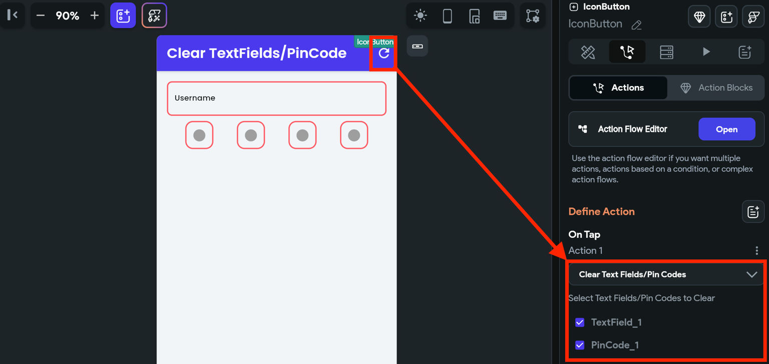
This action lets you clear the values from single or multiple TextField and PinCode widgets. This comes in handy while implementing a form inside your app, and you want to let the user reset the form with one click.
Follow the steps below to add this action to any widget.
- Select the Widget (e.g., IconButton, Button, etc.) on which you want to add the action.
- Select Actions from the properties panel (the right menu), click + Add Action button.
- Search and select the Clear Text Fields/Pin Codes (under Widget/UI Interactions) action.
- Select the TextFields and PinCode widgets you want to reset.
Autofocusing TextField
When you autofocus a TextField, it mimics the tap event and immediately shows the keyboard. This makes TextField ready to receive input from you without having you click on TextField.
To autofocus a TextField, select the TextField widget, move to the Properties Panel > Additional Properties > enable the Autofocus property.
Enable Interactive Selection
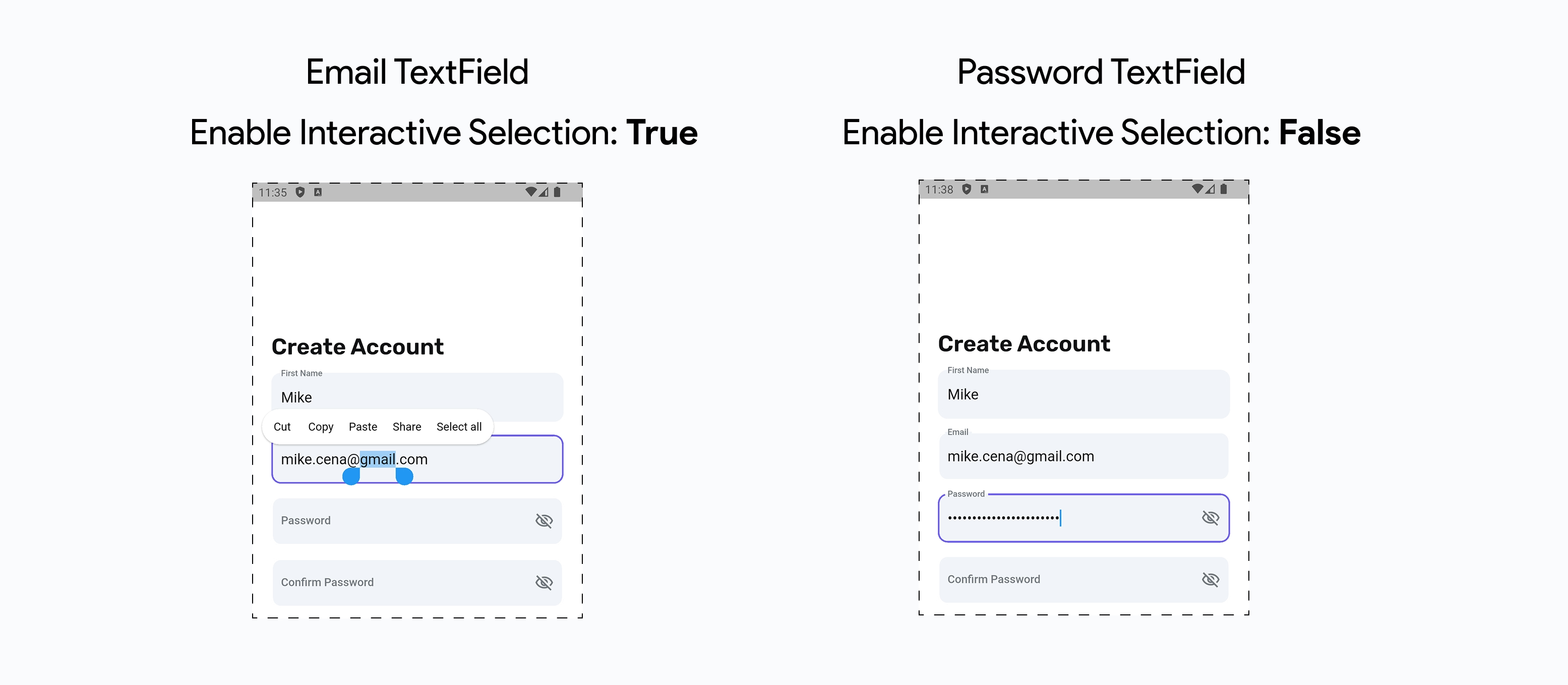
The Enable Interactive Selection toggle controls whether users can interact with the text selection features, such as long-press selection, copy/paste menus, and selection handles.
By default, this property is set to True, allowing users to select, copy, and paste text using the platform's built-in text selection controls. Disabling this can help prevent unintended text copying or editing, especially in sensitive fields.
Autocomplete a TextField
You might want to allow users to enter the text by suggesting them a list of items. The suggested items are shown if it contains the currently entered text from TextField. For example, using autocomplete to get the Country name, Fruit name, etc.
This helps avoid spelling mistakes and enhances the user experience as users won't have to enter the complete text.
To autocomplete a TextField, select the TextField widget, move to the Properties Panel > Additional Properties > enable the Autocomplete property.
Now you can customize the autocomplete using the Autocomplete Properties section. Here's how you do it:
- Inside the Autocomplete Options, click Add Option and provide item names that you would like to appear in the suggestion box.
- You can also Set from Variable to show items from any variable, such as app state variable, API response, and Firestore collection.
If you Set from Variable and run the app in preview mode, you can try entering the country name. The list will be populated with matching countries.
- You can also customize the appearance of the suggestion box using properties such as Height, Elevation, Background Color, and Highlight Color (highlighting the currently selected option in the dropdown list).
- To style the text displayed inside the dropdown list, you can use the Option Text Style and Substring Style (can be used to highlight the matching text in an item name).
Auto Fill Hint
When Auto Fill Hint property is enabled, it uses the operating system's autofill service to suggest the relevant information to the user, such as usernames, passwords, or credit card numbers, based on the context of the text field.
For example, you have a form where the user needs to enter their credit card information. You can use this property to help the autofill service suggest the user's credit card number and expiration date.
To enable the Auto Fill Hint property:
- Select the TextField widget, move to the Properties Panel > Additional Properties > enable the Auto Fill Hint property.
- Set the Auto Fill Hint Options to one that you want to provide a hint about.
The availability and behavior of the Auto Fill Hint may vary by platform and user settings, and it does not guarantee that the operating system's autofill service will suggest the correct information to the user.
Update Page on Change
You might have added the TextField widget inside the search page and want to refresh the search result as the value inside the TextField changes.
Enabling this feature will refresh the page whenever a user types into TextField after a configurable delay.
Here's an example of displaying the TextField value in a Text widget in realtime:
- Select the TextField widget, move to the Properties Panel > Additional Properties > enable the Update Page On Change property.
- Also, set the Update Delay (ms), which specifies the time interval after the user stops typing before the page refreshes its UI. For example, if the Update Delay (ms) value is set to 2000 ms (2 seconds), the page will update 2 seconds after the user stops typing. For this example, let's set it to 0 ms.
- Now select the Text widget, move to the Properties Panel > Set from Variable > Widget State > [TextFieldName]. Tip: You can also set the default value to be displayed until the user has entered any text.
We advise setting the delay value if you make an API call that accepts the input from TextField.
Read only TextField
Sometimes you might want to restrict users from entering or updating anything into TextField and only allowed it if they are in edit mode. You can accomplish this by switching the Read Only property.
Change Cursor Color
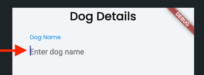
In a form with many text fields, changing the cursor color for the currently focused field can help the user understand where their input will go when they start typing.
To change the cursor color, head over to Properties Panel > Additional Properties > change the Cursor Color.
Changing Keyboard Type
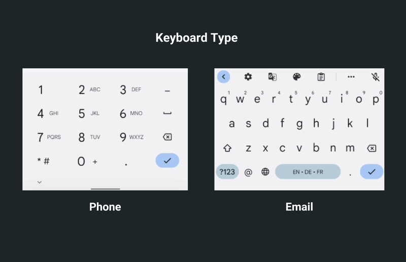
When the keyboard opens by default, you can type any text. You might want user input in a certain format, such as a phone number, email address, website URL, etc. In this situation, you can choose a predefined keyboard type to present the appropriate key selections.
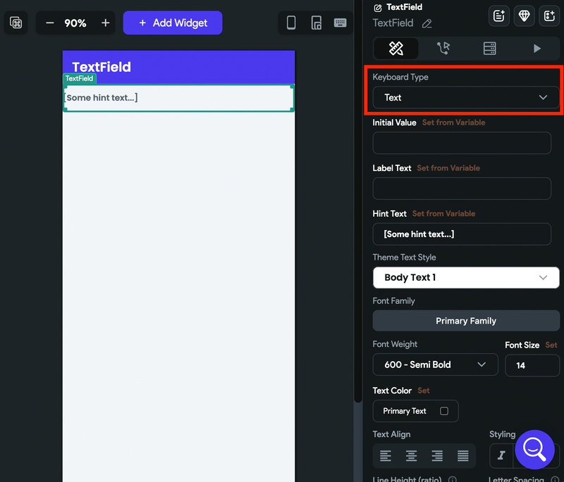
To change the keyboard type, select the TextField widget, move to the Properties Panel > Additional Properties > set the Keyboard Type to the right one.
Masking Input
You might want to allow users to provide input in a specific format. For example, if you want a date in a format like MM/DD/YYYY, where all input must be a number, and its length should not exceed eight digits. You can do so by formatting the user input using the specific mask.
To mask the user input, select the TextField widget, move to the Properties Panel > Additional Properties > set the Mask dropdown to the one you need.
If the required format is not on the list, you can select Custom and specify the Custom Mask. The '#' sign represents the number, and 'A' represents a letter. Here are some examples of Custom Masks:
| Input | Custom Mask |
|---|---|
| Credit card number (e.g., 3424 4353 5453 3535) | #### #### #### #### |
| Custom date (e.g., 12-Jan-2023) | ##-AAA-#### |
Filtering Input
You might want to restrict the type of characters that can be entered into a TextField. Let's say you are building an app that requires its employees to enter their employee ID when they clock in and out for their shifts. The employee ID consists of only letters and numbers, and the app should only allow these characters to be entered. You can do so by filtering the user input
To filter the user input, select the TextField widget, move to the Properties Panel > Additional Properties > set the Filter dropdown to the one you need.
Validating Input
You can validate the TextField value by wrapping it inside the Form widget and adding the validation criteria.
Filtering ensures that only the allowed characters or values are entered, whereas the validation checks the entire input data against certain criteria. Both techniques can be used together or independently to ensure the correctness of user input in a TextField widget.
Capitalization
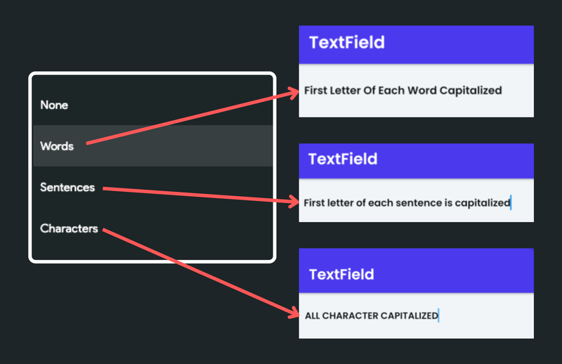
You might want to control the capitalization of text when the user is typing, and also when the text is displayed. The Capitalization property allows you to specify how the text entered in the TextField should be capitalized.
This property accepts one of the following values:
- None: This value means that no capitalization should be applied to the text. All the characters will be displayed as they are typed.
- Words: This value capitalizes the first letter of each word in the text.
- Sentences: This value capitalizes the first letter of each sentence in the text.
- Characters: This value capitalizes every character in the text.
To set the capitalization, select the TextField widget, move to the Properties Panel > Additional Properties > set the Capitalization dropdown to the one you need.
Submit Type
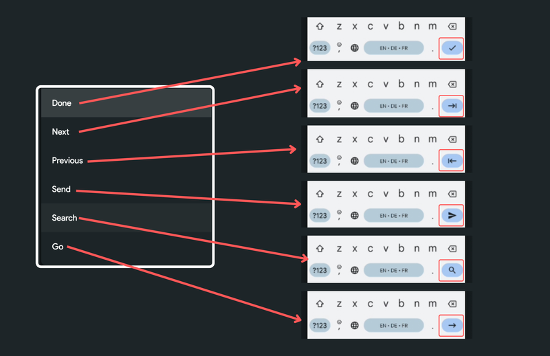
Showing a particular action on a keyboard can be useful in guiding users on what to do next. For example, if you have a search bar, you can display a "Search" button on the keyboard. When tapped, instead of moving to a new line or closing the keyboard, you can execute a search function. This can improve user experience by providing more intuitive keyboard actions based on the context of the input.
This property accepts one of the following values:
- Done: This closes the keyboard.
- Next: This moves focus to the next field.
- Previous: This moves focus to the previous field.
- Send: This represents the Send action.
- Search: This represents the Search action
- Go: This represents the Go action.
To set the submit type, select the TextField widget, move to the Properties Panel > Additional Properties > set the Submit Type dropdown to the one you need.
Set Max Character Length
Sometimes, you might want to specify the maximum number of characters users can enter into the TextField. When the user types or pastes text into the field and reaches the specified character limit, they won't be able to input more characters, or the TextField will visually indicate that the limit has been reached.
For example, When users can leave comments or post messages (similar to 'tweet'), setting a maximum character length can help prevent spam or excessively lengthy responses.
To set the max character limit, select the TextField widget, move to the Properties Panel > Additional Properties > set the Max Length (number of characters you want to allow), and set the Max Length Enforcement to one of the following values:
- Not Enforced: This allows users to input extra characters and displays a warning when the limit is exceeded.
- Enforced: This always truncates any additional character once the limit is reached.
You can also hide the maximum character count by enabling the Hide Max Length Counter option.
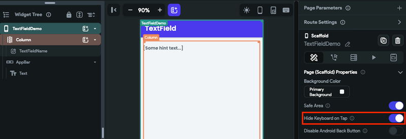
Hiding Keyboard on Tap
Hiding the keyboard when the user taps outside of a TextField is a common user experience pattern that many apps use to improve usability. When the keyboard is open, it can obscure important information on the screen and make it difficult for the user to interact with other parts of the app.
Adding this behavior in your app can make it easier for these users to interact with other parts of the app without interference from the keyboard. It can also make your app feel more polished and professional.
To hide/close the keyboard, select the page, move the Properties Panel > enable the Hide Keyboard on Tap.
Focus Change Event
Sometimes, you may need to know whether a TextField is being used or not. For example, you can turn other parts of the app on or off depending on if the TextField is active. Also, you can start animations when someone starts or stops typing in the TextField.
Let's see an example of controlling the visibility of a Text widget based on the TextField's Focus state.
To do so:
- On a Text widget, add a Conditional Visibility based on the TextField's Focus state. You can access via Set from Variable menu > Widget Focus State > [TextField name].
- Now, on a TextField widget, under the On Focus Change callback, simply add an action to refresh the page by adding the update app state variable.
Trigger Action / Listen Callback
The TextField widget provides you with two types of actions (aka callbacks):
- On Submit: Actions under this will be triggered when you finish entering the text in the TextField widget. i.e., pressing a done button inside the soft keyboard.
- On Change: Actions under this will trigger when you enter or delete a character in the TextField widget.
- On Focus Change: Actions under this will trigger when the focus state changes on a TextField. This means when users click on it to type or click away from it.
Be careful about adding the actions under the On Change. Specifically, you should avoid adding any action that will take more time.
- On Submit
- On Change
- On Focus Change
To trigger an action:
- Select the TextField widget from the widget tree or canvas area.
- Select Actions from the Properties panel (the right menu), and click + Add Action.
- Select the Type of Action among the On Submit, On Change, and On Focus Change.
- Now you can add any action here.
Video guide
If you prefer watching a video tutorial, here's the one for you: