DataTable (Paginated)
The DataTable is a widget used to display data in a table format. It organizes information into rows and columns, similar to a spreadsheet, making it easier to read and understand large amounts of data.
For example, you could use it to display a list of employees in a company, with each row representing an individual employee and the columns showing the employee's name, age, department, and salary.
Additionally, this widget supports pagination, which can handle large datasets by displaying them in manageable chunks.
Adding DataTable widget
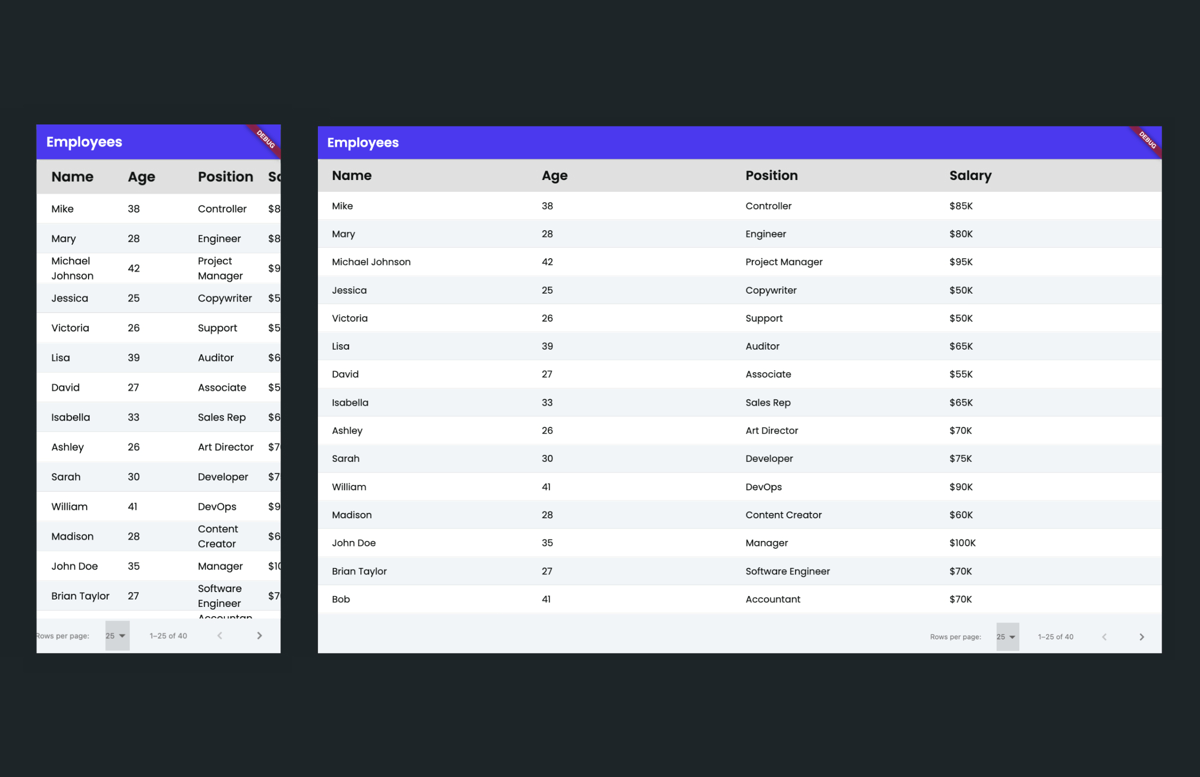
Let's see how to add a DataTable widget by building an example that shows a list of all employees in a company. Here's how it looks:
The steps to add DataTable and display the employees' details are:
- Open the Widget Palette and locate the DataTable widget under the Layout Elements tab. You can drag it into your desired location or add it directly from the widget tree or canvas area.
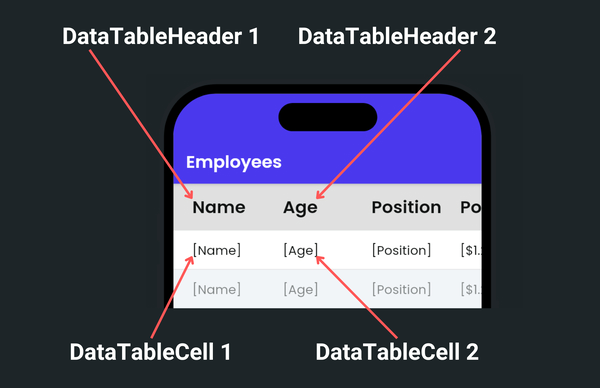
- It adds two types of predefined widgets:
- DataTableHeader: This refers to the top row of the table, which displays the names of the columns. To change its text, click on the DataTableHeader > Text widget, move to the properties panel and give it a name.
- DataTableCell: This displays the actual data. By default, it comes with the Text widget. However, you can replace it with any other widget based on your requirements.
- By default, it shows three columns. To show more, select the DataTable widget, move to the properties panel > Paginated Data Table Properties > enter the Number of Columns you want.
- For the demonstration purpose, let's display data from Firestore:
- First, ensure you have created a collection.
- It's important to note that, unlike other widgets, you cannot directly have a backend query on the DataTable widget. Because if you do so, you won't have access to the query result (list of employees) for further use, such as sorting and searching. Hence, getting the backend query result on a parent widget and then using that result to populate DataTable is advisable.
- For this example, on page load, we'll add a Query Collection action and save the result in a page state variable.
- On the DataTable widget, generate dynamic children using the page state variable (which holds a list of employees).
- Display data in the DataTableCell > Text.
Sorting
The way sorting works in a DataTable is as follows: first, you mark the column to sort. Then, whenever a user clicks on a header, you receive an OnSortChanged callback with two properties: Sorted Column Index and Is Ascending. You consume both properties in a custom function to write a sorting logic.
Sorted Column Indexspecifies the column by which the data should be sorted (0 for first column, 1 for the second column and so on).Is Ascendingdetermines the sort direction (true for ascending order, false for descending order).
Remember, sorting is not performed automatically by the DataTable widget. It provides you the flexibility to implement your own sorting logic through a Custom Function.
Let's extend the previous example and see how you can enable sorting on columns. Here's how it looks:
To enable sorting:
- Select the DataTableHeader, move to the Properties Panel, and turn on the Sortable toggle. Apply this to each column you want to sort
- Select the DataTable widget, select Actions from the Properties panel, and open Action Flow Editor.
- Select the On Sort Changed. Actions added under this will be triggered whenever the user clicks on any column header that has sorting enabled.
- For this example, we update the same page state variable (that populates the DataTable) with the sorted data using the following custom function.
List<EmployeesRecord> sortMyData(
  List<EmployeesRecord> listToSort,
  bool isAsc,
  int sortColumIndex,
) {
  /// MODIFY CODE ONLY BELOW THIS LINE

  // Sort by 'name' for 0, 'age' for 1, 'position' for 2 in code.
  switch (sortColumIndex) {
    case 0:
      listToSort.sort((a, b) => a.name.compareTo(b.name));
      break;
    case 1:
      listToSort.sort((a, b) => a.age.compareTo(b.age));
      break;
    case 2:
      listToSort.sort((a, b) => a.position.compareTo(b.position));
      break;
    default:
      break;
  }
  if (!isAsc) {
    listToSort = listToSort.reversed.toList();
  }
  return listToSort;

  /// MODIFY CODE ONLY ABOVE THIS LINE
}
Searching
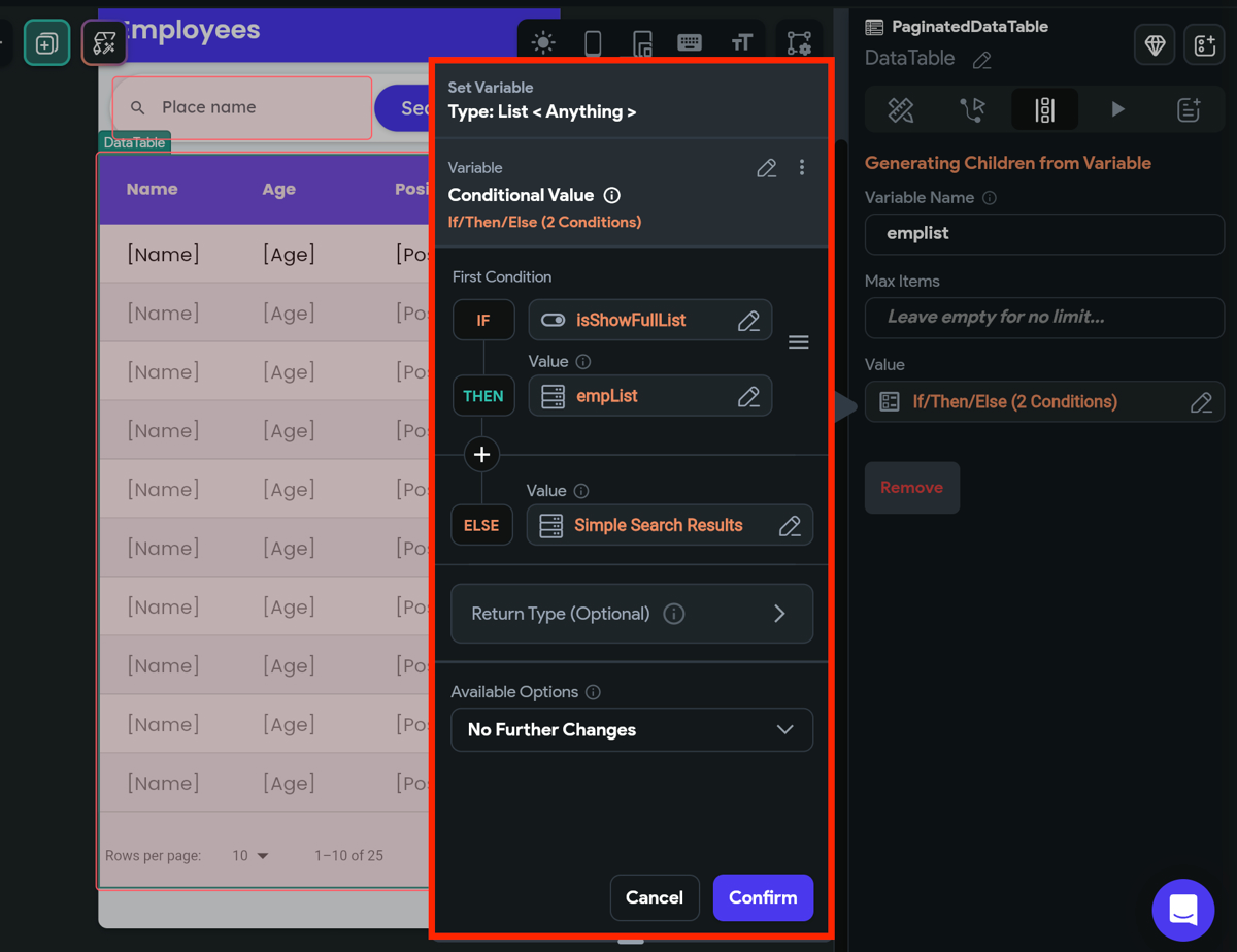
You can add search functionality to the DataTable widget using our Simple Search feature. However, for this specific widget, instead of using a Conditional Builder widget, you can directly utilize the Conditional Value to determine which result to display based on the IsShowFullList variable.
Selecting rows
You might want to allow users to select one or more of its rows for tasks like editing, deleting, or performing specific actions on the selected data. For example, preparing a list of promoted employees from the main employee listing.
To achieve this, create a page state variable to store the selected list. Upon button click, update this variable with the chosen selections from the DataTable. Note that the DataTable provides a list of selected row indices; you'll need a custom function to retrieve the actual rows corresponding to these indices.
Here are the exact steps:
- First, create a page state variable that will hold the list of selected rows.
- Select the DataTable, move to the Properties Panel > Paginated Data Table Properties > turn on the Selectable toggle.
- On button click, update the page state variable with the selected rows. While adding this action, use the following custom function to retrieve the selected items based on the indices. You can get the list of selected rows indices via Widget State > DataTable Selected Rows.
- Optionally, you could pass this variable to a new page to display the selection.
Custom function:
List<EmployeesRecord> findPromotedEmps(
  List<EmployeesRecord> allEmps,
  List<int> selecteEmpsIndex,
) {
  // MODIFY CODE ONLY BELOW THIS LINE
  // return allEmps based on selecteEmpsIndex
  List<EmployeesRecord> promotedEmps = [];
  for (int i = 0; i < selecteEmpsIndex.length; i++) {
    int index = selecteEmpsIndex[i];
    if (index >= 0 && index < allEmps.length) {
      EmployeesRecord emp = allEmps[index];
      promotedEmps.add(emp);
    }
  }
  return promotedEmps;
  /// MODIFY CODE ONLY ABOVE THIS LINE
 }
Get notified on page changed
You might want to get a callback whenever a user taps on the next page of the DataTable. For example, to make an API call to retrieve the data for the next page.
To do so:
- Select the DataTable widget.
- Select Actions from the Properties panel and open Action Flow Editor.
- Select On Page Changed. This callback gives you the Current Row Index, which is the index of the first row of a new page. For example, if you have 25 items (0-24) on the current page, the Current Row Index value will be 25. This is helpful in APIs that fetch a fixed set of data by specifying a starting position (offset).
- Now, add an action to call the paginated API (that returns the result in chunks). See how to add the paginated API call by adding query parameters. For this example, we use this API: https://reqres.in/api/users?per_page=7&page=1. Note: this API uses page-based rather than offset-based pagination, requiring manual adjustment of the page variable.
- On the success of the API call, you can add an action to append the new data in the current list. For this, you can add the following custom function to add new results to existing data.
List<UserStruct> addAlldatatoList(
  List<UserStruct> currentUsersList,
  List<UserStruct> newUsersList,
) {
  /// MODIFY CODE ONLY BELOW THIS LINE

  // add all newUsersList to currentUsersList
  currentUsersList.addAll(newUsersList);
  return currentUsersList;

  /// MODIFY CODE ONLY ABOVE THIS LINE
}
Get notified on rows per page changed
Sometimes, you might want to get a callback when a user changes the number of rows to display on a page. This is helpful for dynamically adjusting data fetch requests based on user preferences.
This is how you do it:
- Select the DataTable widget.
- Select Actions from the Properties panel and open Action Flow Editor.
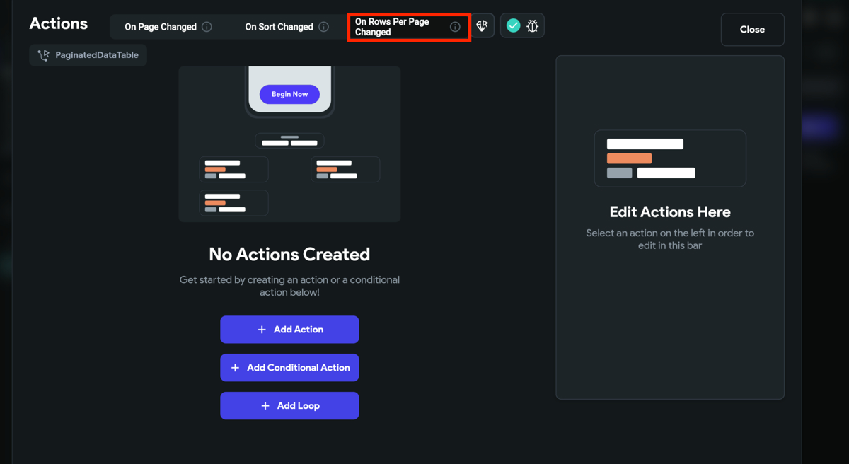
- Select On Rows Per Page Changed. Any actions added under this will be triggered when the number of displayed rows is changed.
- Now, you can add any action here.
Customizing
You can customize the appearance and behavior of this widget using the various properties available under the properties panel.
Configure paginated DataTable
To configure the paginated DataTable, move to the Properties Panel > Paginated Data Table Properties and then:
- To hide the pagination, turn on the Hide Paginator toggle.
- To display buttons to navigate to the first and last page of the DataTable, turn on the Show First And Last Buttons.
- To have a normal DataTable without pagination, turn off the Paginated toggle.
Typically, setting the size explicitly isn't necessary for a DataTable, as it's designed to showcase large datasets and should utilize all available space. However, to enable horizontal scrolling in the DataTable (when content exceeds screen width), you must specify the Min Width.
Adjust row and column spacing
To modify the row and column spacing, move to the Properties Panel > Layout Properties and then tweak the following properties:
- Header Row Height: This changes the height of the header.
- Data Row Height: This changes the height of all the rows.
- Column Spacing: This changes the distance between columns.
Customize DataTable color
To modify the DataTable color, navigate to the Properties Panel > Style Properties, where you can set colors for various elements:
- Header Row Color: This changes the background color of the header row.
- Row Color: This sets the background color for all rows.
- Alternate Row Color: This allows for a different background color for alternate rows.
- Sort Icon Color: This alters the color of the sort icon used in sortable columns.
Adjust border radius
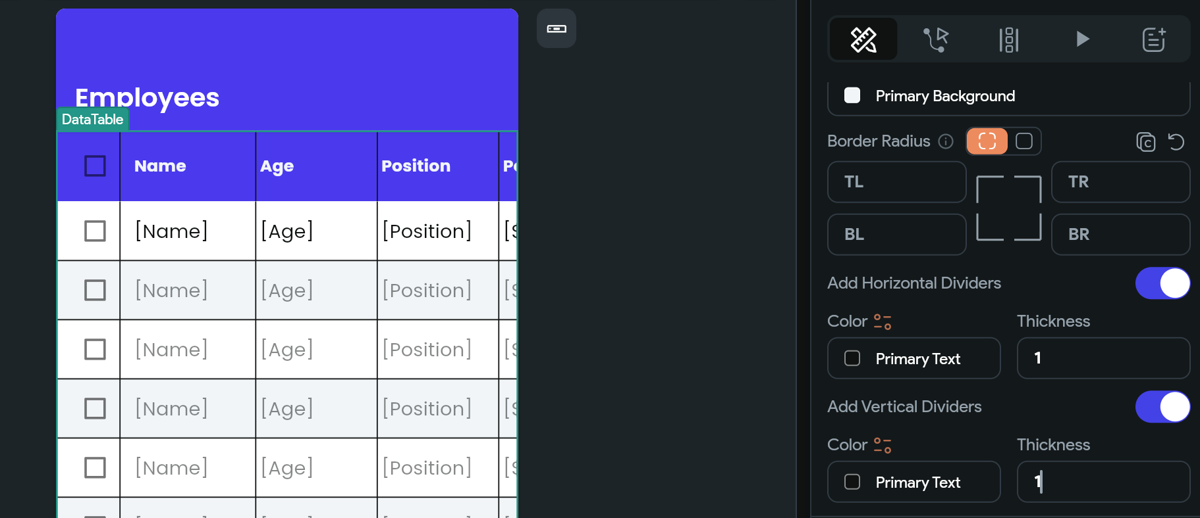
To add the rounded corner to the DataTable, navigate to the Properties Panel > Style Properties > Border Radius and then:
- Enter values for TL (Top left), TR (top right), BL (bottom left), and BR (bottom right).
- To apply the same radius on all sides, switch to the Uniform Radius option. You can then adjust the radius by either moving the slider or entering the desired value directly.

Add dividers
To add horizontal and vertical dividers inside the DataTable, navigate to the Properties Panel > Style Properties > turn on the Horizontal and Vertical Dividers.
After enabling, you can also change its Color and Thickness.
Customize checkbox colors
When rows are selectable, you can customize the appearance of the checkbox by adjusting the following color properties:
- Selected Fill Color: Sets the background color of the checkbox when it is selected.
- Unselected Fill Color: Sets the background color of the checkbox when it is not selected.
- Unselected Border Color: Changes the border color of the checkbox when it is not selected.
- Selected Border Color: Changes the border color of the checkbox when it is selected.
- Check Color: Alters the color of the checkbox mark itself when selected, providing visual feedback to users about their selection status.