Common Widget Properties
When working with widgets in FlutterFlow, you'll encounter properties and features that are common across multiple widget types. Below is a detailed overview of such properties.
Visibility
Visibility settings in FlutterFlow allow you to dynamically control when and how widgets appear in your app.
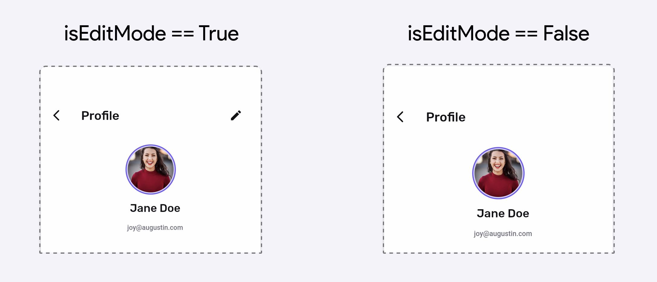
Conditional
Conditional visibility allows you to control the display of UI elements (widgets) based on specific conditions or criteria. It helps you create dynamic, personalized experiences by showing or hiding certain content.
For example, you could display specific features or actions only to users with particular roles, such as showing admin controls exclusively to administrators.
The Show in UI Builder toggle only affects visibility within the design canvas, giving you a quick preview of how the layout will adjust when this widget is shown or hidden.
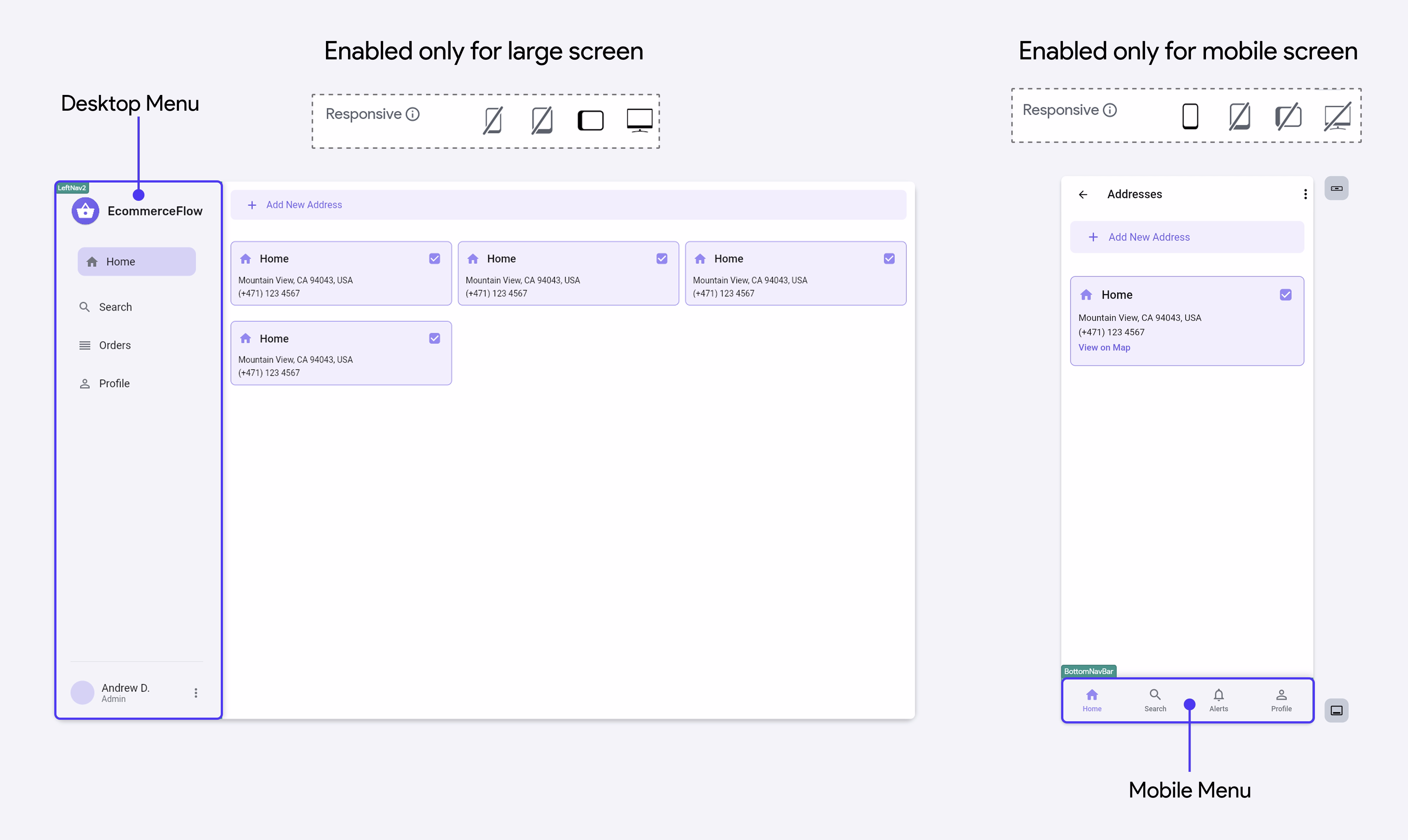
Responsive
The Responsive visibility property allows you to show or hide widgets based on device screen size, such as mobile, tablet, or desktop. By toggling each icon, you can show or hide the widget according to your design needs.
For example, you might create two separate navigation menus:
- Desktop Menu: A wider, left-aligned menu only visible on large screens by enabling the desktop icon and disabling all other screen size icons.
- Mobile Menu: A compact drawer menu only visible on smaller screens by enabling the phone icon and disabling all other screen size icons.
Opacity
The Opacity property controls how transparent or visible a widget appears. It accepts a value between 0 and 1, where 0 means fully transparent, 1 is fully opaque, and 0.5 results in semi-transparency.
This property enables a wide range of creative UI effects, such as translucent buttons, overlay highlights, or smooth theme transitions.
When Animated Opacity is enabled, any changes to the opacity value are smoothly animated based on the specified duration and curve, enhancing visual appeal and user experience.

Padding
Padding is the space added inside a widget, between its content and its border (or edge). It ensures the content doesn't touch the borders, creating visual breathing room and contributing to a cleaner, more responsive layout across different screen sizes.
To set padding, select the widget, go to the Padding & Alignment > Padding section in the Properties Panel, and enter the values in pixels (px), which represent logical pixels.
You can choose from two options:
- Uniform Padding: Apply the same value to all four sides.
- Independent Padding: Set different padding values for top, bottom, left, and right.
If you prefer watching a video tutorial, here is the guide for you:
Alignment
Alignment determines how a widget is positioned within its parent container. It helps you control where your widget appears—left, right, center, top, bottom, or any point in between.
To set alignment, select the widget and go to the Padding & Alignment > Alignment section in the Properties Panel. You'll see a 3×3 grid representing all nine positions:
- Top Left
- Top Center
- Top Right
- Center Left
- Center (Default)
- Center Right
- Bottom Left
- Bottom Center
- Bottom Right
Simply click the dot representing where you'd like the widget to be positioned. Alternatively, you can input a specific value (between -1 to 1) for the precise horizontal and vertical alignment.
- X (Horizontal Alignment) controls the widget’s position along the horizontal axis within its parent. A value of
-1aligns it to the left,0centers it, and1aligns it to the right. - Y (Vertical Alignment) controls the widget’s position along the vertical axis. A value of
-1places it at the top,0centers it vertically, and1places it at the bottom.
Values beyond this range will push the widget outside the visible screen area.
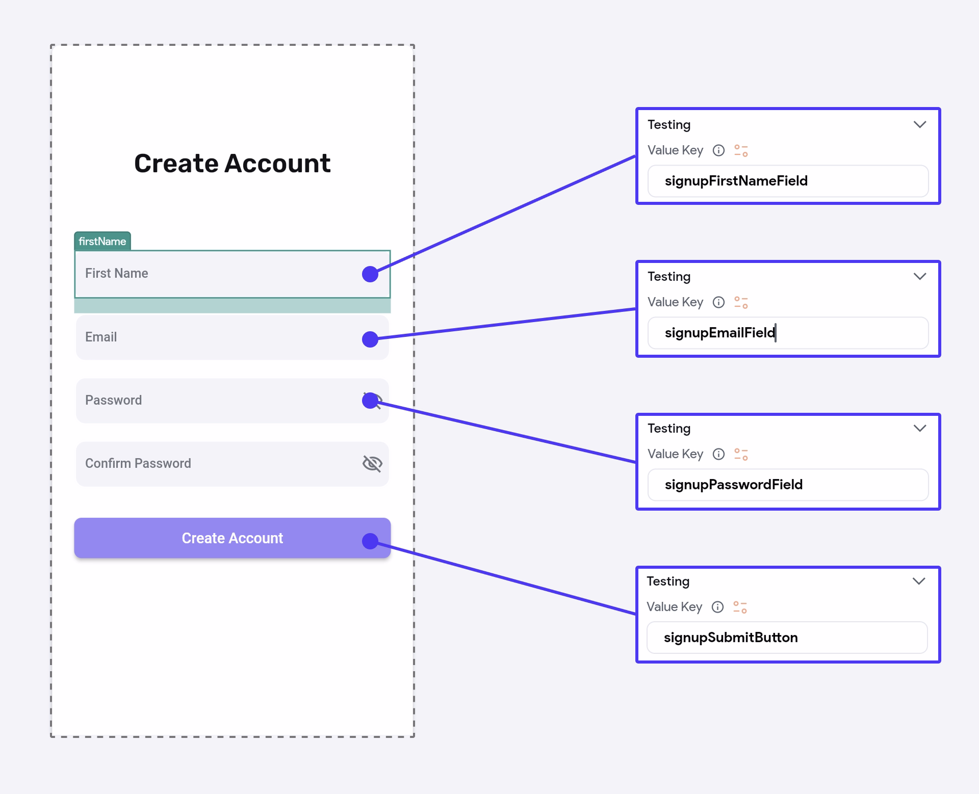
Add Testing Value Key
A Value Key is used to uniquely identify widgets during Automated Testing in FlutterFlow. For example, on a Create Account page, you might use descriptive keys like signupFirstNameField, signupEmailField, signupPasswordField, and signupSubmitButton. This helps testing tools reliably locate and interact with the correct widgets. For more details, refer to the complete guide here.
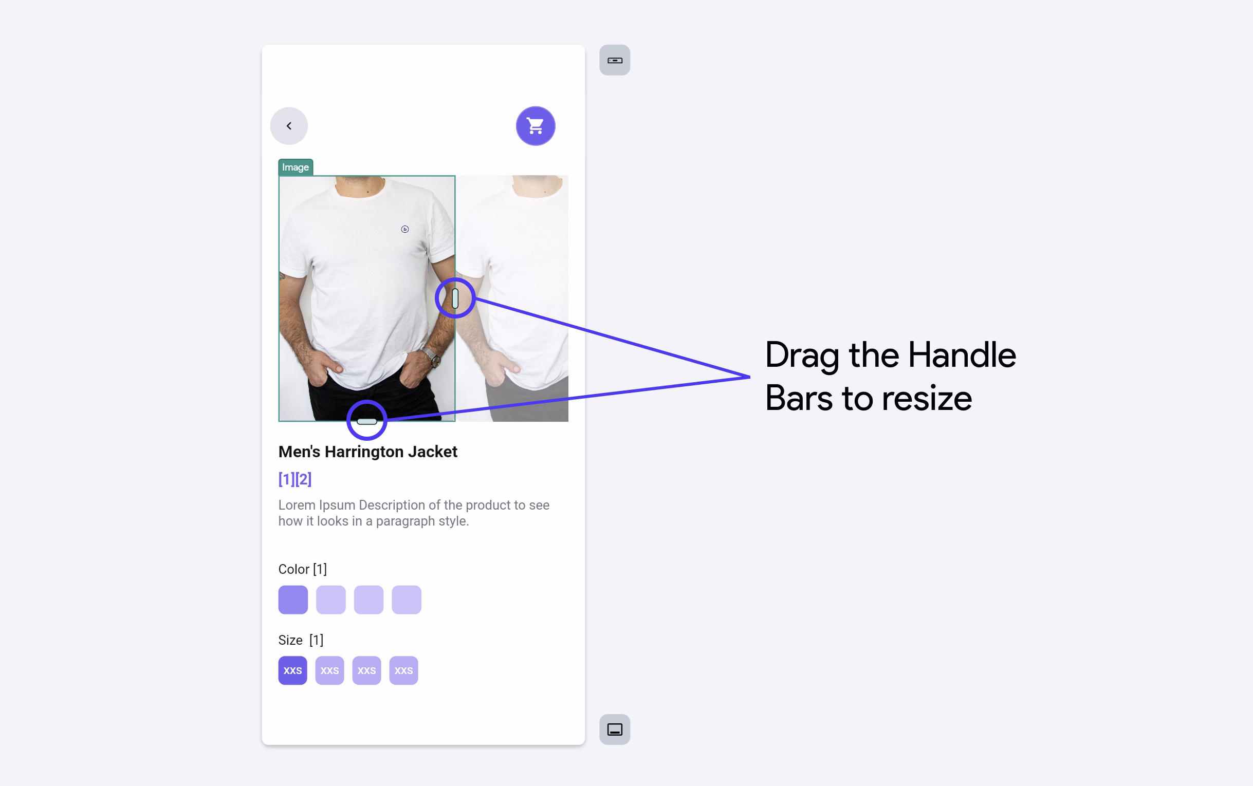
Set Width & Height
To adjust a widget's size, click on the widget you wish to resize and navigate to the right-side Properties Panel. There, you can set the size in the following ways:
- PX (Pixels): Enter a fixed size in pixels for a consistent dimension.
- % (Percentage): Set the size relative to the screen or parent container.
- ∞ (Infinity): Make the widget expand to fill the available width or height.
You can also drag the handle bars on the right and bottom sides of a selected widget to resize. The measurements appear while resizing to show the current pixel values.
You can also use a Responsive Value to apply different width or height values based on screen size. To set it up, open the Set from Variable menu and select Responsive Value. Then, assign specific size values for each screen size category, such as mobile (Screen Width < Breakpoint Small), tablet (Screen Width < Breakpoint Medium), and desktop (Screen Width < Breakpoint Large).
Use Keyboard to Adjust Property Values
You can quickly increase or decrease the property value using your keyboard's up and down arrow keys. This allows for precise control without needing to type in new values each time.
Hold down the Shift key while pressing the arrow keys to change the value by 10 units at a time.
Change Color
To change the color, navigate to a widget property that allows you to set a color, and then click on the currently selected color. This opens the Color Picker, where you have multiple ways to set the desired color:
- Custom Color: Use the gradient area to select any shade and fine-tune it using:
- The hue slider (rainbow bar) to adjust the base color.
- The transparency slider (checkered bar) to control opacity (alpha value).
- Use RGB or HEX: Manually input a HEX code (e.g.,
#A489F5) or set the RGB values directly for precise color control. The Alpha (A) value defines transparency (e.g., 100% = fully opaque). - Theme Colors: Below the picker, you’ll find a list of your app’s predefined Theme Colors like Primary, Secondary, and Background. Using theme colors ensures design consistency across your app and makes global updates easier.
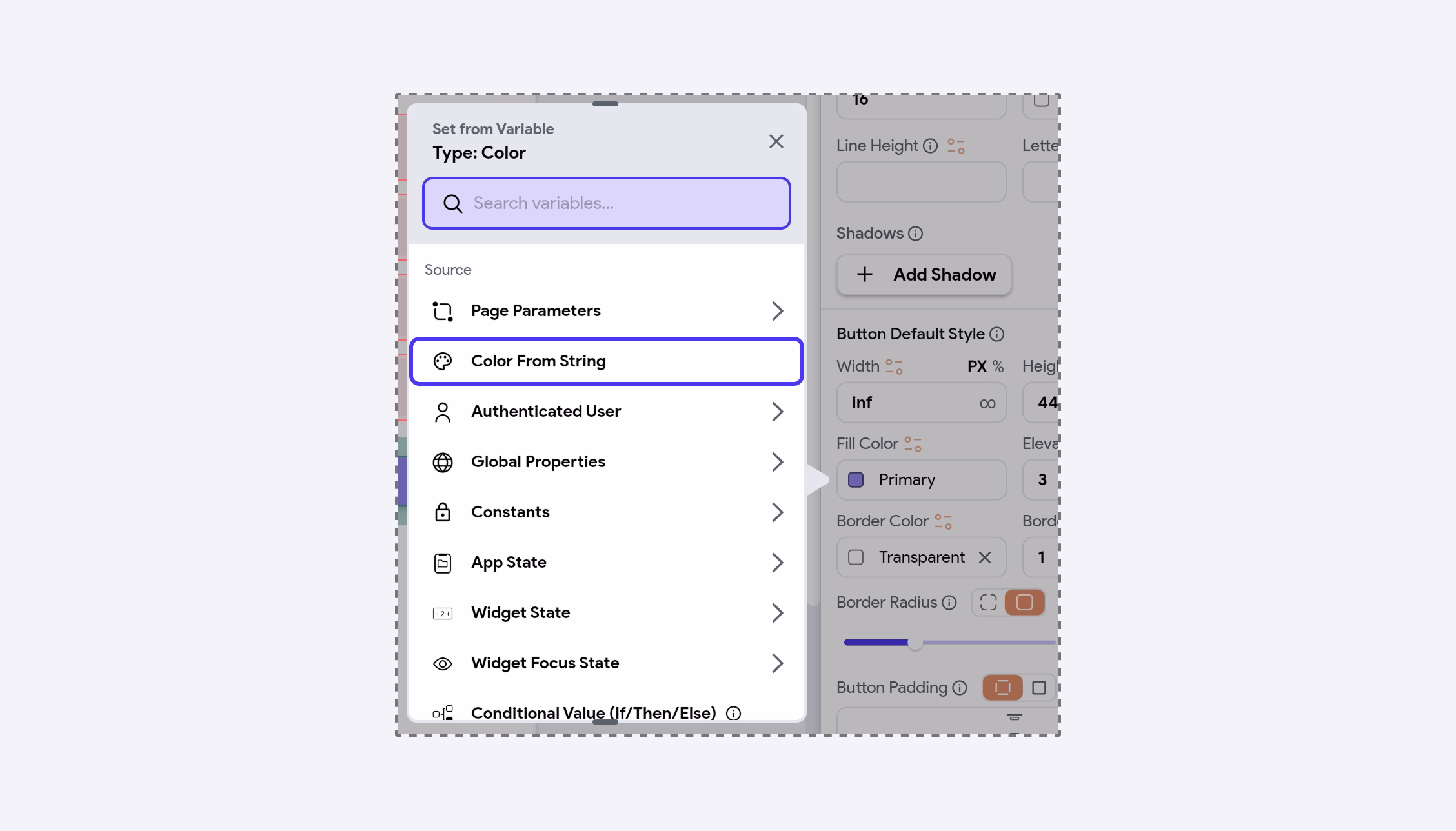
- Set from Variable: You can also dynamically assign a color based on your app logic. For example, changing the background color based on the selected item or theme.
You can also assign a color using a String variable that contains a CSS-style color value (e.g., "#FF5733", "rgba(255, 87, 51, 1)", or "red"). This is especially useful when colors are stored in a database or returned from an API. Make sure the string format follows valid CSS color syntax, as FlutterFlow uses the from_css_color package under the hood to parse these values.
This allows you to dynamically theme parts of your app based on user preferences or remote configurations.
Copy Variable��
If you’ve created a complex variable value (e.g., using Conditional Logic) and want to reuse the same logic elsewhere, you can easily do so by copying the variable.
To copy and paste a variable, open the Set from Variable menu, click the three dots, and select Copy Variable. Then go to the target location, open the same menu, click Paste Variable, and confirm.
Bulk Edits Properties
You can easily modify the properties of multiple widgets at once. For example, if you want to change the background color of several buttons from blue to green, there's no need to edit each one individually. Simply select all the buttons and update their fill color in one go.
To do this, hold down the Shift key and click on each widget you want to edit. Once selected, their shared properties will appear in the Properties Panel, where you can apply changes.
Use Images from Unsplash
You can easily display high-quality images directly from Unsplash using the Properties Panel. Just click the search icon, type in your desired keyword, and select an image from the results.
You can also choose the image size (i.e., Small, Regular, or Full) before adding it, depending on your layout.
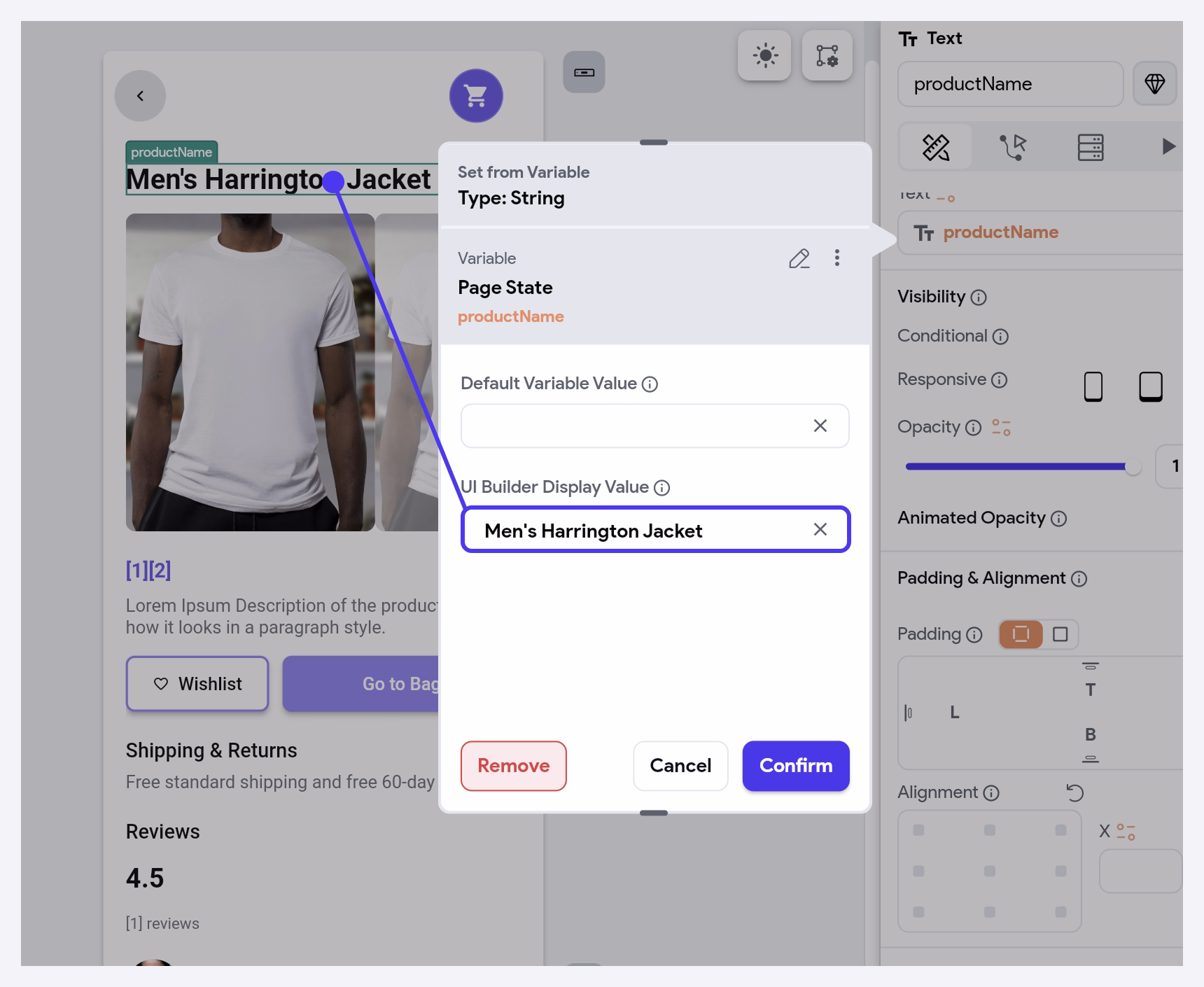
UI Builder Display Value
For widgets like Text and RichText, if the content is set from a variable, you can add a placeholder value that appears only in the FlutterFlow builder. This placeholder helps you visualize how the text will look on the canvas, but it won’t appear in the live app, it's replaced by the actual variable at runtime.
This is especially helpful for previewing layout, spacing, and alignment without removing or disrupting your variable bindings.
Adding Border
You can add a border to any widget using the following properties:
- Border Color: Choose a color manually or bind it to a variable. You can select from your theme colors (like
Primary) or use the color picker. - Border Width: Set the thickness of the border in pixels.
- Border Radius: Adjust how rounded the corners should be using the options below:
- Independent Radius: Set different radius values for top, bottom, left, and right.
- Uniform Radius: Apply the same value to all four sides. The slider and numeric input allow you to have precise control.
- Button Padding: Controls the space inside the widget (between the content and the border).
Use consistent border and padding styles for buttons, cards, and containers to maintain a clean and cohesive UI.