Text
Text is a fundamental element in any user interface, used to convey information and interact with users. In app development, effectively presenting text can significantly enhance the user experience, making information accessible and interactions intuitive. Two common widgets used for displaying text in FlutterFlow are the Text widget and the RichText widget. Each serves a distinct purpose and offers different capabilities for integrating text into an application.
Text Widget
The Text widget is used to display a piece of text on the screen. It's one of the most commonly used widgets in app development.
For example, in this screen, the Text widget is used to present different pieces of information clearly and effectively. The Text widgets display the product name, "Men's Harrington Jacket," its price, "$148," and a detailed description of the product. These Text widgets are styled differently to emphasize specific pieces of information.
The Text widget can be found under the Base Elements tab in the Widget Palette. You can either drag it to your desired location on the screen or insert it directly via the widget tree.
Once the Text widget is selected, the Properties Panel on the right side becomes active, allowing you to customize the styling of your Text widget. Here, you can adjust various attributes such as font size, color, alignment, and more to tailor the appearance to fit your design needs.
RichText Widget
The RichText widget offers more elaborate formatting capabilities compared to the basic Text widget. It allows for the mixing of multiple styles within a single text sequence, enabling the creation of stylized textual content.
This widget uses a tree of TextSpan objects to define the rich formatting options, including different fonts, sizes, and colors for various parts of the text. RichText is particularly useful for text-heavy applications that need inline styling and linking, like in a formatted article or a document viewer.
The RichText widget can be found under the Base Elements tab in the Widget Palette. You can either drag it to your desired location on the screen or insert it directly via the widget tree.
When the RichText widget is added to your widget tree, FlutterFlow automatically creates two RichTextSpan child objects. You can modify the text value and styling of each object to create multiple styles within your paragraph.
To modify the RichTextSpan objects, see the quick demo below:
Common Text Styling Properties
For consistency, we recommend defining your Typography and custom text styles from Theme Settings > Typography & Icons before creating any screens.
Few things to note:
-
Line Height: Sets the height of the text (e.g. a value of 1.5 would make the line height 50% larger than the font size.
-
Text Align: Define how text is positioned within a container, typically as left-aligned, right-aligned, centered, or justified
Advanced Properties for Text Widget
- Max Lines: This property specifies the maximum number of lines that the text can occupy. If the content exceeds the set number of lines, it will be truncated or end with an ellipsis, depending on the configuration. This is useful for maintaining a clean and consistent layout where text space is limited.
-
Auto Size
The
Auto Sizeoption allows theTextwidget to automatically reduce its font size to fit within its parent widget. This ensures that the text remains legible without overflowing its container, making it especially handy for responsive designs where the display may vary across different devices.-
Configure Parent Widget Dimensions
To enable
Auto Size, theTextwidget must be inside a widget that has both defined width and height. Without these constraints, the font size cannot be adjusted automatically.-
Select the
Textwidget. -
Check its parent widget.
-
Ensure both width and height are explicitly defined.
warningWithout defined dimensions, the
Auto Sizefeature may not behave as expected.
-
-
Behavior Scenarios
The following examples illustrate how
Auto Sizebehaves under different container configurations:-
Container with width set to
infinityand height set to100px,Auto Sizedisabled. The text may overflow beyond the container. -
Container with width set to
infinityand height set to100px,Auto Sizeenabled. The font size adjusts to fit the defined height. -
Container with width set to
30%and no height defined,Auto Sizeenabled. The feature has no visible effect due to missing height constraint. -
Container with width set to
70%and height set to50px,Auto Sizeenabled. The text is resized to the minimum allowed font size to remain within the container.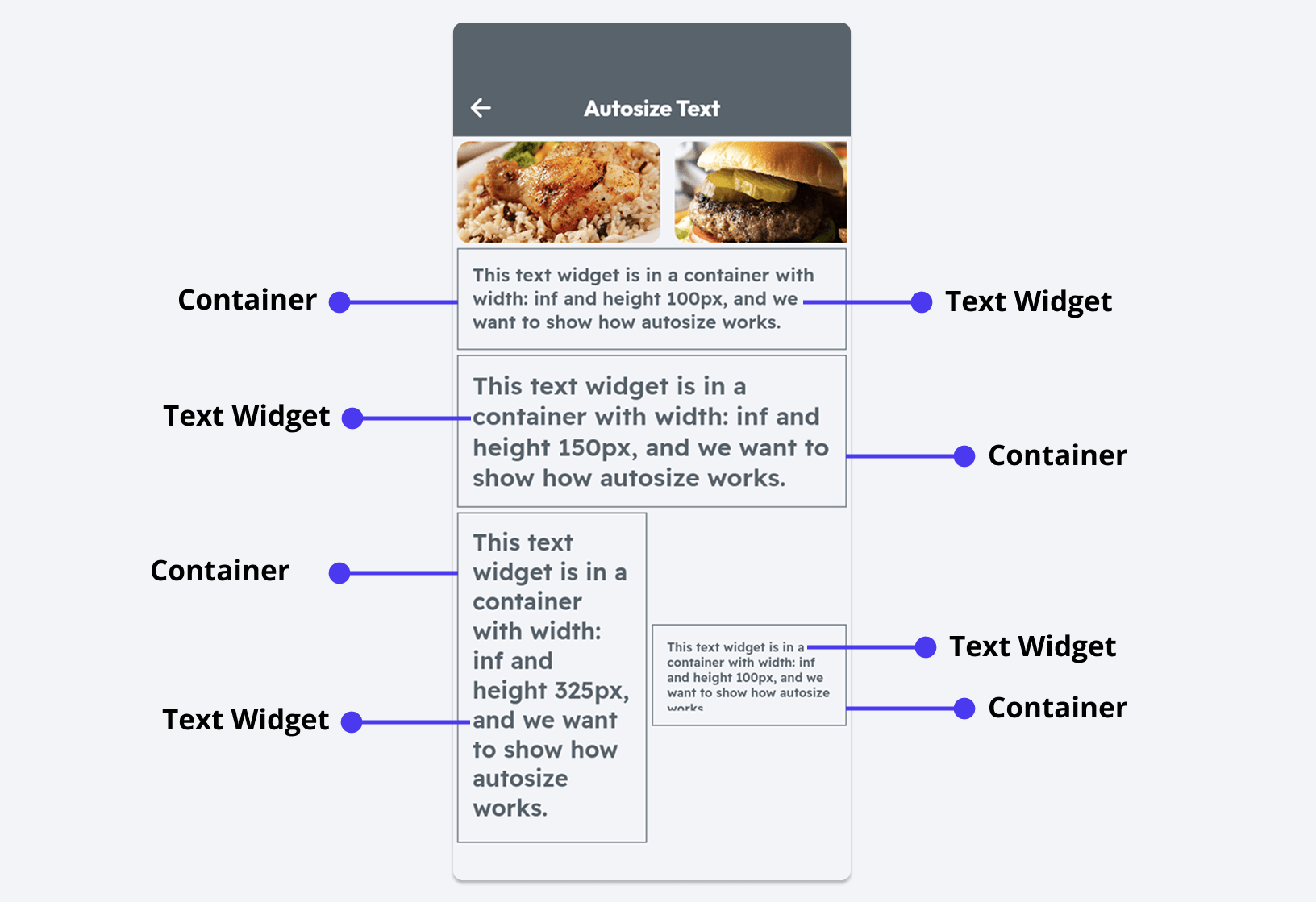
-
-
Use Auto Size with percentage-based dimensions for better responsiveness. For example, set the container width to 30% and enable Auto Size to allow the text size to adjust as the screen size changes.
The Auto Size feature has a minimum font size threshold. If the container becomes too small, text may clip or overflow when resizing is no longer possible.
Setting Text Overflow replacement
You may want to limit the number of characters shown inside the Text widget and replace the extra characters with the ellipsis or completely hide them.
This option is only available if the value is set from the variable.
To set the text overflow replacement:
-
Select the Text widget, navigate to the Properties Panel > Text Properties > enter the value for Max character to limit the number of characters.
-
Set the Text Overflow Replacement to either Clip/Cutoff or Ellipsis (...)
Adding Gradient color
Note that enabling the Gradient option disables AutoSize and setting Max Lines for your Text.
Adding a gradient color to the text gives it a modern look and feel. You can either use our ready-made templates or create it from scratch.
Here's how you do it:
-
Select the Text widget, navigate to the Properties Panel > Text Properties > enable the Gradient toggle.
-
To add your own colors:
-
Select the Type among the Linear and Radial. The Linear distributes the colors horizontally, whereas the Radial circularly spreads the color.
-
If you choose Linear, specify the Direction, and for Radial, specify the Radius.
-
Add/Remove or customize the existing colors.
-
You can also add gradient colors from a preset template as shown in the video demo.
Formatting numbers
You may want to format large numbers for better readability. Displaying a number like 2,354,000 or 4,356,634,444 instead of 2354000 or 4356634444 enhances the user experience.
For instance, it's clearer to show the population as 1,200,000 rather than 1200000 and currency values like $2K or $5M instead of $2000 or $5000000.
Types of formatting
Below are the types of formatting that we support:
- Decimal: Shows numbers in decimal format (e.g., 1,200,000 and 1.200.000).
- Percent: Shows numbers in percentage format (e.g., 28%, 99.99%).
- Scientific: Shows numbers in scientific format (e.g., 1e3, 1E6).
- Compact: Shows numbers in compact format (e.g., 2.1K, 2.3M, 5B).
- Compact Long: Shows numbers in compact long format (e.g., 2.1 thousand, 2.3 million, 5 billion).
- Custom: If the given formatting options do not fit your requirement, you can use specify a custom format.
Format a number
Use the instructions below to format a number:
-
Select the Text widget, move to the Properties Panel > Set from Variable > display the value from a variable of type Integer or Double. (e.g., App State > App State Variable Name).
-
After selecting a variable, set the Available Options to Number Format and Number Format Options to the required type.
-
If you choose Decimal, you must set the Decimal Type as well. The decimal values can be shown in two ways, i.e., 1,200 (with a comma) and 1.200 (with a period).
-
Select Automatic to show decimal value based on the user's country.
-
Select Period for Decimal to show decimal value with a period (e.g., 1.200).
-
Select Comma for Decimal to show decimal value with a comma (e.g., 1,200).
-
-
If you choose Custom:
-
Find the Custom Format box, and enter your format. For example, entering
###,###.###will convert the number 123456.789 into 123,456.789, and 000.00 will convert the number 12.786 into 012.79. -
In the Locale input box, enter the locale in which you want to display the number. (If you leave this property empty, the locale is automatically set as per the user's location). Learn more about how to format a number here.
-
-
-
To display this number as currency, enable the Display as Currency toggle and specify the Currency Symbol.
-
Click Confirm.