Page Elements
Page elements in FlutterFlow are the key elements that define the structure and functionality of each page in your app. Understanding these elements is crucial for building intuitive and effective user interfaces. From navigational elements like the AppBar and Drawer to interactive components like Floating Action Buttons (FABs), each element plays a specific role in shaping the user experience.
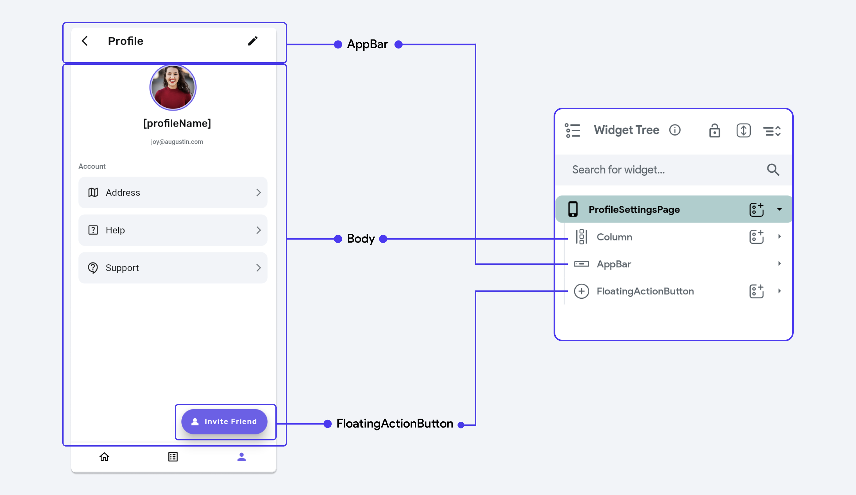
Here's how the Scaffold contributes to page design in FlutterFlow:
-
AppBar : Scaffold allows you to easily include an
AppBarat the top of the page, which can house the title, navigation controls, and other actions. -
Floating Action Button (FAB): An action button that is commonly used for primary actions on the screen, like adding a new contact or composing a message.
-
Drawer & End-Drawer: A slide-out menu for app navigation, accessible from the
AppBaror by swiping from the side. -
Body: The main content area where you place your widgets for the body of the Page.
In FlutterFlow, you won't find a section explicitly labeled as "Body". For example, in the
ProfileSettingsPage, the Column serves as the root of the widget tree for the body, with the rest of the child widgets assembled underneath.
AppBar
AppBar is a widget that displays a toolbar at the top of the screen, typically used for branding, navigation, and actions related to the current screen. It supports title and icons, and offers customization with a variety of styles and functionalities.
The AppBar is divided into the following sections:
- Leading: Typically holds a menu or back icon that provides navigation control. By default, if there is a drawer or page navigation with "Allow Back Navigation" enabled, a specific icon (such as a menu or back arrow) is displayed. However, you can override this with another Icon widget if desired, allowing for more tailored navigation options.
- Title: Primarily serves to indicate the content of the active screen or to display the name of the application, aiding users in recognizing their context within the app. This section can also be customized with different widgets for a more tailored visual representation.
- Actions: Hosts icon buttons for various operations like search, share, and more, situated on the right end.
Add an AppBar to your Page
Enable Default Button
The "Show Default Button" toggle in the AppBar Properties Panel controls whether the default leading icon (usually a back arrow or a menu icon) appears when the user can navigate back or when a Drawer is present on the page.
However, it's important to note that this default icon won't appear in the FlutterFlow canvas during the design stage. It only becomes visible when the app is running, and the conditions for showing the button are met.
If you wish to replace the default icon with another icon in the leading space, follow the guide on adding an AppBar.
In the generated code, when this toggle is enabled, automaticallyImplyLeading property in the AppBar widget is set to true. This means that the appropriate default button will be displayed if back navigation is enabled or Drawer is detected when you run the app.
Floating Action Button (FAB)
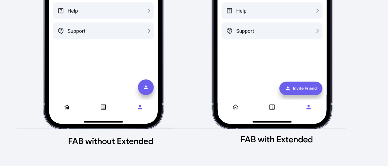
Floating Action Button (FAB) is a distinctive circular button that hovers over content, commonly used for a primary action within an app, like adding a new item or composing a message.
Extended Property
This variant of the FAB includes both an icon and a label, making it larger than the standard
circular FAB. It is useful when you want the action button to convey more information than just the
icon can provide, such as text explaining the action ("Add Task", "Create Post", etc.).
Use-cases
The extended FAB is particularly beneficial in applications where the action needs clear and
immediate recognition from the user, which cannot be fully achieved by an icon alone. It is also
useful in interfaces where there is ample space to accommodate a longer button without cluttering
the UI.
Adding a Floating Action Button to your Page
Drawers
Drawer is a slide-out menu that can emerge from either side of the screen, typically used for app navigation or placing additional options. It allows users to switch between different sections of an app without cluttering the main interface.
Add a Drawer to your Page
End-Drawer
Using a similar approach, you can also add an End Drawer to your page.
Drawer [Action]
Using this action, you can open and close the drawers with a tap of a button. For example, opening the drawer from the widget placed outside the Appbar and closing it from the widget placed inside the drawer.
Types of drawer action
There are three types of actions you can add to the drawer.
- Open Drawer: Opens the regular drawer.
- Open End Drawer: Opens the end drawer.
- Close Drawers: Closes all the open drawers.
Go to your project page on FlutterFlow and follow the steps below to define the Action to any widget.
- Select the Widget (e.g. IconButton, Button) on which you want to define the action.
- Select Actions from the Properties panel (the right menu), and click Open. This will open an Action flow Editor in a new popup window.
- Click on the + Add Action.
- On the right side, search and select the Drawer action.
- Select the Drawer Action Type among the Open Drawer, Open End Drawer, and Close Drawers.
- Click Close.
Nav Bar
The NavBar (or Navigation Bar) allows you to quickly navigate between pages of your app. It is displayed at the bottom of the screen for convenient access. The items inside the NavBar are represented by an icon, optional text, or both.
You can display up to three or five primary or top-level pages (pages that can be accessed from anywhere in your app) inside the NavBar.
From the NavBar settings page, you can add the NavBar and make modifications such as changing the display style, reordering icons, customizing its appearance, and more.
Enable Nav Bar in settings
By default, the NavBar is disabled for any project created in FlutterFlow. Before you can add pages to the NavBar, you need to enable it from the FlutterFlow settings. Navigate to Setting and Integrations > General > NavBar & AppBar and enable Nav Bar.
Initially, your NavBar will not have any pages in it. You'll see a message instructing you to add at least two pages. Before proceeding, make sure to create at least two pages. If you need help with adding a new page, you can find more information here.
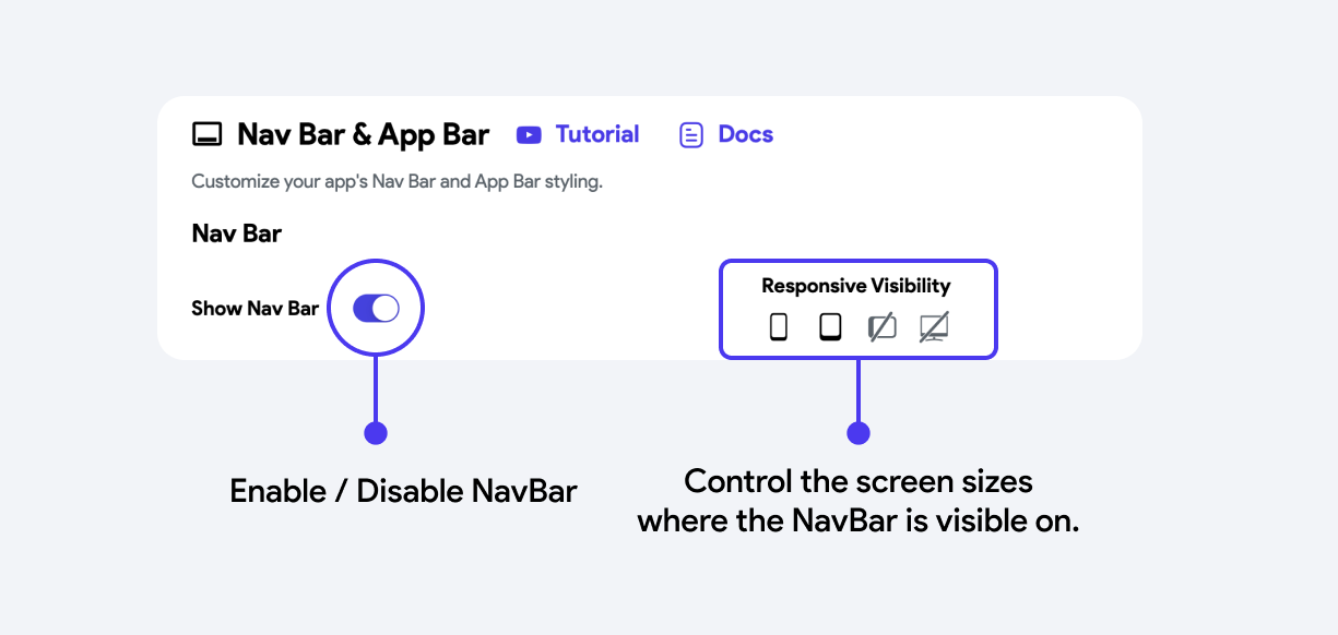
Responsive Visibility: To ensure that your NavBar is visible only on certain screen sizes, you can toggle the device icons based on your design preference.
Add Pages to your Nav Bar
Once enabled, you need to select the pages you want to appear in the navigation bar and then add them. Here's how you can do it:
Nav Bar Properties (Property Panel)
- Label: This label will be displayed on the Nav Bar.
- Nav Bar Icon: This icon represents the page in the Nav Bar. You can also choose its size.
Please note that the NavBar will only appear on the canvas if you have added at least two pages to it.
Reordering Nav Bar Items
To reorder the Nav Bar items:
-
Navigate to the Setting and Integrations > General > NavBar & AppBar > Nav Bar.
-
Under the Re-Order Page Icons, identify the page that you want to reorder, click on the hamburger icon (icon with three lines ) beside it and drag it in an upward or downward direction.
Modifying NavBar Style
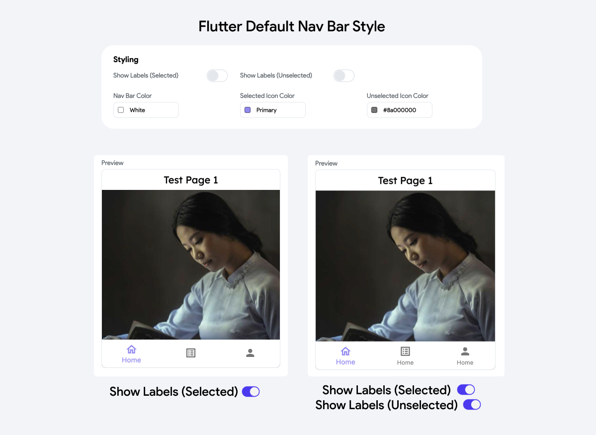
When you enable the NavBar, it initially adopts the Flutter Default Nav Bar style. However, if you seek more customization options, you can set the Nav Bar Style dropdown to one of the following:
Flutter Default Nav Bar
This is the standard material style NavBar. You have the option to show or hide labels for both selected and unselected items.
Styling Properties
| Property | Type | Description |
|---|---|---|
| Show Labels (Selected) | Toggle | Allows you to enable or disable the display of labels for selected items in the NavBar. |
| Show Labels (Unselected) | Toggle | Allows you to enable or disable the display of labels for unselected items in the NavBar |
| NavBar Color | Color Wheel | Sets the background color of the NavBar |
| Selected Icon Color | Color Wheel | Specifies the color of the icons when they are selected. |
| Unselected Icon Color | Color Wheel | Specifies the color of the icons when they are not selected. |
Google Nav Bar
This modern Google-style NavBar features a subtle animation that reveals the item label (page name) but only displays the label for the selected item.
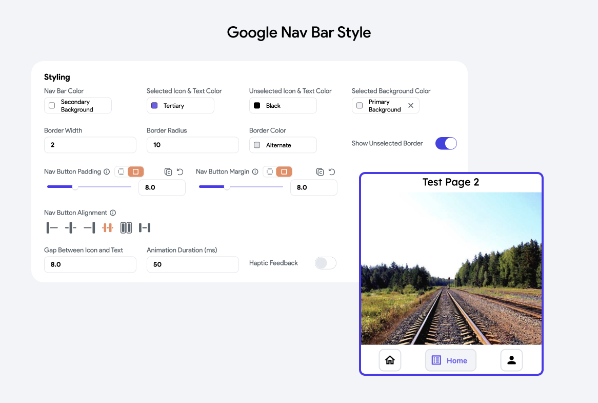
Styling Properties
- Nav Bar Color: Sets the background color of the NavBar.
- Selected Icon & Text Color: Changes the color of the icon and text when an item is selected.
- Unselected Icon & Text Color: Sets the color for icons and text when an item is not selected.
- Selected Background Color: Alters the background color of the selected item.
- Show Unselected Border: Toggles the visibility of a border around unselected items
- Border Width: Specifies the width of the border around the NavBar item buttons.
- Border Radius: Determines the corner roundness of the NavBar item buttons.
- Border Color: Alters the color of the borders around NavBar item buttons.
- Nav Button Padding: Adjusts the padding inside each nav button.
- Nav Button Margin: Controls the margin around each nav button.
- Nav Button Alignment: Allows customization of how nav buttons align within the NavBar. Options like center, space-between, etc., are given.
- Gap Between Icon and Text: Specifies the spacing between the icon and text within nav buttons.
- Animation Duration (ms): Defines how long animations take when switching between items.
- Haptic Feedback: A toggle that enables or disables haptic feedback when interacting with NavBar items, enhancing the tactile experience.
Floating Nav Bar
This NavBar style appears as a floating element above the pages and shows labels for all items present in the NavBar.
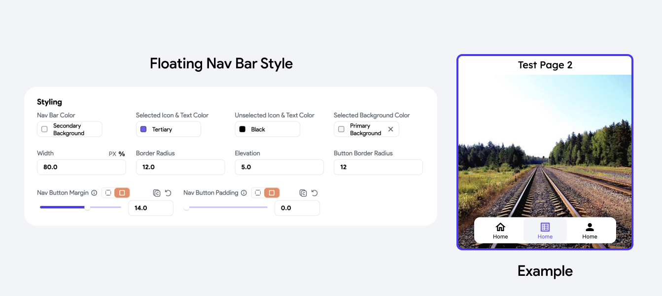
Styling Properties
- Nav Bar Color: Sets the background color of the NavBar.
- Selected Icon & Text Color: Specifies the color of the icon and text when an item is selected.
- Unselected Icon & Text Color: Defines the color for the icons and text when they are not selected.
- Selected Background Color: Alters the background color of the selected item.
- Width: Controls the width of the NavBar.
- Border Radius: Determines the roundness of the NavBar's corners.
- Elevation: Adjusts the shadow or elevation effect beneath the NavBar, which helps give the NavBar a floating appearance above other content.
- Button Border Radius: Specifies the radius for the borders of each button within the NavBar.
- Nav Button Margin: Sets the margin around each nav button
- Nav Button Padding: Controls the padding inside each nav button.
SnackBar
SnackBar is a temporary, lightweight notification that briefly appears at the bottom of the screen to provide feedback about an operation.
When to use Snackbar?
Here are some common usages of a SnackBar in an app:
- User Feedback: Notifies users about the success or failure of actions like submitting a form or uploading a file.
- Undo Actions: Provides a quick option to undo a recently completed action, such as deleting an email or removing an item from a list.
- Informational Alerts: Displays brief messages about changes or updates, such as synchronization status or network issues, without requiring user interaction.
- Confirmation Messages: Confirms the completion of tasks that don't need immediate attention, like saving settings or adding a calendar event.
To show a SnackBar message
Show SnackBar [Action]
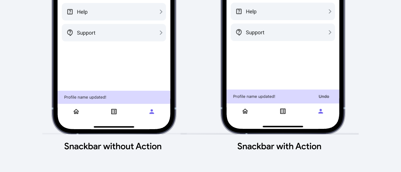
Material Design allows you to add an interactive element to the SnackBar notification, allowing users to respond directly from the snack message.
Add Action Property
Typically, a SnackBar can include a single action button. This button is used to offer users an immediate option to interact with the snack message.
Common uses include undoing an action that the snack message refers to (like undoing a deletion), retrying a failed task (like reconnecting to a network), or any other quick recovery or response tasks.
-
Customization: The action within a SnackBar is customizable. You can define the button's label, appearance, and the function it executes when pressed. This allows the SnackBar to not only inform users but also engage them in meaningful ways to enhance the user experience.
-
Timeouts and Visibility: The presence of an action can affect the duration the SnackBar is displayed. By default, a SnackBar may auto-dismiss after a few seconds, but if an action button is present, users might need more time to read the message and respond, thus you might consider adjusting the display duration accordingly.
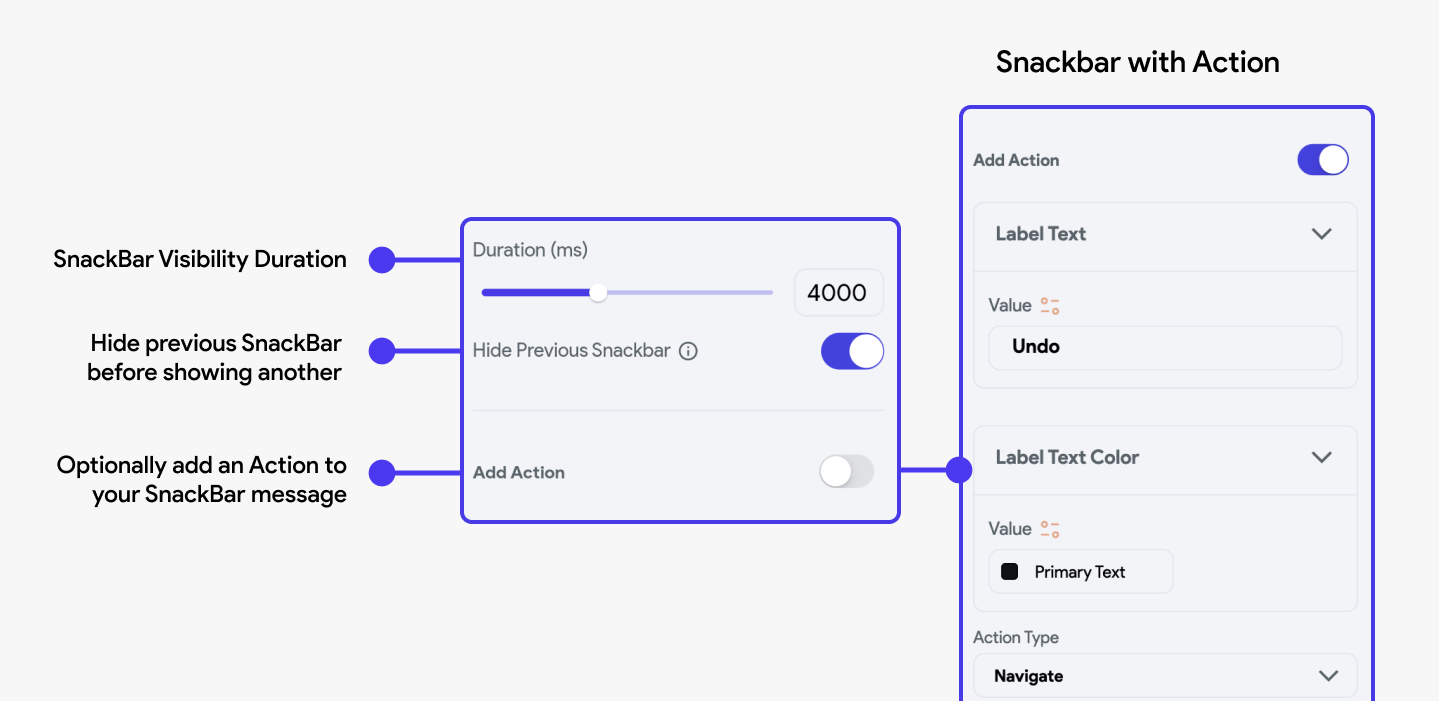
Adding actions to SnackBars helps make them not just informative but also interactive, facilitating a more dynamic user interaction model where feedback and actions are closely linked.
Hide SnackBar [Action]
Managing multiple SnackBar instances efficiently is crucial because showing them all at once can
overwhelm the user interface and confuse the user. To address this, Flutter apps uses a queuing
system for SnackBars:
Snackbar Queue: When multiple SnackBars are triggered in succession, they are queued to be
displayed one after the other rather than all at once. Each SnackBar waits for the previous one to
disappear before the next one shows up.
Hiding Previous Snackbar: If you want to immediately replace a currently displayed SnackBar with a new one without waiting for it to auto-dismiss, you can use the Hide Snackbar action in FlutterFlow.
The action has the following hide scope:
- Current Only: This option hides only the currently displayed snackbar.
- All (Current and Queue): This option hides the current snackbar as well as any snackbar in the queue.
This can be useful in scenarios where an immediate update to the user feedback is necessary, such as correcting a message or providing new information. By using these methods, you can control the flow of information via SnackBars, ensuring that user feedback is timely, relevant, and not overwhelming.