Alert Dialog
The action allows you to alert the user of important situations that require acknowledgment in the form of a pop-up or custom-designed dialog. With this feature, you can choose to display a pre-built pop-up or create a custom design that suits your specific requirements.
Types of Alert Dialog
We allow you to define two types of Alert Dialog Actions:
- Informational Dialog: To show some information the user should be aware of before interacting with the app. Contains only a single action button.
- Confirm Dialog: This dialog can contain two action buttons. It can trigger the subsequent action based on whether a user confirms the action. It can also be used before performing any non-revertable user action, for example, before deleting a user account.
- Custom Dialog: This is a fully customizable dialog that you can create using components.
Adding Informational Dialog [Action]
Follow the steps below to add this type of action to any widget:
- Select the Widget (e.g., Button) on which you want to add the action.
- Select Actions from the Properties panel (the right menu), and click + Add Action.
- Search and select the Alert Dialog (under Alerts/Notifications) action.
- Set the Alert Dialog Type to Informational Dialog.
- Provide the Title and Message for the dialog. Note: You can also set it from a variable; for example, a combined text with a value from a variable.
- Also, enter a Dismiss Text that will be shown on the action button.
Adding Confirm Dialog [Action]
Follow the steps below to add this type of action to any widget:
- Select the Widget (e.g., Button) on which you want to define the action.
- Select Actions from the Properties panel (the right menu), and click Open. This will open an Action Flow Editor in a new popup window.
- Click on the + Add Action.
- On the right side, search and select Alert Dialog.
- Set the Alert Dialog Type to Confirm Dialog.
- Provide the Title and Message for the dialog. Note: You can also set it from a variable; for example, a combined text with a value from a variable.
- Now, enter a Dismiss Text (shown on the action button that will cancel the Action) and a Confirm Text (shown on the action button that will trigger the Action that you will define in the next step).
- Now, click on the + button and select Add Conditional.
- On the right side (Set Condition for Action), set the Source to Confirm Dialog Response.
- Under the TRUE section, add an action that will be triggered if a user gives confirmation.
- Under the FALSE section, add an action that will be triggered if a user cancels this dialog.
- Click Close.
Adding Custom Dialog [Action]
Before you add this action, ensure you create a component that you want to display as a custom dialog. Now follow the steps below to add this type of action to any widget:
-
Select the Widget (e.g., Button) on which you want to add the action.
-
Select Actions from the Properties panel (the right menu), and click + Add Action.
-
Search and select the Alert Dialog (under Alerts/Notifications) action.
-
Set the Alert Dialog Type to Custom Dialog and Select Component.
-
It is recommended to set the appropriate Width and Height for the custom dialog.
-
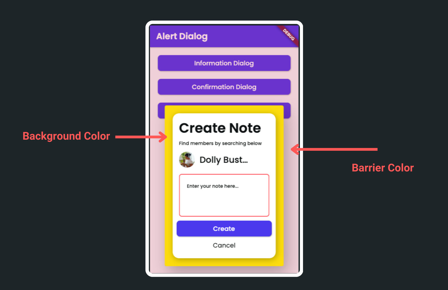
Optionally, you can set the Background and Barrier Color for this dialog.
-
By default, this type of action blocks the following action (if any) from triggering while this action is in progress, meaning the dialog is present on the screen. However, in some cases, you might want to allow the next action (after this) to execute, for example, making an API call immediately after showing the custom loading dialog. To do so, enable Non Blocking option.
-
By default, Non Dismissble option closes the dialog when you click outside of it. To disable this behavior, enable this option.
-
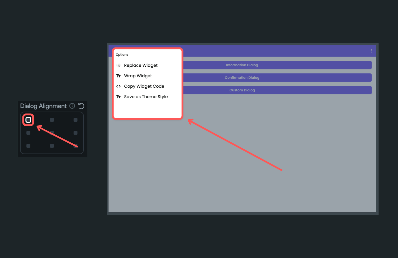
By default, the custom dialog appears in the center of the screen. However, you can use the Dialog Alignment property to decide where to position the dialog on the screen.
-
To position the dialog around the widget that opened it, enable the Align with the Target Widget, and then align using the Target Alignment property. Tip: If dialog goes out of the screen, enable Avoid Overflow.