Building Layout
In FlutterFlow, you build a page layout using Widgets. Widgets, such as Text, Buttons, Images, and Icons, are visible on the screen. Others, like Containers, Rows, Columns, and Stacks, are not directly visible but help arrange and position the visible elements on the page.
These widgets are categorized into four main types: Layout Elements, Base Elements, Page Elements, and Form Elements. To build a page, you combine different widgets from these categories to get the desired look and feel of your app.
Understanding Layout Concept
One of the most common layout patterns is to arrange widgets either vertically or horizontally. To display widgets in a vertical layout, use the Column widget. For a horizontal layout, use the Row widget. If you need to place one widget on top of another, use the Stack widget.
Composing widgets is a fundamental aspect of creating layouts in FlutterFlow. It involves combining different widgets to form a cohesive and functional user interface. Understanding how to effectively compose widgets allows you to design complex layouts and create intuitive, user-friendly apps. Learn more about composing widgets here.
Building Layouts: Exercise
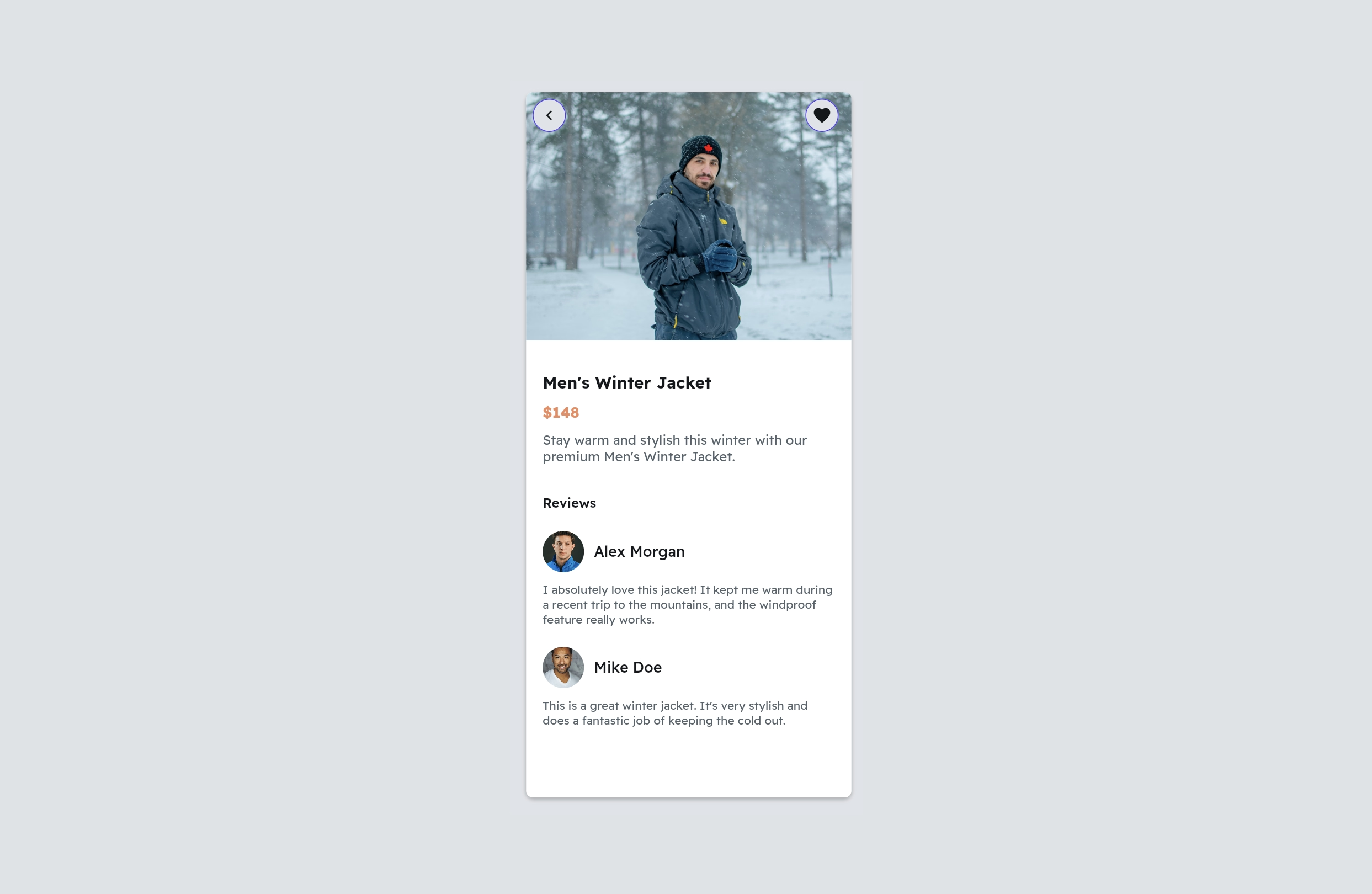
Let's walk through an exercise to build the following layout:

The steps to build the given layout are as follows:
1. Sketch the layout
When you are just starting out with building apps, this step is very crucial. Before you actually start adding widgets to the page, sketch a picture of how the main layout will be broken into smaller parts.
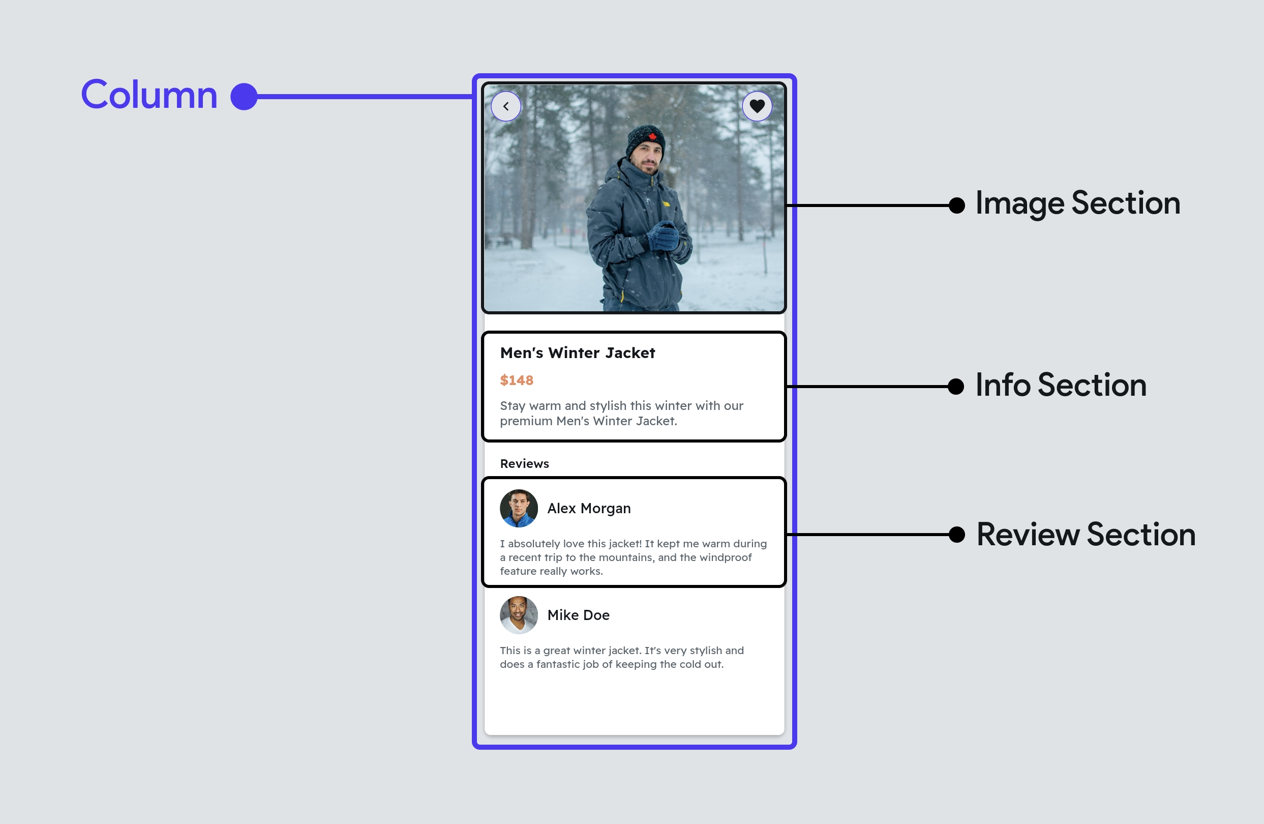
Breaking down the given layout into sections looks like this:

Next, identify the widgets that can replace those sections, such as Column, Row, and Stack. Once you have a clear idea of which widgets to use, you can begin adding them.
In the figure above, the main section is replaced with the Column widget and is divided into smaller sections. The next step is to look carefully at these smaller sections and, if required, divide them into further small sections and replace them with the appropriate widget. You can repeat this process until you achieve the desired level of granularity.
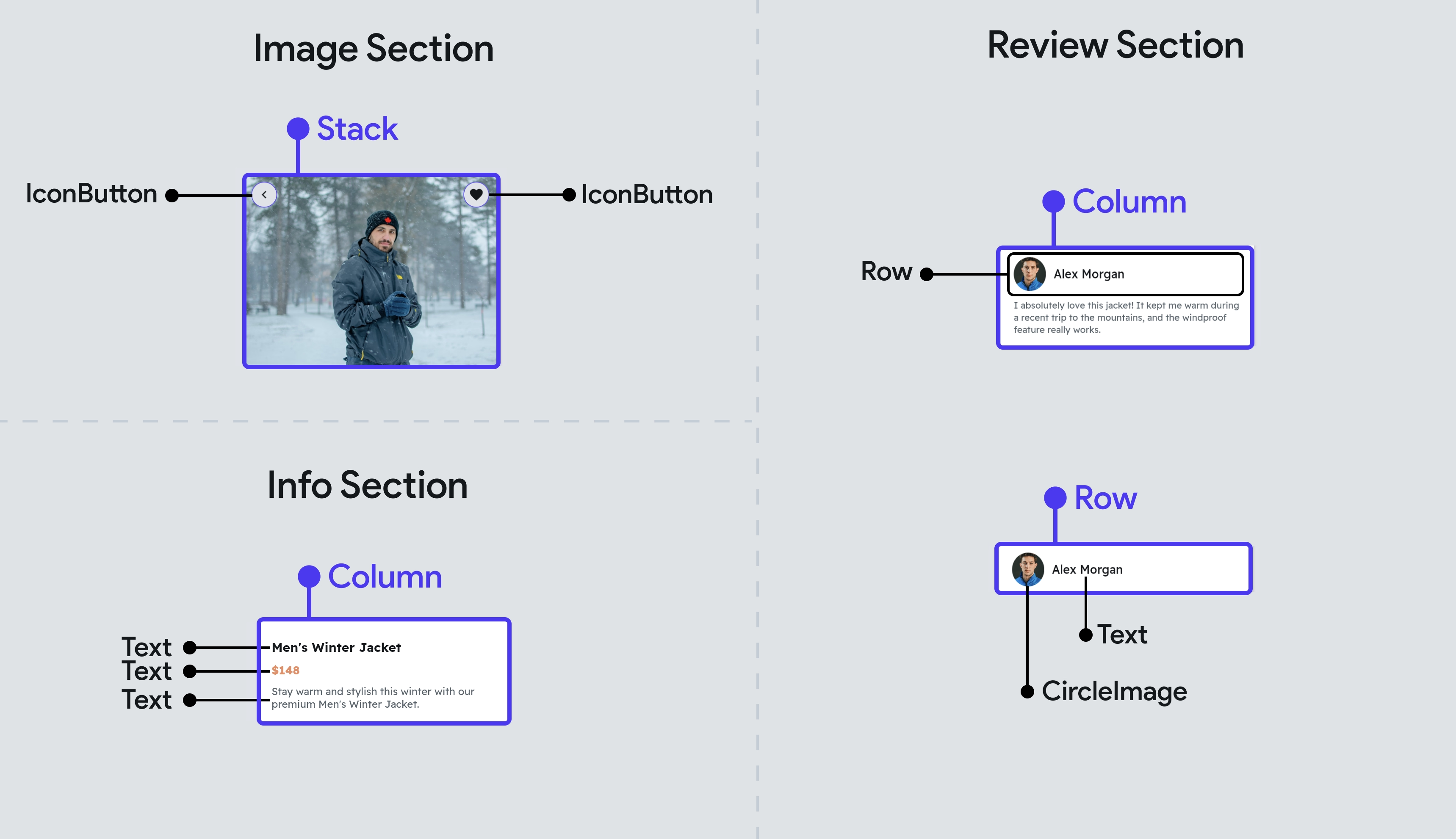
Splitting the smaller section further looks like this:

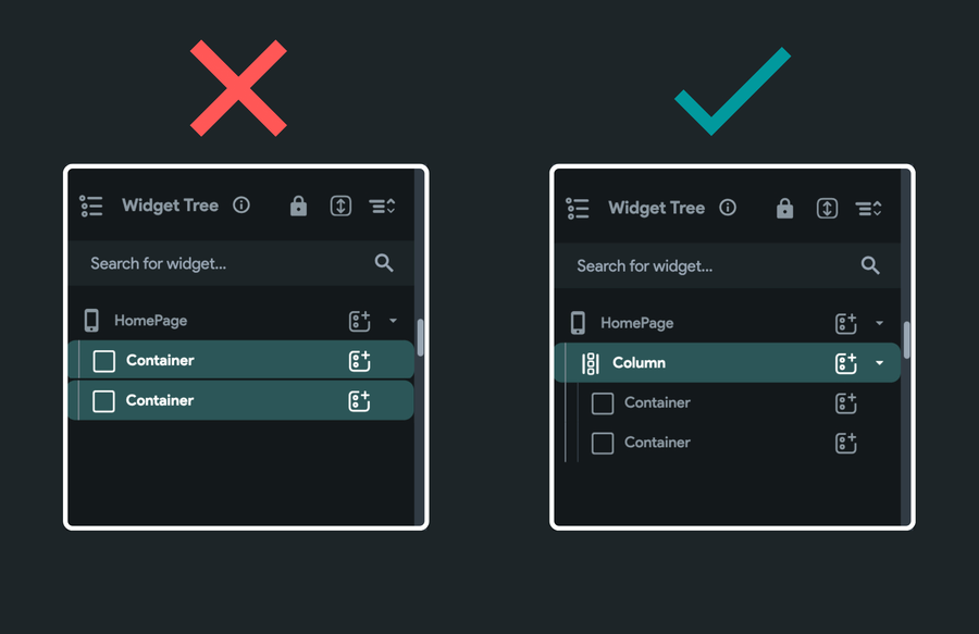
A page can only have one parent widget. i.e., you can't have two containers (at the same level) inside the HomePage. For that, you can wrap the two containers inside the Column widget, which makes the Column widget a single parent.

2. Add Image section
The top section includes the Image and IconButton widgets. To place the IconButton on top of the Image, wrap them inside a Stack widget. Here's how you do it:
3. Add info section
The info section consists of a few Text widgets inside the Column.
4. Add reviews section
The review section consists of multiple different widgets. First, add a Column to separate the reviewer's information (image and name) from the actual review text. Next, display the reviewer's information inside a Row widget using the CircleImage and Text widgets. Here’s exactly how you do it:
Common Layout Widgets
Apart from Row, Column, and Stack widgets, there are some other widgets that are widely used for building the page layout. Here are some of them:
Video guides
To learn more about building layout, watch our videos: