Line Chart
The Line Chart connects the data points on a graph with a line. This is typically used to display information that evolves over time.
For example, you could use this widget to show progress over some time. This will plot the progress value on a chart that becomes easily digestible for the users instead of just showing numbers in a tabular format.
Adding line chart
Adding a chart comprises of following steps:
1. Preparing Data
Before adding the chart widget, you need to prepare the data in the format that the chart widget accepts. The line chart widget requires an X coordinate (runs horizontally from left to right) and a Y coordinate (runs vertically from bottom to top) value. Together these values (x,y) are used to mark a point in the chart. You can store and retrieve these values in the following ways:
1.1 Firestore Documents
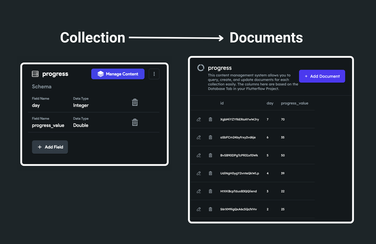
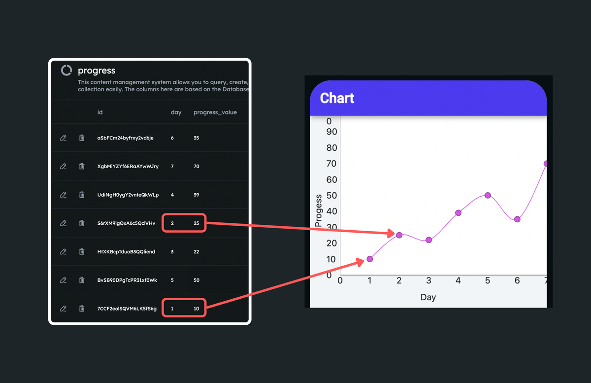
If you use Firebase as the backend, you can create a collection and add the list of documents. Each document entry is used to plot a single point on the chart. Hence you must add at least two fields (with DataType Integer or Double) in a document that acts as the X and Y coordinates to plot the point.
The figure below illustrates the sample collection that will draw a single line on the chart:

The above collection schema is used for simplification. You are free to have your own schema that works best for you.
Here's how the data is used to mark a point in a chart:

1.2 Numbers Lists
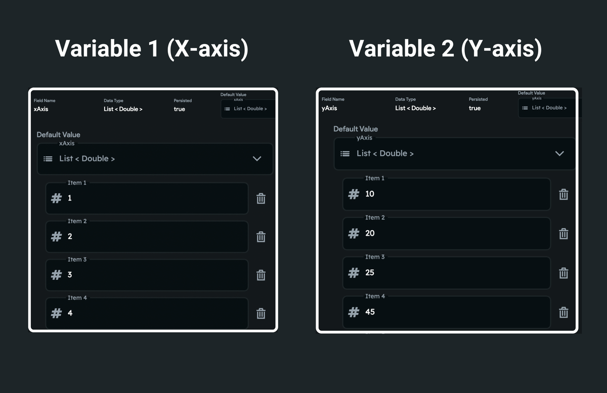
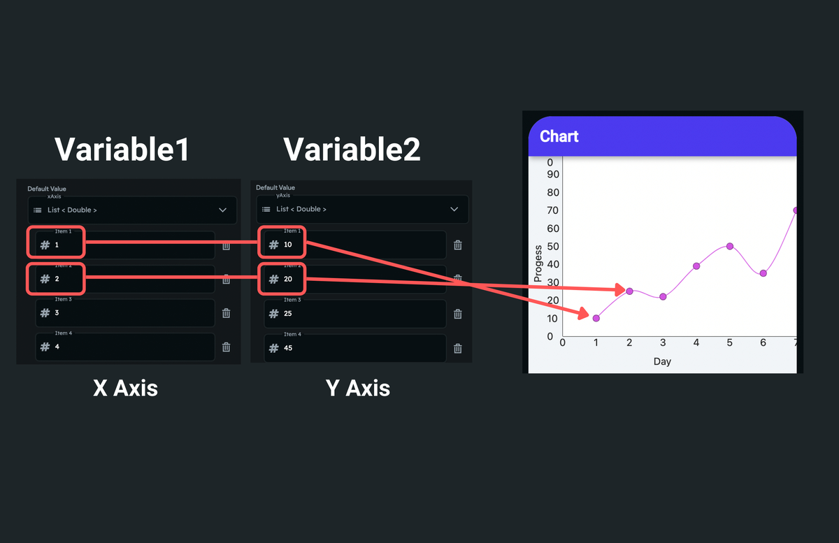
The chart widget can plot a point using a list of numbers. You must create at least two separate lists with DataType Integer or Double. One list stores all X-axis values, whereas the other stores a list of all Y-axis values. The chart widget uses both variables to create pair of (x,y), which are then used to mark a point in the chart.
The variable can be an app state variable or the action output variable of an API call.
You must have at least two variables to draw a single line.
The figure below illustrates what the app state variables should look like:

Here's how the number list is used to mark a point in a chart:

To create the app state variable, please find the instructions here.
2. Adding Chart widget
To add the chart widget to your project:
- Drag the Chart widget from the Base Elements tab (in the Widget Panel) or add it directly from the widget tree. Note: The Line Chart is the default chart type.
- Move to the property panel and scroll down to the Chart Data section.
- For the Line Chart, Chart Data is a line drawn on the chart. The line is drawn by providing data to this. To show the first line, open the Chart Data 1 section, and set the Data Source to Firestore Documents or Number List.
- If you select Firestore Documents:
- Make sure you have access to a list of documents. The list of documents can be retrieved by querying a collection at any top-level widget, such as Page or Column widget. You can also query a collection on the Chart widget itself. To query collection on a page:
- Select the page and then click on the Backend Query tab (on the right side of your screen).
- Set the Query Type to Query Collection.
- Scroll down to find the Collection dropdown and set it to your collection.
- Set the Query Type to List of Documents.
- Click Save.
- Set the Source to the collection_name Documents > Documents (List<collection_name>) and click Confirm (e.g. progress Documents > Documents (List<progress>)).
- Set the X Value Field, whose values will lay out horizontally from left to right (e.g., day, week, month).
- Set the Y Value Field, whose values will lay out vertically from bottom to top (e.g., progress, number of users, sales).
- Make sure you have access to a list of documents. The list of documents can be retrieved by querying a collection at any top-level widget, such as Page or Column widget. You can also query a collection on the Chart widget itself. To query collection on a page:
- If you select Numbers Lists:
- Under the X Data, click on the UNSET and set it to a variable whose values will lay horizontally from left to right (e.g., day, week, month).
- Further options are displayed as per the selected Source. For example, if you choose App State, The Available Option field is displayed that allows you to select the actual variable.
- Under the Y Data, click on the UNSET and set it to a variable whose values will lay out vertically from bottom to top (e.g., progress, number of users, sales).
- Click Add Data to show multiple lines on a chart. Each new line is stacked on top of the previous line.
- Scroll down to the Chart Properties section and adjust the Width and Height properties.
- Using Firestore Documents
- Using Numbers Lists
Customizing line
You can customize the look and feel of each line drawn on a chart widget to match your design. The Line Properties (inside the Chart Data) section is used the customize the line.
To customize the line:
- Select the Chart widget from the widget tree or the canvas area.
- Move to the properties panel, open the Chart Data section and then open the Line Properties section.
- To change the Line Color, click on the box next to the already selected color, select any dark/light color, and then click Use Color or click on an already selected color and enter a Hex Code directly.
- To change the thickness of the line, change the value in the Line Thickness input box.
- By default, all the data points are connected with a smooth curve line; to disable this, simply turn off the Curved Lines property. This will draw a straight line between two points.
- If you keep this property enabled, you may notice that for some data points the curve goes beyond/above the actual value. To prevent this, you can enable the Prevent curve from overshooting.
- To see the point at the exact location on the chart, you can turn on the Show Dots property.
- To fill the area below the line with a custom color, turn on the Fill Below Line property and set the Fill Color by clicking on the box next to Unset, select any dark/light color, and then click Use Color or click on Unset and enter a Hex Code directly.
Customizing chart
You can customize the chart to match your design such as changing the background color, setting axis bounds, show grids, displaying borders, and more.