Dividers
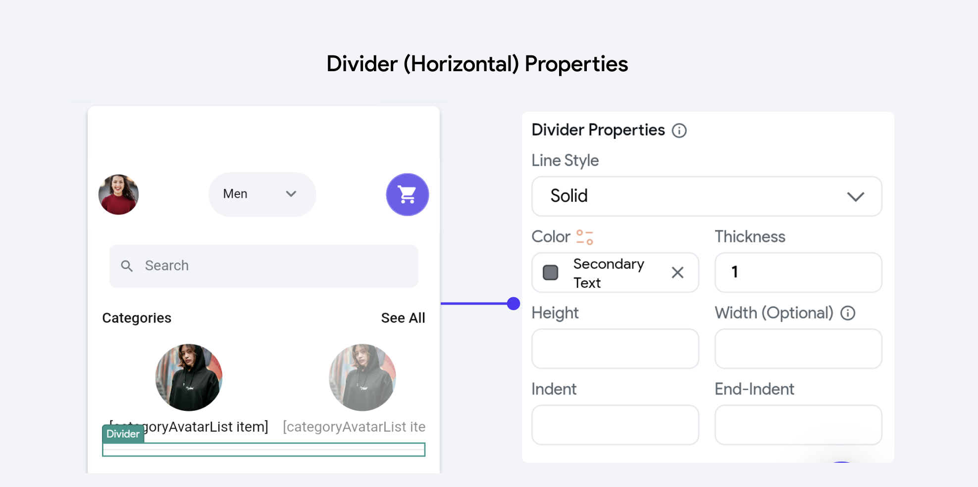
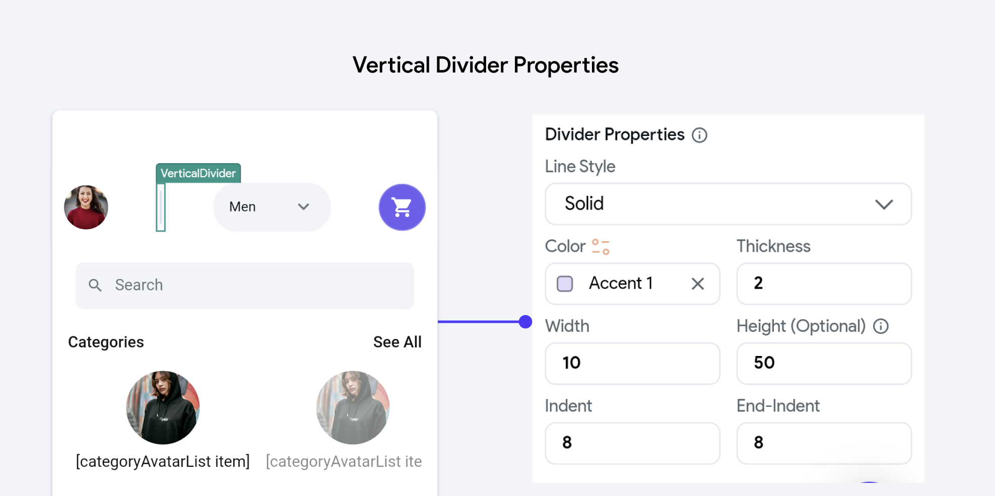
Add a thin horizontal or vertical line, with padding on either side. Customize the color, width or height, and style of the divider from the Properties Panel.
Divider Properties
Here are the properties in detail:


-
Line Style: This property determines the visual pattern of the divider line. Options typically include:
- Solid: A continuous line.
- Dotted: A series of dots.
- Dashed: A series of dashes.
- Dashdotted: A combination of dashes and dots.
-
Color: Defines the color of the divider line. This can be set using predefined theme colors or custom values to match or contrast with the application's design scheme.
-
Thickness: Specifies the thickness of the divider line, influencing its visual prominence. Thicker lines are more noticeable and can be used to make a bold statement, while thinner lines are subtler.
-
Width: This property sets the horizontal length of the divider. It can be specified in absolute terms (e.g., pixels).
-
Height: For vertical dividers, this property sets the vertical length. Like width, it can also be defined in pixels.
-
Indent and End-Indent: These properties control the spacing from the edges of the container to the start and end points of the divider line, respectively. Indents can be used to fine-tune the placement of the divider within a layout, helping to achieve a balanced or desired aesthetic effect.