Expandable
An Expandable widget is a user interface component used to show or hide content dynamically. It consists of a header that can be tapped to reveal or collapse additional content. This functionality is particularly useful in interfaces where space is at a premium, such as in mobile applications or complex forms, enabling users to access information on demand without overwhelming the screen with too much content all at once.
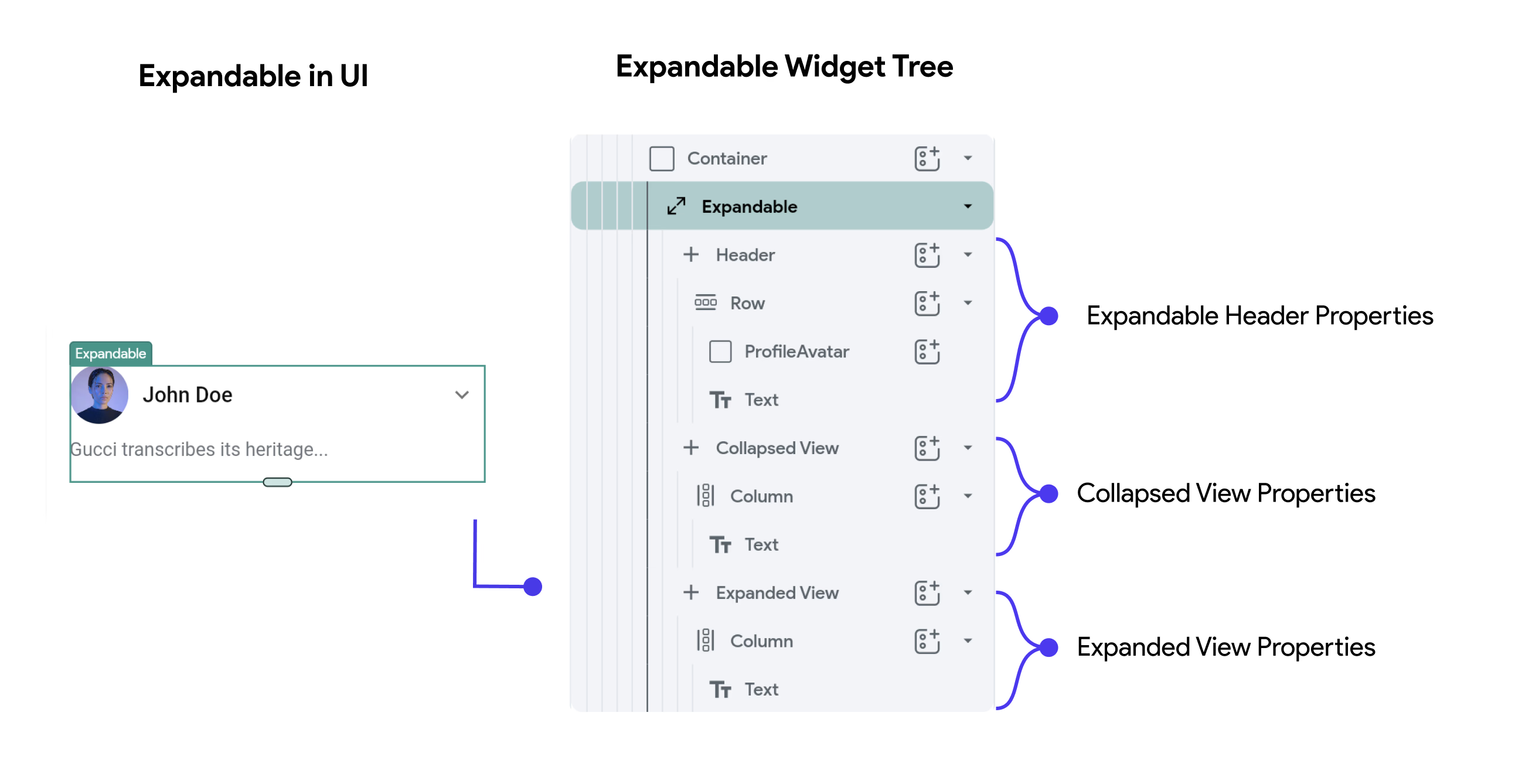
Default Widget Tree for Expandable Widget
When you add an Expandable widget, the default widget tree typically includes:
- Header: The visible part of the widget when it is both collapsed and expanded. This usually contains a label or icon indicating what the expandable content relates to.
- Collapsed View: The default state showing minimal content or summarization.
- Expanded View: Contains more detailed information or additional controls that are visible when the widget is expanded.
Expandable Widget Properties
- Icon Properties: For Icon Properties, check out the Icon guide.
- Expandable Properties:
- Active View: Specifies whether the widget is currently in the collapsed or expanded state.
- Initially Expanded: Determines if the widget should be expanded by default when the view is first loaded.
- Tap Header to Toggle: Allows the user to expand or collapse the content by tapping the header.
- Tap Body to Expand/Collapse: Defines whether tapping on the body of the expanded content can toggle its state.
- Style Properties:
- Width & Height: Dimensions of the widget, which can be set to infinity to take full width or height.
- Background Color: The color behind the expandable content.
- Header Alignment: Aligns the header content such as left, center, or right.
Practical Use of Expanded
This setup allows for a highly customizable Expandable widget, making it suitable for FAQs, forms, lists, or other content that benefits from a clean, compact initial appearance with options for more detailed information. The ability to fine-tune how and where icons appear, along with the behavior of the widget's expandability, gives developers significant control over user experience and interface design.