Draggable + DragTarget
The Draggable widget is used to make a widget that can be dragged and dropped to a different location within the app. It allows users to interact with the app by moving an item using touch gestures or a mouse. The DragTarget widget is used in conjunction with the Draggable widget to specify where a dragged item can be dropped. It creates a region that can accept the data carried by the Draggable widget.
When an item is dragged over a DragTarget, the DragTarget has the opportunity to determine whether it can accept the item. If it accepts, it can then trigger actions such as updating the app's state to reflect the change.
For example, in a shopping cart app, you could use these widgets together to allow users to add items to their cart by dragging and dropping them onto a cart icon.
Adding Draggable and DragTarget Widgets
Let's see how to add a drag-and-drop functionality by building an example that allows users to put only plants on the shelf. Here's how it looks:
The steps to build such an example are as follows:
1. Create page state variable
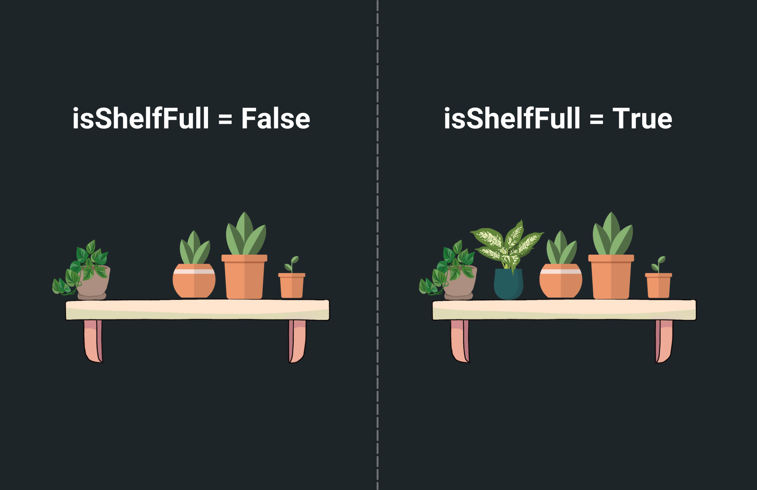
In this example, we have two images of a shelf: one with empty space for one plant and another
with all plants on the shelf. To control which image to show based on whether the correct item
is dropped on the shelf, we need a
page state variable.
Therefore,
create a page state variable
named isShelfFull with the datatype Boolean and set its default value to False.

2. Add Draggable widgets
Let's add the draggable widgets and specify the data for each widget. This data will later be used to determine if the correct item is being dropped on the shelf. For instance, you can assign a unique identifier or a type attribute (e.g., plant, spoon, toy) to each draggable widget.
As we proceed in this section, you'll learn how this information is crucial for the DragTarget widget to evaluate whether the item being dropped matches the expected type for the shelf.
In this example, the draggable items are a plant, a spoon, and a football. Let's see how to add them:
- Inside the Row widget, add Draggable widgets directly from the widget tree or canvas area.
- Inside the Draggable widget, you can add any widget as a child widget. For this example, we use the Image widget.
- To add data to draggable widgets, select the Draggable widget > Properties Panel > Draggable Properties > specify the Type of the data and its Value.
The Draggable widget also provides you with various drag events (as Action Triggers) that you might want to use to customize the drag experience. These include:
- On Drag Started: Gets triggered when the user initiates a drag operation.
- On Drag Update: Gets triggered when the drag is currently in progress, allowing you to track its movement or update other UI elements accordingly.
- On Drag Completed: Gets triggered when the user successfully drags and drops the widget into DragTarget widget.
- On Drag Cancelled: Gets triggered when the drag operation is aborted, such as when the user releases the widget outside a DragTarget or the DragTarget rejects the widget.
- On Drag End: Gets triggered when the drag operation finishes, regardless of whether it was completed or cancelled.
3. Add DragTarget widget
The DragTarget widget in this example allows users to drop items onto the shelf. We utilize the Stack widget to layer the DragTarget widget over the shelf image. Moreover, the display of the shelf image is controlled by the ConditionalBuilder widget, which uses the isShelfFull variable to determine which image to show. This widget arrangement ensures that the shelf image updates dynamically based on whether the shelf is full or not.
Let's see how to add DragTarget widget:
- Open the Widget Palette and locate the DragTarget widget under the Base Elements tab. You can drag it into your desired location or add it directly from the widget tree.
- Inside the DragTarget widget, add a Container widget, preferably of the same size as the image, and set its background color to transparent. This will serve as the drop zone for draggable items.
- Now, you need to specify the type of data this target will receive. To do so select the DragTarget widget > Properties Panel > Draggable Properties > specify the Type of the data. This is crucial for ensuring that only the correct items can be dropped on the target.
4. Get notified on drag events
The DragTarget widget provides you with the various drag events (aka callbacks) which are essential in building drag and drop functionalities.
Here are they:
- On Drag Accept: Actions under this are triggered when the data is dropped over the DragTarget.
- On Drag Enter: Actions under this are triggered when the data is being dragged over DragTarget.
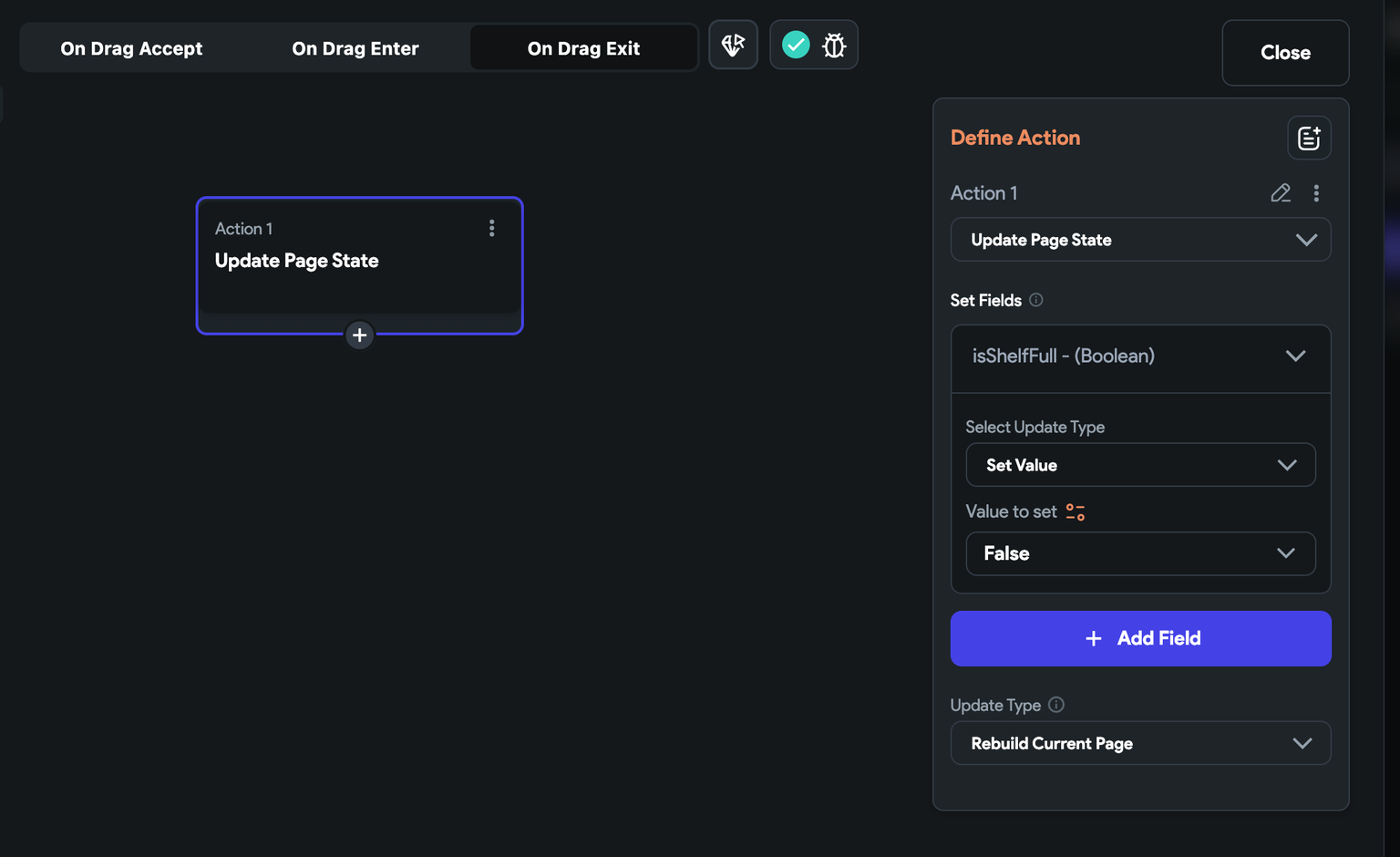
- On Drag Exit: Actions under this are triggered when a draggable item that was previously over the DragTarget leaves its area. For example, In the shopping app, if the user decides not to drop the item into the cart and moves it away, this event callback can be used to remove the highlight from the shopping cart.
You can use On Drag Accept or On Drag Enter to determine if DragTarget can receive the data and accordingly update the app state.
It's crucial to think about the user experience you wish to create. For instance, if you aim to trigger an action as soon as an item enters the drop area, utilize On Drag Enter along with On Drag Exit. Conversely, if your action should occur only after the item has been dropped, then On Drag Accept, paired with On Drag Exit, is your go-to option.
Let's see how to add drag events for this example:
-
Select DragTarget widget, select Actions from the Properties Panel (the right menu), and click Open. This will open an Action Flow Editor in a new popup window.
-
To ensure that only a plant item is being dropped:
- Select the On Drag Accept and select + Add Conditional Action.
- From the set variable menu, select Drag Target > Dragged Data. This captures the data of the draggable item that we added in step 2.
- Check if the captured data matches the expected item, i.e., plant.
- In the TRUE branch, you can add a snackbar message and update the
isShelfFullvariable to True. This will create an effect like the user has actually dragged and dropped the item onto the shelf.
- Now, select the On Drag Exit andadd an action to update the
isShelfFullvariable to False. This ensures that if the user decides not to drop the item and moves it away, the shelf image reverts to the empty one.
