Icon options
This page lists the options in the App icon drawer. To change your icon step by step, see App icon.
Only owners and developers can change the icon or draw symbols. Others can open the drawer but can’t change anything.
Appearances
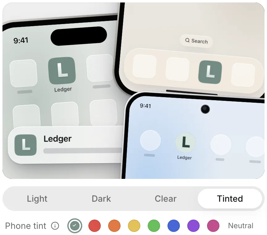
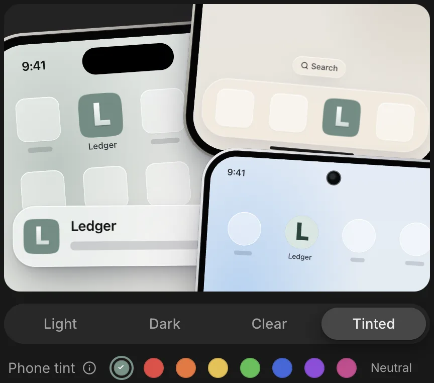
The appearance buttons above the drawer’s rows switch the preview between the ways phones show your icon. The preview shows iPhone and Android home screens at once.
| Appearance | iPhone shows | Android shows |
|---|---|---|
| Light | The icon in light mode | The adaptive icon |
| Dark | The icon in dark mode | The adaptive icon on a dark home screen |
| Clear | The clear icon | The adaptive icon |
| Tinted | The tinted icon, in the Phone tint you pick | The themed icon |
Phone tint offers Neutral, Red, Orange, Yellow, Green, Blue, Purple, and Pink. It changes only the preview, because people who use your app pick their own tint on their phones.
Styles
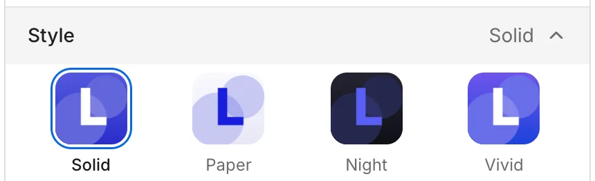
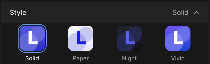
The Style row sets how the symbol and its background use the icon’s color. Each style applies to drawn symbols and to letters.
| Style | Look |
|---|---|
| Solid | A white symbol on your color |
| Paper | Your color on a pale wash of it |
| Night | A bright version of your color on near-black |
| Vivid | A white symbol on a brighter color that shifts in hue |
Colors
The Color row sets the color the style is built from.
| Option | What it does |
|---|---|
| The first swatch | Uses your app’s theme color. If the theme color is black, white, or a gray, it uses a color set for your app instead. When the theme color changes, the icon changes with it, and the row reads Theme. |
| The other swatches | Use a fixed color. The row reads Your own. |
| Your own color | Opens a color picker for any color. The row reads Your own. |
| Follow theme | Appears when the icon no longer follows your theme color, such as after you pick another swatch, pick your own color, or keep the old color after a theme change. It switches the icon back to your app’s theme color. |
Dark mode
The Dark mode row sets the icon’s dark appearance on iPhone.
| Option | What it does |
|---|---|
| Automatic | iPhone darkens your icon itself. |
| Custom | You choose a style for dark mode from Solid, Paper, Night, and Vivid. The default is Night. |
Dark mode applies only to iPhone. Android draws its own themed icon.
Motifs
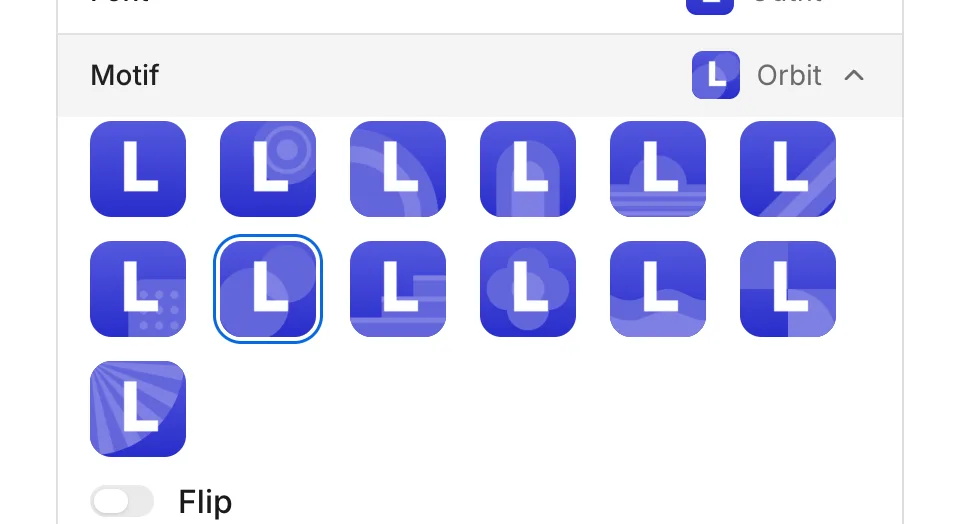
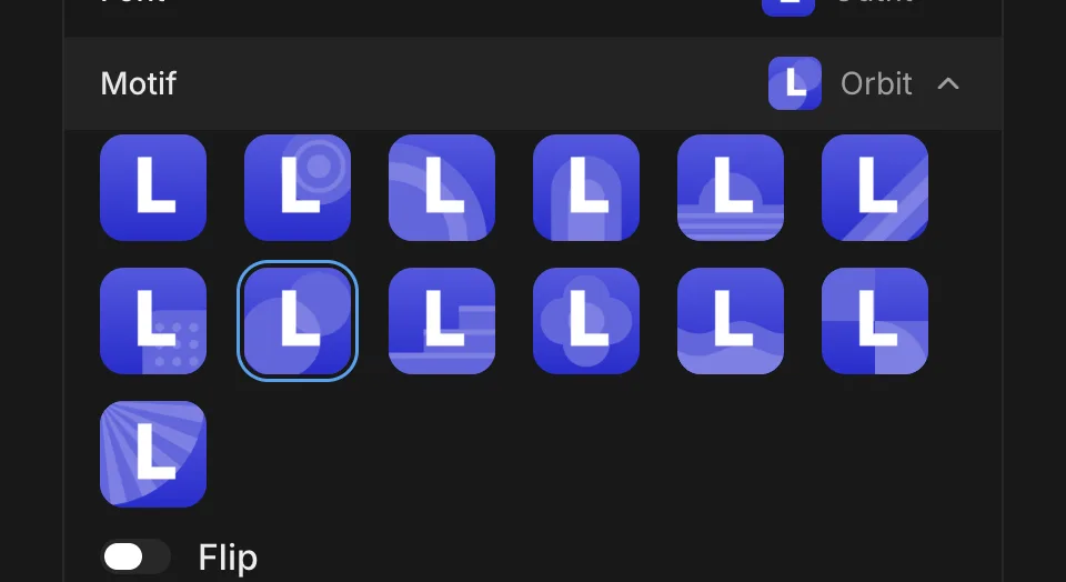
The Motif row adds a shape behind the letters. The shape is a tone between the icon’s background and the symbol’s color, with a pattern inside it in a second, stronger tone. Motifs apply only to letters. When you pick a drawn symbol, the row reads Not used and keeps your motif for when you go back to letters.
| Motifs |
|---|
| Sun, Ripple, Arch, Horizon, Bands, Dots, Orbit, Steps, Bloom, Waves, Quarters, Rays |
To leave the letters on a plain background, choose None. To mirror the motif from left to right, turn on Flip.
Fonts
The Font row sets the typeface for the icon’s letters. Fonts apply only to letters. When you pick a drawn symbol, the row reads Not used and keeps your font for when you go back to letters.
| Fonts |
|---|
| Outfit (the default), Inter, Space Grotesk, Nunito, Unbounded, Archivo Expanded, Anton, Geist Mono, Fraunces, DM Serif Display, Bodoni Moda, Instrument Serif Italic |
Letters
The Letters field sets the text on a lettering icon. It appears when you select the lettering tile under Symbol.
| Rule | Value |
|---|---|
| Length | 1 to 8 characters, spaces included |
| Characters | Latin letters (including the accented letters of most European languages that use the Latin alphabet), digits, and common punctuation and symbols, such as £, €, ©, ™, and curly quotes. Cyrillic, Greek, emoji, and symbols such as → and ★ aren’t supported. |
| Spaces | Allowed only between characters. Spaces at the start and end are removed, and several spaces in a row become one. |
| One character | Placed as an initial |
| Two or more characters | Set as a word across the icon |
| Empty | Shows your app’s initial: the first letter A to Z or digit 0 to 9 (accents are ignored) of your app’s App name (or its Project name, if App name is blank), in capitals. If the name has none, the icon shows the motif alone. |
Letters don’t use your daily draws.
Drawn symbols
Drawn symbols are pictures that FlutterFlow draws for your app when you select the plus (+) tile under Symbol and then Draw.
| Rule | Value |
|---|---|
| When you can draw | After your app’s first version is ready |
| Draws per app | 5 a day. The count resets at midnight Coordinated Universal Time (UTC). The Draw button’s tooltip shows how many draws are left today. |
| Who uses the draws | You, your teammates who can edit the app, and the agent share the same daily draws. |
| The first version’s draw | Free: it doesn’t use one of the day’s draws. |
| Failed draws | Not counted |
| Symbols per draw | One |
| Draws at a time | One. Draw is unavailable while a draw runs. |
| Description | Optional. If you leave it empty, FlutterFlow bases the drawing on your app itself. |
| Symbols kept | The Symbol row keeps the 48 most recent drawn symbols. |
If your description asks for letters or a word, the drawer offers Use lettering, because letters are set exactly and don’t use a draw.
Your own PNG
Your own PNG uses a finished image as the icon, as is.
| Rule | Value |
|---|---|
| Format | PNG |
| Size | Exactly 1,024 by 1,024 pixels |
| File size | Up to 1 MB |
| Other rows | While a PNG is in use, Symbol, Font, Motif, Style, Color, and Dark mode read Not used. FlutterFlow keeps your design and restores it when you remove the PNG. |
| Dark and tinted icons | A PNG has no custom dark or tinted icon. iPhone makes its own versions from the image. |
| Themed icon on Android | A PNG has no themed icon of its own. |
| Transparency | iPhone builds fill transparent areas with the color at the icon’s edge, because the App Store doesn’t accept icons with transparency. If the edges themselves are transparent, the fill is white. |
iPhone and Android differences
This table lists where the icon differs between iPhone and Android builds.
| Option | iPhone | Android |
|---|---|---|
| Dark mode | Automatic or a Custom style | Draws its own |
| Tinted and themed icons | A designed icon has its own tinted icon. | A designed icon has its own themed icon. |
| Your own PNG | iPhone makes its own dark and tinted versions. | The PNG sits on a background of the color at its edge. |