Change the look
Your app’s look covers its colors, fonts, and button and card shapes. Describe the style in your prompt to guide the first version, and ask for adjustments in threads as you build.
How the look is chosen
When FlutterFlow generates your first version, it builds the screens from one design system of buttons, cards, and list rows. A look sits on top of those parts and sets the colors, fonts, and corner rounding. FlutterFlow picks the ready-made look that best fits your prompt. If your prompt asks for a different brand color or font, FlutterFlow swaps in a new accent color (adjusted for contrast if needed) or heading and body fonts from its font list while keeping the rest of the look. If no ready-made look fits, or if your prompt gives a six-digit hex color such as #1A73E8, FlutterFlow creates a custom look from your prompt.
Light and dark themes
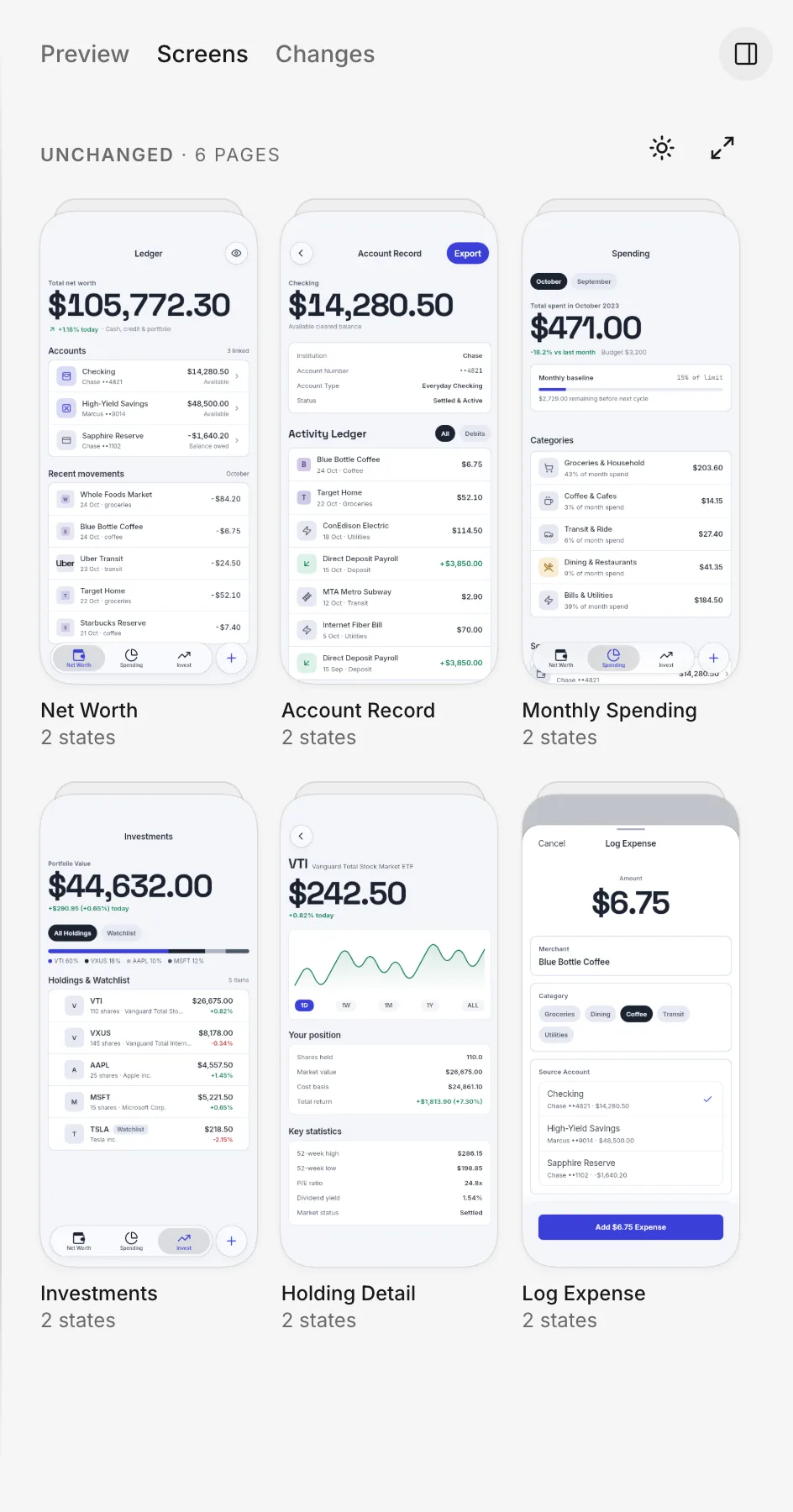
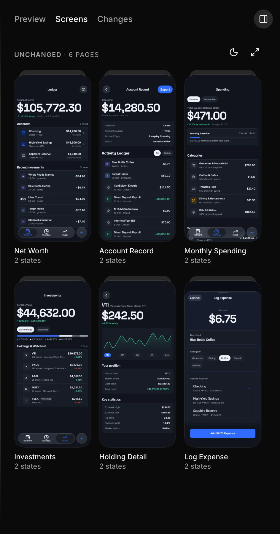
A generated look includes both light and dark palettes, unless you ask for a dark-only look in your prompt.
Check both themes when you review the app. In a thread, open Screens and click Switch to dark or Switch to light to toggle the theme.
Fonts
When FlutterFlow generates your first version, it picks heading and body fonts from this list: the system font, Inter, Fraunces, JetBrains Mono, Newsreader, Space Grotesk, DM Sans, Outfit, Nunito, and Plus Jakarta Sans.
To use another font after the first version, attach your own font file or ask the agent to use an openly licensed font. See Logo and fonts.
Ask for a new look
To change the look after the first version, name the style, colors, or fonts you want in a thread, and state what to keep:
Example request
“Restyle the app to feel calm and spacious. Use rounded cards and more space between sections. Keep the screens and navigation as they are.”
Example request
“Use #1F8A5B as the accent color, Fraunces for headings, and Inter for body text. Check that text and buttons are readable in light and dark themes.”
Example request
“Make the app dark only, with a near-black background and warm white text. Keep that appearance even when the device uses a light theme.”
Before you push, check the changed screens in both themes: fonts match your request, labels fit inside buttons, and text stands out from its background.
Next steps
- Design directions before choosing a look.
- App icon to match the app’s look.
- Push when the result is ready.